These 7 designs run from a vertical stack to a stippled full back piece, and the deciding factor is how much company you want the moons to keep: clean phases alone, or phases threaded with stars, botanicals, or geometric patterns borrowed from folk art and navigation charts.
Thin crescents in negative space need single-needle steadiness, especially on the inner arm where skin moves under the machine, while stippling builds tone through dot density that scabs uniformly but falls apart if you pick at it.
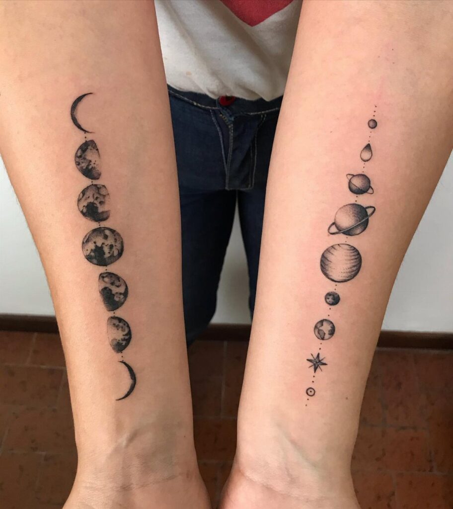
1. Vertical Moon Phases
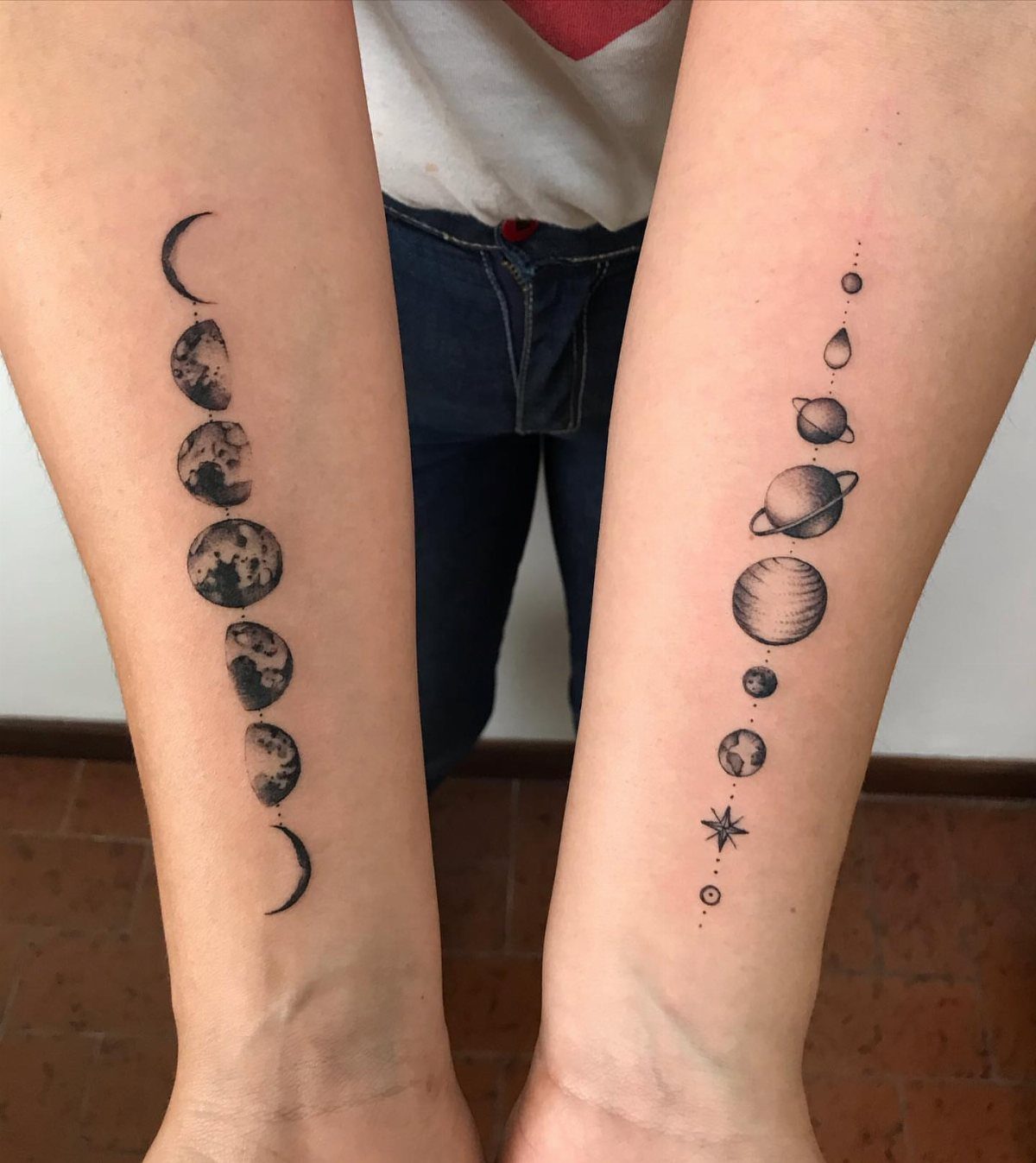
Vertical stacking keeps the pace slow going down the arm, which reads more like a calendar than a bracelet.
A run of phases fits most inner forearms before the wrist bone, with the last one sitting just above where the bone widens.
The spacing matters more than the moons themselves.
I would measure thumb-width gaps while standing, since skin stretches differently sitting down. Botanical swirls threading between phases helps if the line feels too bare, though that shifts it from pure lunar to mixed symbolism.
Who it’s for: anyone whose work hides the inner arm, since a vertical piece draws the eye straight up and competes with conversation.
2. Horizontal Moon Phases
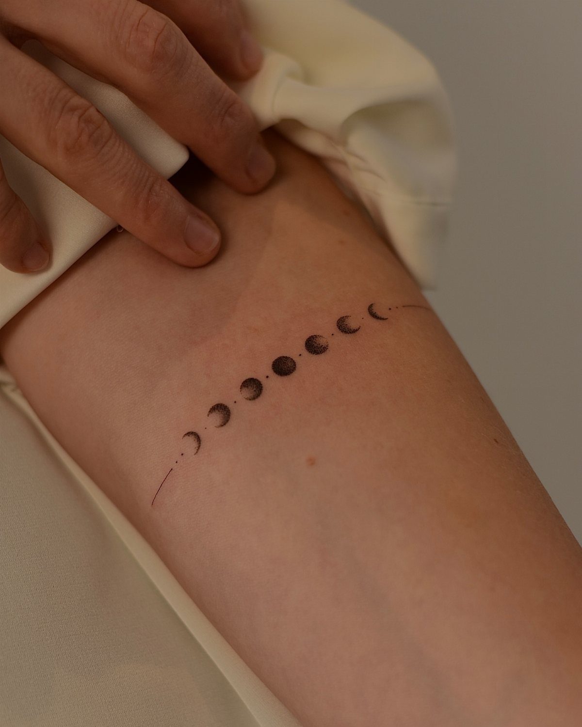
A horizontal run across the wrist or above the elbow crease reads as jewelry, which suits someone testing whether they want a tattoo at all.
The full moon at center anchors the eye; skimp there and the sequence feels lopsided.
Notes show cursive text beneath on some versions, but that locks meaning to one phrase forever. I would keep text separate or skip it.
Placement above the forearm lets you check the phases without twisting; on the wrist, the line fractures as skin moves.
Hold off on swimming through the full healing period for any linework, but know that horizontal lines catch sun faster along the arm top. Plan sunscreen into the routine once the skin has fully healed.
3. Moon Phases with Stars
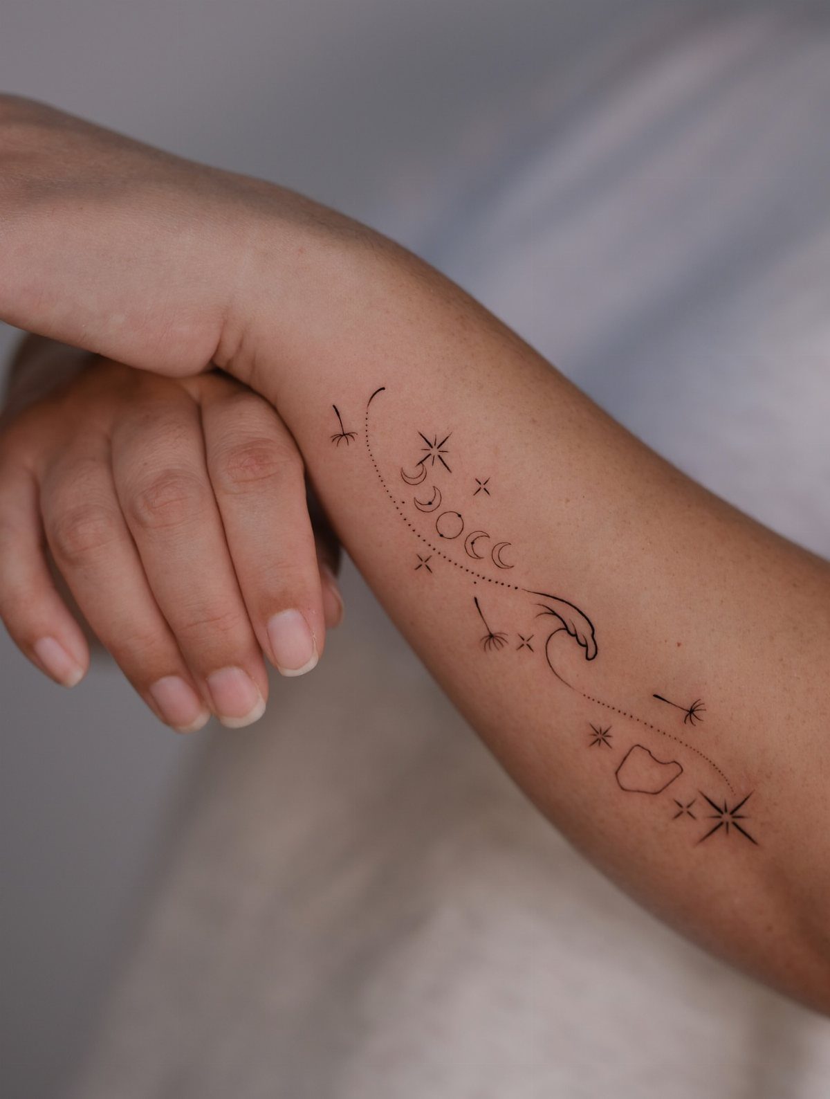
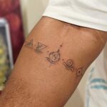
Small stars flanking each phase turn a science-chart tattoo into something more folk or sailor. The dandelion seeds in the visible version do the same work as stars: they give the moons something to illuminate.
I would keep star count odd, three or five per side, since even pairs look like earrings pinned wrong.
Four-pointed stars read as sparkles; five-pointed reads as actual stars, so pick the mood you want. That choice changes the tone more than the moons do.
Scale is the trap.
Stars too large compete with the phases; too small, they blur to plain dots down the road. A test: draw your largest acceptable star, then halve it.
4. Moon Phases with Botanical Elements
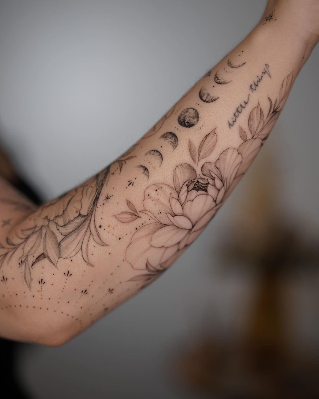
Botanicals soften the lunar sequence into something grown rather than calculated.
The peonies in the visible version take up real estate, so this works best when the moon phases arc above a larger floral piece rather than carrying the design alone.
Leaves alternating with phases keeps both elements equal so neither overpowers the other.
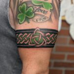
I would choose leaves native to somewhere I have lived; generic vines look like clip art. The ornamental knot at bottom from one note is a separate decision, a period on the sentence that otherwise trails off.
Line weight must match. Thin moons with heavy leaves look like 2 tattoos colliding.
5. Stippled Moon Phases
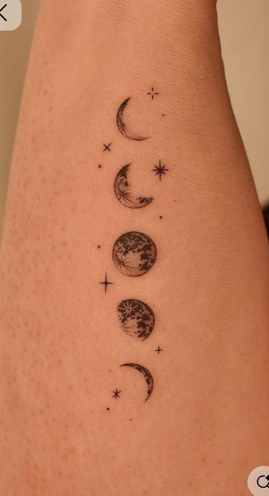
Stippling builds tone through patience, not machine speed. A full moon of dots takes roughly triple the session time of a solid black one, and touch-ups are harder since re-stippling over faded dots looks patchy.
The texture rewards close viewing and falls to solid gray at conversational distance, which suits someone who wants private detail. Vertical and horizontal both work for stippled pieces; I would angle neither and let the dots themselves create movement.
Aftercare differs slightly: dots scab more uniformly than lines, but picking any lifts the whole constellation. The wrist bracelet version reads as beaded from a distance, a texture solid ink cannot fake.
6. Moon Phases with Geometric Patterns
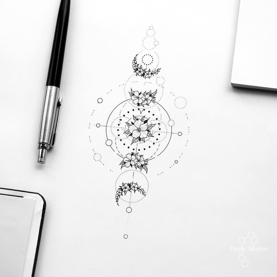
Geometric lines give moon phases an armillary sphere or navigational feel, more instrument than decoration. Radiating sun lines split the difference between astronomical and symbolic, a compromise that reads either way depending on who is looking.
I would keep geometry to the spacing and framing, not the moons themselves.
A hexagonal full moon stops reading as moon. A decorative knot works here as pure geometry without botanical meaning, a better fit for this version than for leafy ones.
This style ages cleanly if lines stay single-weight. Multiple line widths in geometric work blur at different rates, so the precise drawing ends up looking off while simpler versions hold their shapes.
7. Minimalist Black Ink Moon Phases
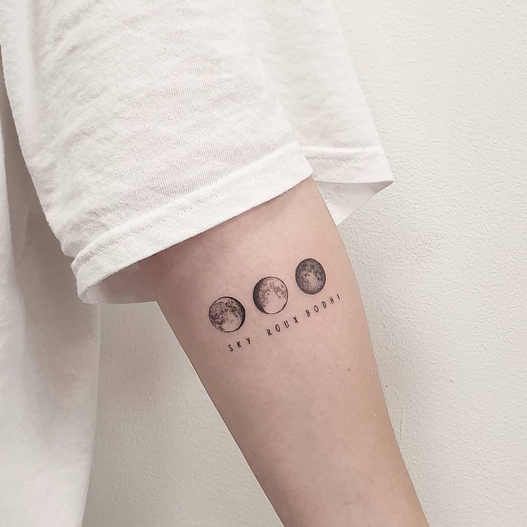
3 moons in black ink leave nowhere to hide. The negative space does the work; any wobble in the line shows instantly, which is why this style costs more in artist selection than in ink.
A clean line of moons in 3 phases stays small enough to sit just above a word or name.
That text is the fragile part: names age fast, coordinates age faster. I would leave the band clear and let the phases speak alone.
Single needle or tight three-round keeps edges clean at this scale. Blowout turns a thin crescent into a smudged comma, so the artist needs steady pull on areas where skin sits thin, which is most of the inner arm.
This size works best for the person who has spent half a year deciding and still wants the design restrained.
Placement Ideas for Tattoos
The forearm keeps what hangs on the wall in a gallery: you face it, you choose the light, and you can read it without a mirror.
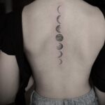
Vertical phases there turn the inner arm into a column you check the way someone else checks a watch. Spine work demands a different patience.
The skin is thin over bone, lines blow out easier, and you will not see the result yourself except in reflection or photographs. Collarbone placement frames the sequence where a necklace would sit, which reads as adornment rather than record.
I would test any vertical placement with tape cut to phase shapes, worn through a full day of reaching and bending, before committing. The wrist bone widens; work that ignores this bulge sits crooked and stays crooked.
Symbolism of Moon Tattoos
Change and femininity attach to moon phases automatically, almost too automatically. The symbol has soaked up enough intent that a viewer reads it before you explain.
What varies is whose change, whose cycle. The botanical versions I noted earlier push the meaning toward growth and decay, the living part of cycling rather than the abstract one.
Text beneath phases, where it appears, tries to pin the symbol to one event, one name, one set of coordinates.
That specificity ages the way all specifics age. The folk or sailor reading from stars alongside moons belongs to a lineage of navigation by night, of journeys measured in lunar months rather than calendar ones.
Pick the companion symbols knowing which lineage you are borrowing from, because mixed lineages mixed carelessly look like shopping rather than choosing.
Design Variations
Shading and botanical elements already earned their section; the variation worth adding is purely graphic.
Solid black moons against untouched skin read as stamps, official and flat. Stippled tones, noted earlier, shift to gray at distance and reward stepping closer.
Between these poles sits hatching, cross-hatched lines building darkness through directionality rather than density. Hatched moons carry texture stippling loses to scale; viewed from too far, stipples merge to gray mud, while hatching keeps its grain.
The geometric versions I described elsewhere can slide into optical illusion territory, moons that seem to bulge or recede depending on line direction around them.
That effect costs in legibility: a moon that tricks the eye stops reading as moon to the eye not seeking the trick.
I would decide whether the design serves first reading or second, because the techniques that reward return visits often frustrate first ones.
Frequently Asked Questions
What does a moon phase tattoo mean?
Change, cycles, and femininity attach to it automatically from long use. By now the symbol carries its own context; people meet it already half informed.
What shifts is whose change and whose cycle: botanical versions lean toward growth and decay, while stars alongside moons borrow from navigation by night and journeys measured in lunar months.
Where should I put my moon tattoo?
Worn along the forearm, the sequence reads left to right like a timeline; turned vertical, it becomes a narrow column against the inner skin.
The wrist works for horizontal runs but fractures as skin moves. Spine placement demands extra patience since skin sits thin over bone and blowout happens easier.
Collarbone framing reads as jewelry rather than record. Tape cut to phase shapes and worn through a day of normal motion will tell you whether a vertical line stays straight on your body.