The designs below run from a vertical forearm strip to a horizontal composition with a rose and botanical leaves, so the deciding factor is how much skin and how many sessions you want to commit.
Pick your layout first, vertical or horizontal, and every other choice follows from there. A fine line full moon can glow without shading, but a rose overlapping the phases needs that extra session for the petal work to hold.
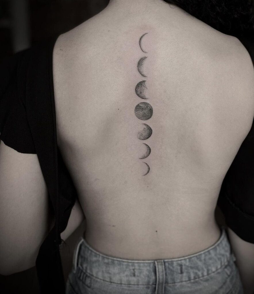
1. Vertical Moon Phases
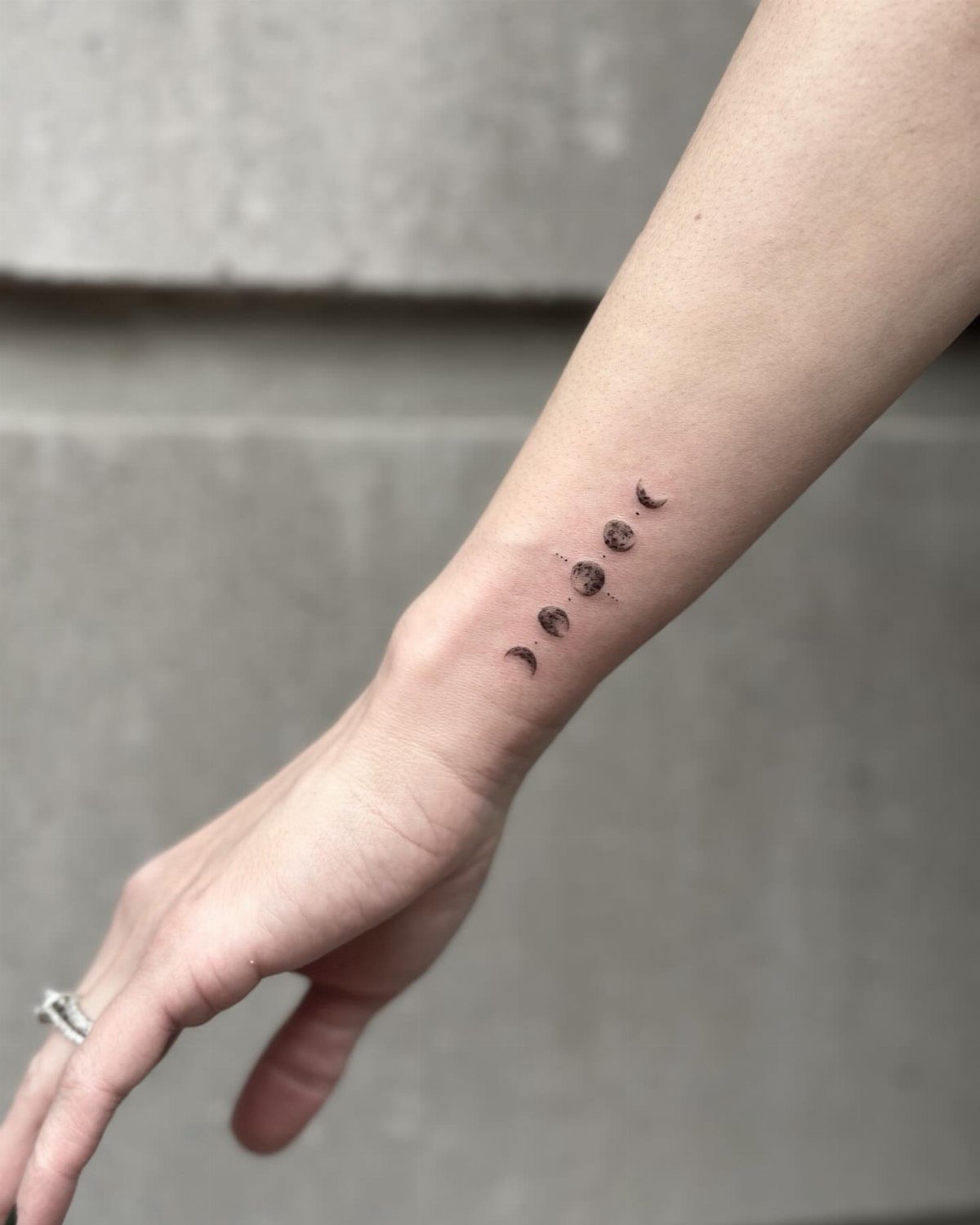
A vertical column of moon phases runs from wrist toward elbow, following the arm’s natural line rather than fighting it.
The crescents narrow and widen in order, full moon at center, sometimes with a single star above to mark the top.
I like this placement for how it moves with the body; raise your arm and the phases shift like a slow tide.
Black ink keeps it legible at the small sizes that fit here.
Ask your artist to space the phases so none blur together as they age, and expect 2 sessions if you add the lotus or koi that sometimes anchor larger versions down the spine.
2. Horizontal Moon Phases
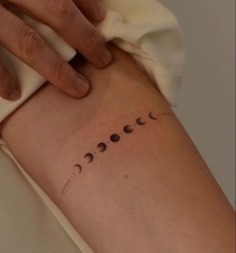
Running horizontal across the forearm or collarbone, these phases read left to right like a sentence.
The eye follows easier, which makes this the layout I’d pick for adding words alongside; a short phrase fits naturally at either end without competing for space.
A full cycle needs more phases than a tighter spot allows, so plan the space before you settle on how many to include.
Most women I see carrying this one keep the moons small, no larger than a fingertip, with botanicals or script flanking rather than overlapping.
Grayscale shading holds up better than pure black for the full moon’s roundness, in my observation, but line-only versions heal faster and cost less.
3. Moon Phases with Stars
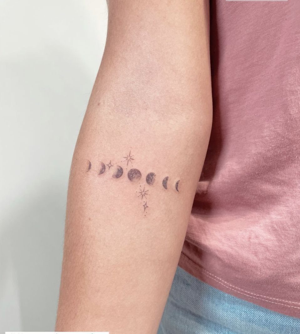
Stars turn a moon phase strip into a particular night sky, not just a diagram.
Tiny ones, scattered two or three above and below the full moon, keep the balance; too many and the eye loses the sequence. Fine dots between them suggest distance without drawing focus.
The celestial pairing suits women who came for moon meaning and want to wear the broader context too. Horizontal reads as a measured timeline; vertical with stars gains a chart-like quality I find more personal, like mapping a specific date.
Diamond accents from some versions add geometry’s structure if the plain stars feel too loose, though that moves the piece toward a different style entirely.
4. Moon Phases with Botanical Leaves
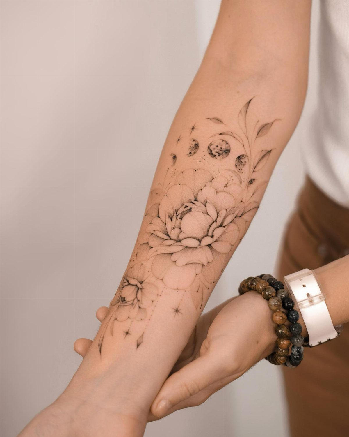
Peony or vine wrapped around the moons softens the astronomical into something grown. The botanical element usually sits central, largest leaf or bloom behind the full moon where the composition’s weight already gathers, then tapers toward the crescents.
This is the version for women who want the lunar cycle but need it to feel organic, tended.
Leaves need more skin than moons alone; plan on a forearm minimum, upper arm or thigh for comfort.
Black ink throughout keeps the 2 elements from competing, though I’ve seen the flower done in lighter graywash so the phases read first, bloom second.
Check your artist’s floral portfolio separately; moon phases any competent hand manages, but botany betrays a weak eye fast.
5. Fine Line Moon Phase Tattoos
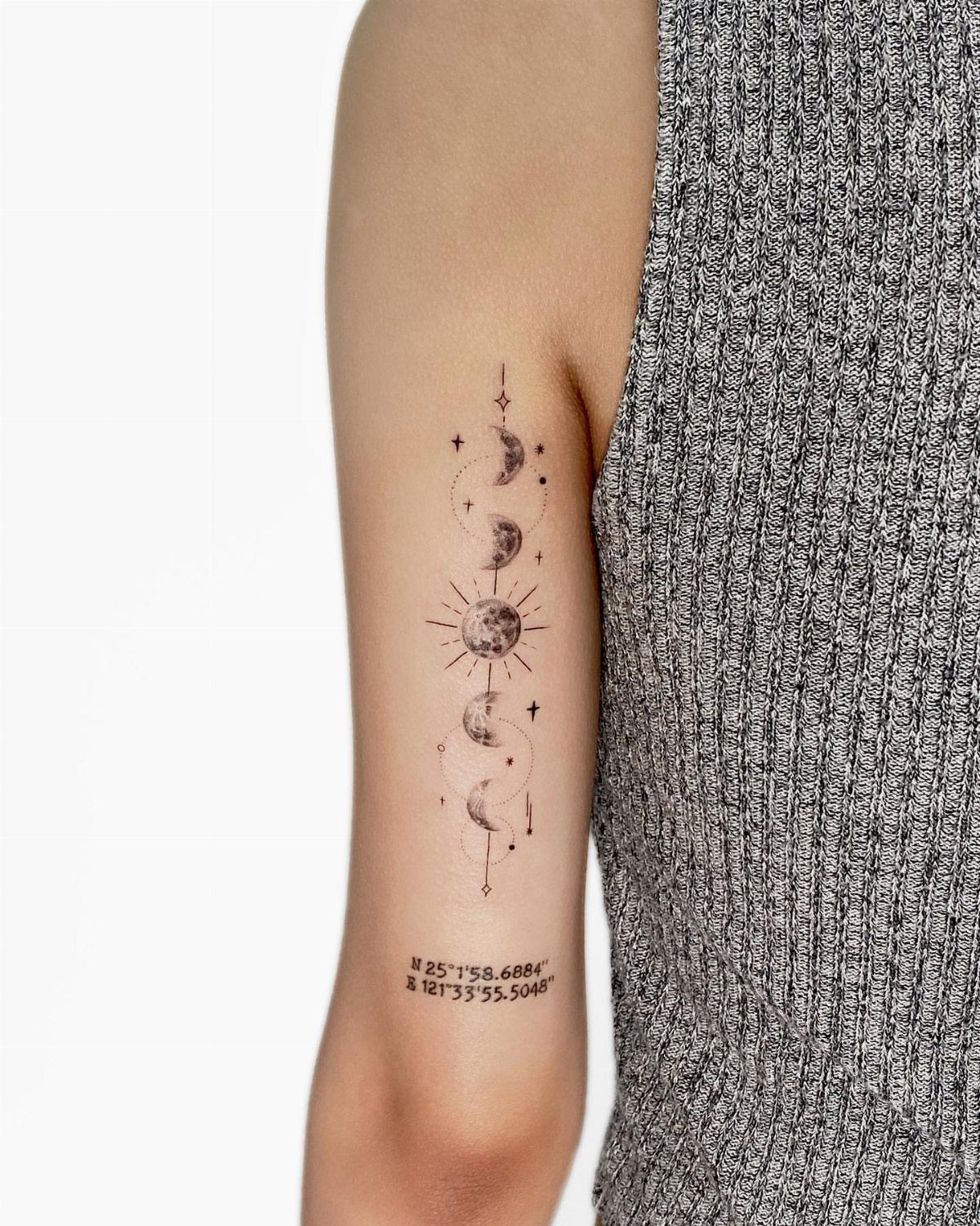
Single-needle work, hair-thin and precise, lets moon phases read as etched rather than stamped.
The technique takes longer, costs more, and blurs faster if the artist rushes or you heal poorly. Worth it for how the full moon’s edge can actually glow against skin, no shading needed.
I’d limit additions to one or two, though.
The delicacy is the point, and every extra element subtracts from it. Touch-ups are normal for lines this thin, so budget for that before you start.
6. Moon Phases with Geometric Accents
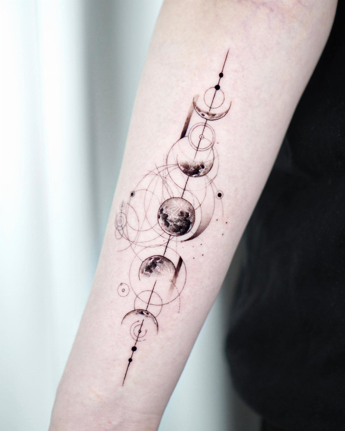
Circles, intersecting lines, and measured angles frame the moons in something closer to blueprint than folklore. The geometric version appeals to women who want the tattoo to read as designed, constructed, intentional from first glance.
Placement matters more here; the forearm’s flat plane keeps circles true, curves of the bicep or calf will distort them. Diamond accents at phase points, or concentric circles around the full moon, are common moves I kept seeing.
One version mixes botanicals in too, which I find crowded; choose green or choose geometry, let each have its own space. Black ink throughout, no exceptions; color would break the draft-table mood entirely.
7. Moon Phases with Text
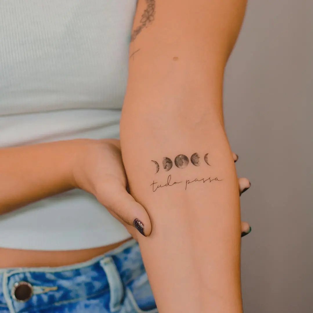
A horizontal moon phase strip sits above a line of script, each element reading in the same direction so the eye travels once.
The "tudo passa" I kept seeing pairs Portuguese resignation with lunar cycle, though any short phrase works if it matches your rhythm.
Cursive sits better than block letters here; the curves echo the crescents without matching them too neatly.
Size the text smaller than the moons or it becomes the point instead of the comment. Placement high on the inner forearm keeps both lines flat enough to read; the wrist rolls and foreshortens them into something messier.
Black ink throughout, no color to split attention between the 2 elements.
8. Moon Phases with a Rose
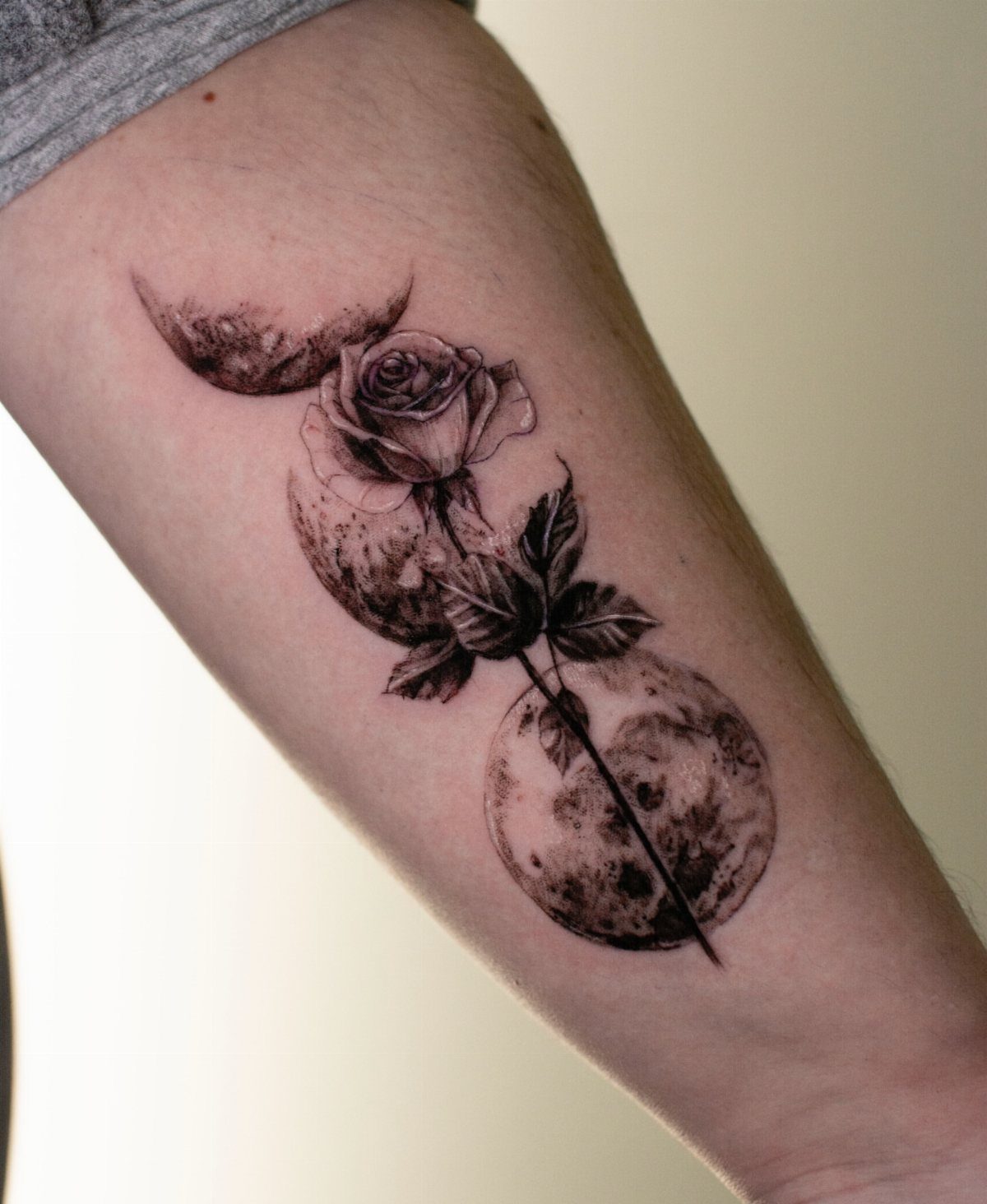
A single rose overlaps the moon phases, stem weaving through crescents, bloom open at the full moon’s center.
A black and grey palette keeps the moon phases and rose reading as one continuous image rather than two separate designs competing for attention.
Overlapping demands planning: decide which element sits on top before the needle starts, or the rose flattens and the moons cut out.
The rose needs shading to hold its form against the moons’ solid black, and that shading takes longer than line work alone. Budget the extra session.
This one suits women who want both symbols but only one tattoo. Check that your artist’s floral shading holds up at small scale; a blown petal blurs faster than a blown crescent.
Tattoo Placement Advice
The forearm works best for moon phases you want to see daily; it sits flat for reading, ages evenly, and shirts cover it when needed.
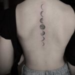
Spine placement demands more commitment: the strip runs from neck to tailbone, a curved flow that moves with the back’s natural line rather than against it.
Most women I see with this one started smaller and scaled up after testing how the vertical format felt.
Back placement suits a wider composition, enough room for the full cycle plus breathing space around it.
The skin there holds ink well and fades slower than spots that see more sun, though you will need a mirror or a friend to check it yourself.
Chest and back pieces trend toward bolder stencil work, which reads differently than the fine-line detail women usually choose for arms.
Design Customization
A single date marked in small numerals beside the full moon turns the cycle into a timestamp: birthday, loss, recovery, the night something shifted.
Most artists place the numbers where the new moon would sit, balancing the composition without crowding the moons themselves.
Names need care. Script small enough to fit beside a phase blurs faster than the phases themselves, and a name that outlasts the relationship draws questions you may not want.
Initials can work into the line of a crescent if you keep them to 2 characters; at that length they read as a design element rather than a declaration.
Additional symbols work best when they repeat. One star is an accent; five scattered become their own language.
If you add a pet’s paw print or an ancestor’s birth flower, limit it to a single placement, usually at the full moon or one end, so the eye still reads the phases first.