The above knee tattoo you choose depends on whether the design curves with your quadriceps or fights them.
Pain runs 8 to 10 out of 10 on the front and inner thigh, where thin skin leaves bone almost unprotected, so the composition has to earn that sitting.
Flowing shapes like butterfly wings or trailing vines move naturally with each step; rigid geometry warps visibly when the knee bends.
1. Butterfly Tattoos
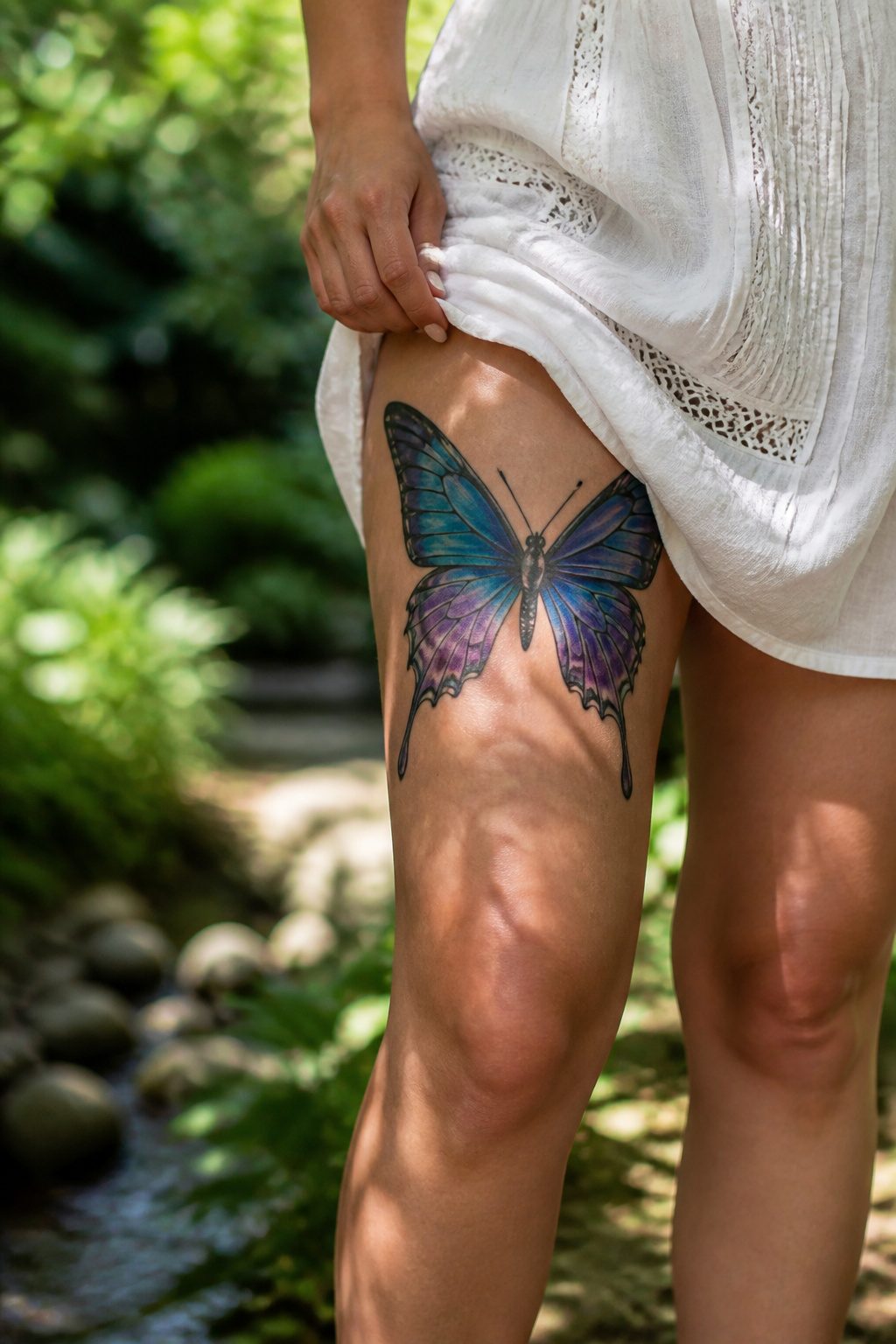
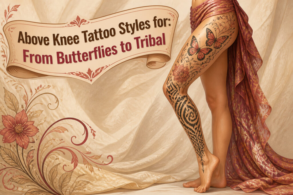
Butterflies rank among the most requested motifs for above knee placement, and the reason is structural as much as symbolic.
The lower wings of a butterfly or the trailing tails of a luna moth follow the natural curve of the quadriceps as they taper toward the knee, letting the design sit without fighting the body’s shape.
Motion matters here: the skin above the knee flexes and shifts with every step, so a composition that curves gently at its lower edge moves more gracefully than one drawn with a straight bottom border.
The symbolism tends to land harder than people expect. Transformation and resilience are the usual readings, but what struck me, reading through dozens of portfolios, is how much the style choice shifts the emphasis.
An American-traditional butterfly with saturated color reads cheerful, almost celebratory; a gothic or abstract treatment turns the same form into something more ambivalent, the grit of survival rather than the triumph of it.
Either way, the wing shape does the placement work for you, which is why artists so often steer clients toward this motif when the knee itself needs to stay clear.
A butterfly can also serve as a transition piece, bridging a nature-themed thigh tattoo into whatever sits below without forcing a single image to wrap an awkward joint.
The knee’s size and range let you scale up to photorealistic work if you want the detail to hold from a distance, though that same scale demands more planning around how the quadriceps flex.

24PCS Unique Henna Stencil Pack – This complete henna tattoo kit accessory set includes 24 sheets of reusable mehndi stencils (6.89" x 3.34"). Featuring exclusive designs like long arm bands, moon motifs, vine flowers, and large floral templates, it is ideal for creating DIY temporary skin art on wrists, arms, back, and full body.

BOLD BODY ART is at your fingertips with hawink Skin Markers. Create vibrant temporary tattoos to complement cosplay outfits, Halloween costumes. Includes easy-to-use stencils. TEMPORARY TATTOO KIT includes 10 skin-safe body art pens and 56 large temporary tattoo stencils. Create eye-catching body art with a rainbow of tattoo marker pens that are skin-friendly.

【 575+ Fun Assorted Tattoo Stencils 】-The ChurlChurl tattoo stencils collection includes 575 high quality stencils with multiple themes. enjoy cute trendy tattoo stencil designs like butterflies, words, flowers, symbols, totem, Egypt style patterns and more.
2. Mandala Tattoos
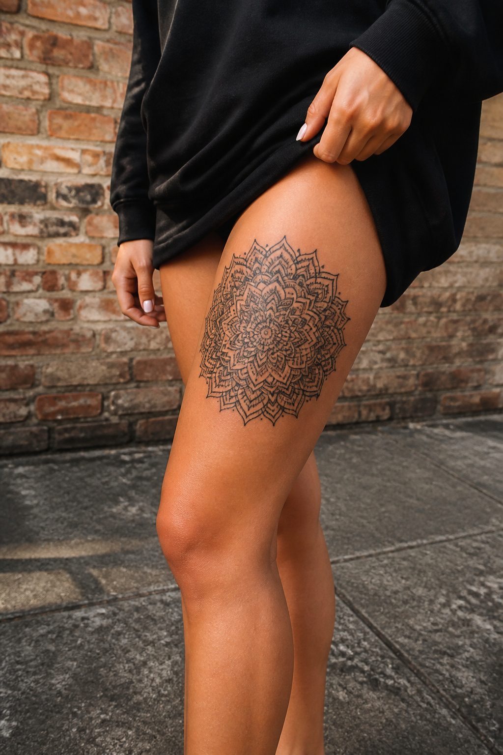
Mandala designs carry a quiet weight. The circular form, repeated in concentric layers, centers itself on the front of the thigh above the knee with an almost architectural rightness.
The placement gives the artist enough flat, stable skin for the fine linework mandalas demand, and that matters more than most people realize when they’re flipping through flash books.
The symbolism runs two ways at once. Hindu and Buddhist traditions use the mandala as a spiritual map of the universe, while the geometry itself, read more plainly, speaks of balance and unity held in tension.
Either reading works. What convinced me, reading through a dozen portfolios, is how the above knee placement lets the design breathe without stretching.
Thigh skin there sees less of the distortion that warps ankle or forearm pieces when you move, and the 2023 tattoo regret data backs what artists already knew: thigh placements rank among the least regretted, while forearm pieces sit at the opposite end.
Size matters for longevity. A compact mandala above the knee can hold its detail; a tiny one will blur into soup inside five years.
The circular shape also frames well against the natural curve of the quadriceps, sitting like a deliberate ornament rather than a sticker slapped on at random.

Generous Quantity: 5 sheets containing a total of 55 monarch butterfly tattoos for multiple applications and sharing

★【26 Sheets Large Butterfly Rose Temporary Tattoos For Women】--COKTAK Brand Multicolor Mixed Style Vintage Rose Flower Temporary Tattoos For Adults. 【Size】Package Includes 12 Sheets 7.8"X3.7" Inches/19.8x9.6cm Large Temporary Tattoos For Thigh Leg And 14 Sheets 3.86"X2.28 Inches/9.8x5.8cm Small Temporary Tattoos For Fingers Hands.

💕【27 Sheets Creative Watercolor Flower Temporary Tattoos For Women】--VANTATY Unique Desgin Mixed Style 3D Rose with butterfly Temporary Tattoos For Adults Body Art Stickers Look Real! Package Includes 12 Sheets 7.8"X3.7" Inches/19.8x9.6cm Large Watercolor Temporary Tattoos For Thigh Leg Forearm And 15 Sheets 3.86"X2.28 Inches/9.8x5.8cm Small Temporary Tattoos For Fingers Hands. This Product Is Not Suitable For People Under 12 Years Old.
3. Floral Designs
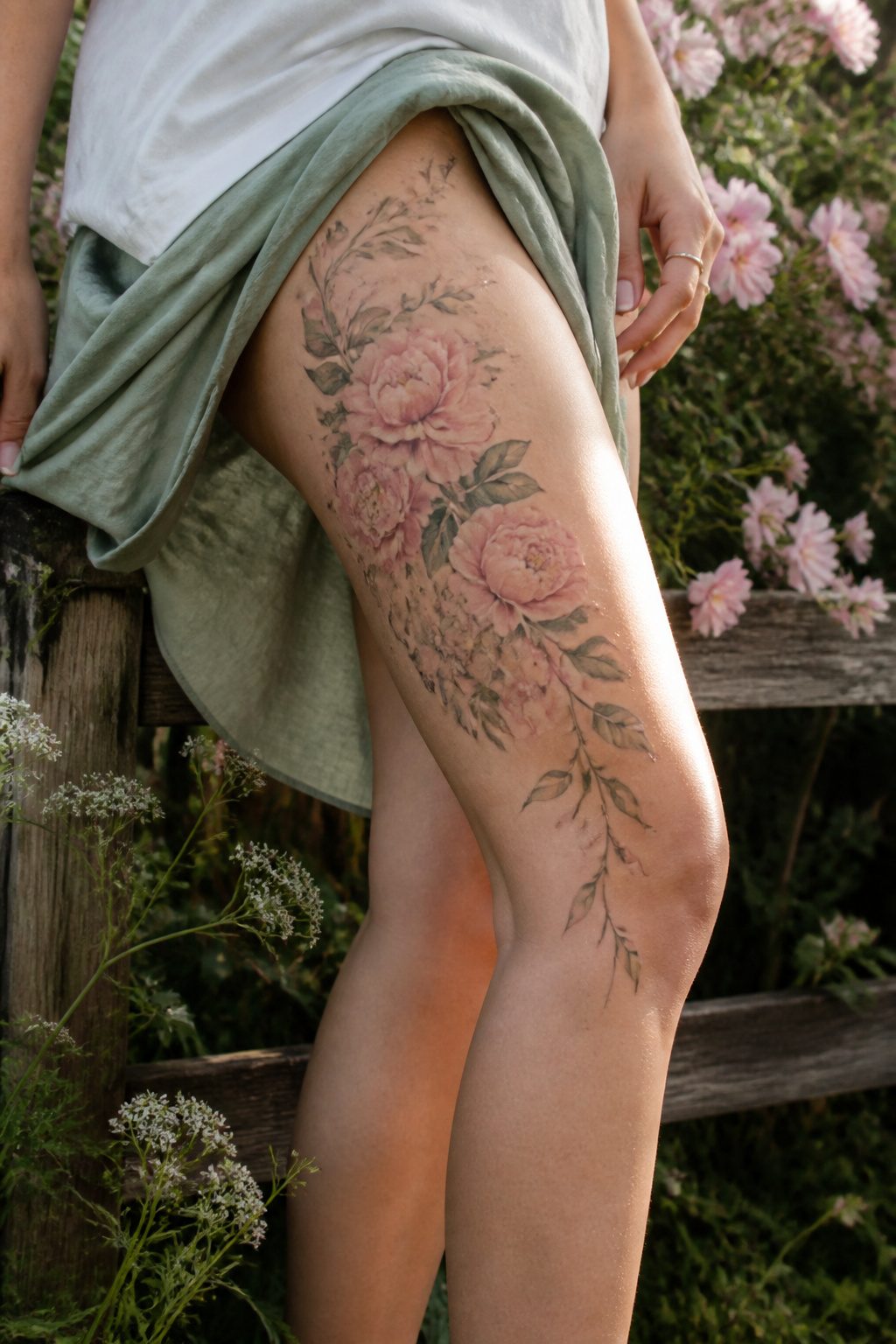
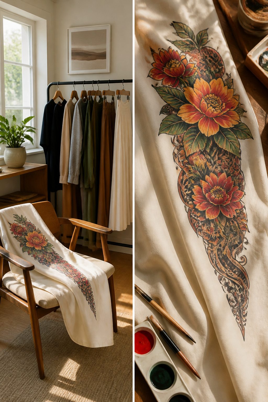
Floral designs carry the most natural advantage for the above knee tattoo placement because stems and vines already want to follow the body’s lines.
A peony or rose cluster can sit higher on the thigh while tendrils drop toward the kneecap, using the curve instead of fighting it.
That wrapping motion also means the tattoo reads correctly from multiple angles, something a static emblem struggles with when the leg bends.
The versatility runs both directions. Vines can climb toward the hip as part of a larger thigh piece, or they can frame the knee as a border between upper and lower leg work.
Flowers and laurels arrange into shapes that hug the anatomy rather than distorting with movement.
Pain sits at 8 to 10 on the standard scale here, since the skin above the knee carries little muscle or fat padding over bone.
A design that flows with the leg’s motion, rather than pulling against it, minimizes the compositional risk of that placement.

【Boho Mandala Lotus & Vine Design】This semi-permanent tattoo features a mandala lotus center framed by delicate lace patterns and jewelry-inspired details. With its henna-meets-bohemian aesthetic, it’s designed to wrap around the thigh, underboob, or sternum for delicate "jewelry ink" effect. Perfect for bold women wanting to showcase their feminine grace at beach parties, festivals, or intimate moments, this large-scale piece adds a touch of mystical elegance to your body art collection.

【Black Flower Chest Temporary Tattoos for Women】A pack of 10 sexy and fresh tattoo stickers with different patterns, each size is 5.43*9.44 inches, including mandala flower branch butterfly tattoo stickers, which look sexy and mysterious,perfect for girls who want to try a fresh tattoo style.

🐙32 Sheets 89+ PCS Unique Tribal Black Temporary Tattoos:🐠 There Are 32 Sheets With 8 Large Half Arm Sleeve Temporary Tattoos For Women Adults 21x15cm 8.2"x5.9" And 24 Sheets Small Temporary Tattoos For Girls Kids 10.5x6cm 4.1"x2.3" Including Various Popular Gothic Designs 3D Animal Snake Lace Elephant Cross Boho Bohemia Moon Crown Owl Lion Wolf Tribal Tiger Tatoos Skull Skeleton Dreamcatcher Dream Catcher Turtle Lotus Mandala Flower Feather Fake Jewelry Tattos Design.
4. Celestial Tattoos
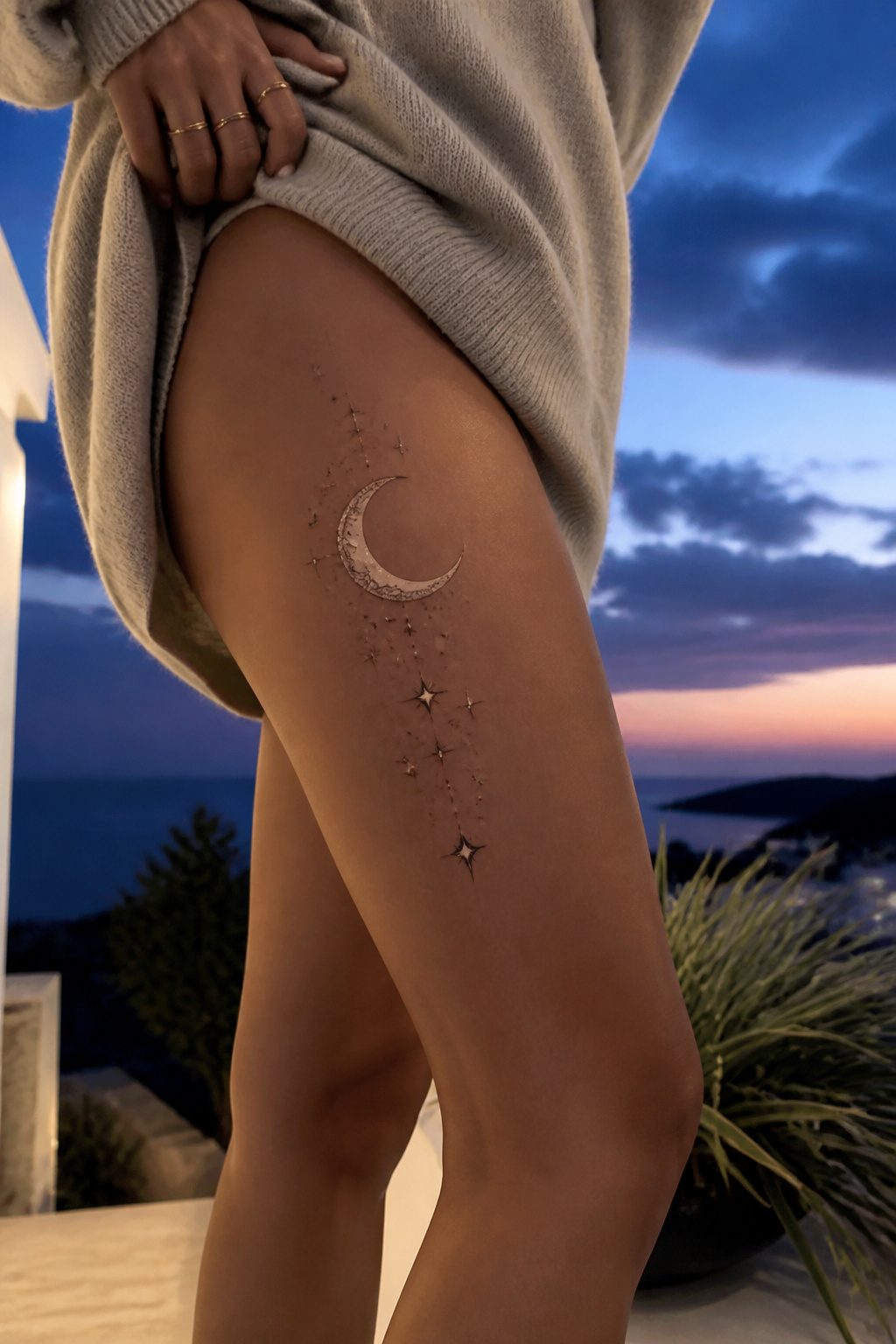
The crescent shape above the knee practically asks for a moon. Stars and planets can trail upward from that natural curve, running vertically along the thigh so the design moves with the leg instead of fighting it.
Light catches this placement at angles you do not get on flat skin; a star that reads bright at noon turns into a faint pinprick by evening, and the moon shifts from silver highlight to deep shadow as the day changes.
That unpredictability is the appeal for some, a dealbreaker for others. A solid black planet or a dense cluster of stars holds up better than fine linework here, where the skin stretches and the light keeps moving.
The area stays hidden under most daily clothes, so the reveal stays yours to control: shorts, a skirt, a swimsuit. Vertical flow works with the thigh’s length; horizontal bands fight it and often look squeezed.

✿【 Long Strip Body Art Tattoo 】: Designed with extended long strip patterns tailored for arms, back, torso and shoulders, these full-size temporary tattoos cover larger skin areas perfectly. Featuring diverse delicate patterns and smooth integrated lines, the overall look is stylish and atmospheric, easily creating a stunning full-body decorative effect and upgrading your whole dressing temperament.

LONG IVY VINE TATTOO DESIGN Includes 3 separate temporary tattoo sections designed to join together to create one long trailing ivy vine measuring approximately 19.5 inches in total.

ELEGANT BOTANICAL VINE ART: Features a graceful, continuous blooming layout mimicking the natural, organic curvature of growing forest flora. This delicate botanical illustration is crafted using a digital hand-drawn fine line tattoo ensures crisp lines to deliver ultra-sharp leaf silhouettes, intricate wildflower clusters, and clean minimalist stem line weights.
5. Geometric Patterns
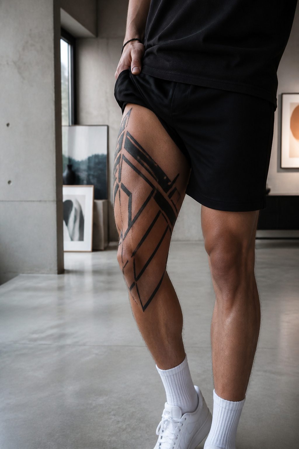
Geometric patterns above the knee carry an immediate visual authority, but the body does not cooperate the way a flat surface would.
The thigh curves, muscle shifts with movement, and a grid that looks mathematically perfect while standing straight will warp noticeably when the knee bends.
Skilled artists solve this by building the silhouette first, then letting the interior geometry flex with the underlying form rather than fighting it.
Line weight matters more here than in smaller placements. Slightly bolder structure survives the thigh’s motion better than fragile detailing, and the design needs enough scale to feel intentional on a large canvas.
A rigid square or perfect circle can still work above the knee; it just demands more planning.
The closer hard edges sit to the kneecap, the more obvious any visual distortion becomes when the joint flexes, so leave breathing room around the knee itself.
The modern appeal is partly symbolic.
Clean angles and repeating shapes read as order and control, a deliberate counter to organic chaos. That tension, structure against the body’s softness, is what makes the placement interesting rather than merely decorative.

6 Sheet Tribal Tattoos temporary, Each sheet measures 9cm* 19cm/3.54*7.48 inches (L*W).

✔[FULL SLEEVE TRIBAL TATTOO] Briyhose Tribal Full Arm Temporary Sleeve Tattoos Can Cover Your Body Parts Large. It Contains 4 Sheets 18.9 * 6.7 Inch (48 * 17cm) Long Sleeves Totem Tribal Fake Tattoo Stickers For Adults Men Women Tatto Kit. You Can Share It With Your Family And Friends.

SAFE TATTOO SLEEVES: Contains 4 sheets tribal totem full sleeve temporary tattoos and 4 sheets fake tribal totem half arm temporary tattoos which are printed with high quality tattoo ink and paper meeting rigid safety and materials requirements. Do not apply to sensitive skin, near eyes, or if you are allergic to adhesives
6. Text Tattoos
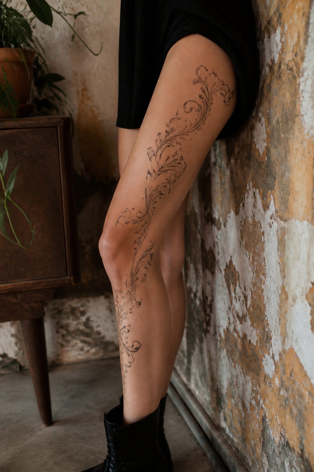
Words gather meaning the longer you carry them, and an above knee tattoo of text is no exception. A phrase that mattered at twenty may still matter at fifty, but the leg it rides on keeps changing shape.
Font choice here is not just aesthetics. Thin scripts can collapse into illegibility where the thigh curves, and the knee’s constant motion turns rigid block letters into visual stutter.
What reads cleanly while standing distorts when the leg bends; the lower portion of any lettering needs a generous curve that follows the leg rather than fighting it.
Spacing matters more than size. Letters set too tight will blur together over time on skin that stretches and contracts with every step.
A wrapped composition, where the phrase follows the natural line of the muscle, reads better from more angles than a straight horizontal band that breaks when viewed from the side.
The pain runs sharp here, thin skin with little padding over bone, often hitting 8 to 10 on the scale. Pick something worth the sitting, then trust the artist to map how that word moves when you do.

▶ Henna Tattoo Kit: 16 sheets tattoo stencils. airbrush tattoo stencils suitable for tattoo lovers. Experience the effects of tattooing without the pain of tattooing.

⯁ 400+ Reusable Henna Stencils: Get 24 sheets of high-quality, self-adhesive hollow templates featuring over 400 unique patterns. These temporary tattoo stencils allow you to create stunning body art including mandalas, butterflies, and dragons. Perfect for practicing techniques without permanence

INCREDIBLE VALUE – 524 Unique Designs: This henna tattoo kit includes 20 stencil sheets with 524 patterns, featuring butterflies, florals, symbols, lettering, totems, and Egyptian-inspired designs. These henna stencils let you mix, match, and layer for custom henna temporary tattoos on hands, arms, and body. A refillable pen with a soft nylon tip is included for precise lines and varied strokes (pen does not include ink)
7. Animal Tattoos
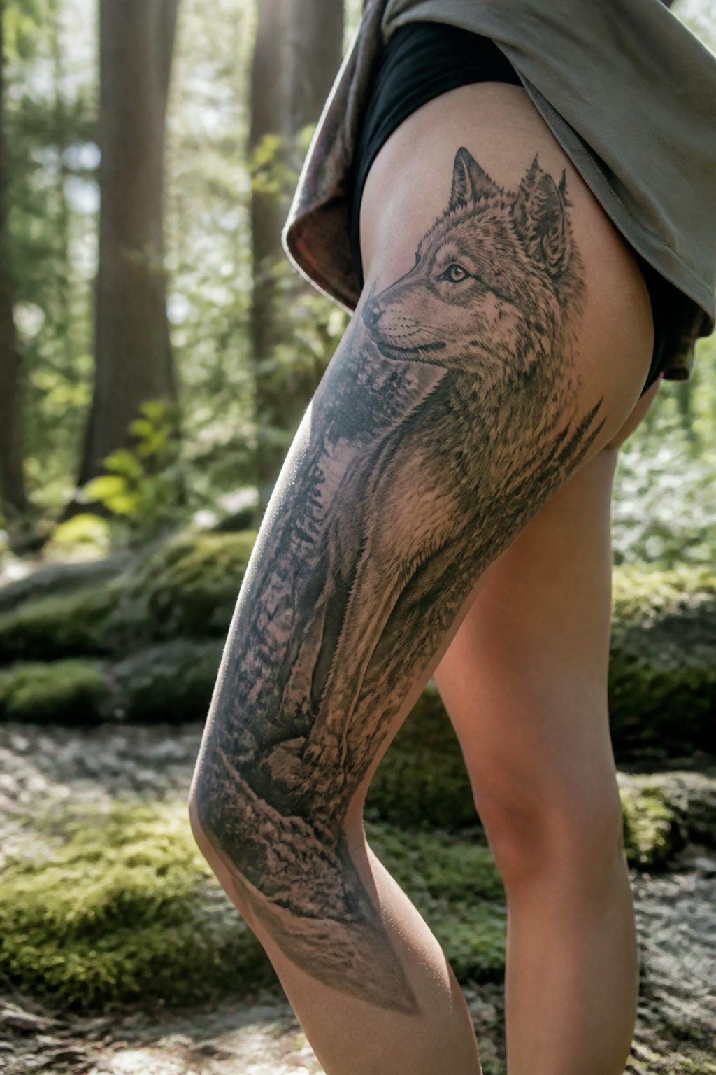
A wolf placed high on the thigh reads as guardianship without needing a full back piece to say it.
The vertical stretch above the knee lets the animal’s body follow the leg’s natural line, head near the hip and tail tapering toward the kneecap.
I have seen this layout work as a full portrait with fur detail and as a clean silhouette that shows up from across the room.
Birds give you motion in a spot that moves already.
A raven in flight, wings spread to catch the full height of the thigh, turns when you walk. Foxes fit tighter spaces, their curled tails filling the inner thigh while the face points outward.
The trait you want matters less than how much detail the size allows. A silhouette the length of your hand will read clearly; a portrait needs twice that height to keep the eyes from muddying.
Placement above the knee rather than on it keeps the image from distorting when you sit.
The muscle shifts there, and a fox’s narrow muzzle can stretch into something unrecognizable. Ask to see healed photos of thigh work from your artist, especially pieces that cross the same line yours will.

For all of us who remember 1990s were a blast here is a fantastic idea for costume - Nurse Tattoo!

🐙2 Sheets Creative Large Flower Temporary Tattoo Sleeve:🐠 There Are 2 Sheets Full Arm Temporary Tattoos For Women Full Sleeve Temporary Tattoos For Adults Including Popular Unique Designs Black 3D Rose Peony Flowers Tattoos Watercolor Butterfly Flamingo Floral Tattoos Full Sleeve Thigh Leg Tattoo Sticker.

🌼【VARIETY OF POPULAR PATTERNS】Package Includes 23 Sheets HIGH QUALITY Creative Unique Design Mixed Style Realistic Flowers Temporary Tattoos For Women Adults Including 12 Sheets Large 7.8"x3.7" Inches/19.8x9.6cm Half Arm Sleeve Tattoo Stickers For Thigh Leg and 11 Sheets 3.86"x2.28 Inches/9.8x5.8cm Small Fake Tattoos For Finger Hand Hot Fashion Popular.
8. Celtic and Tribal Designs
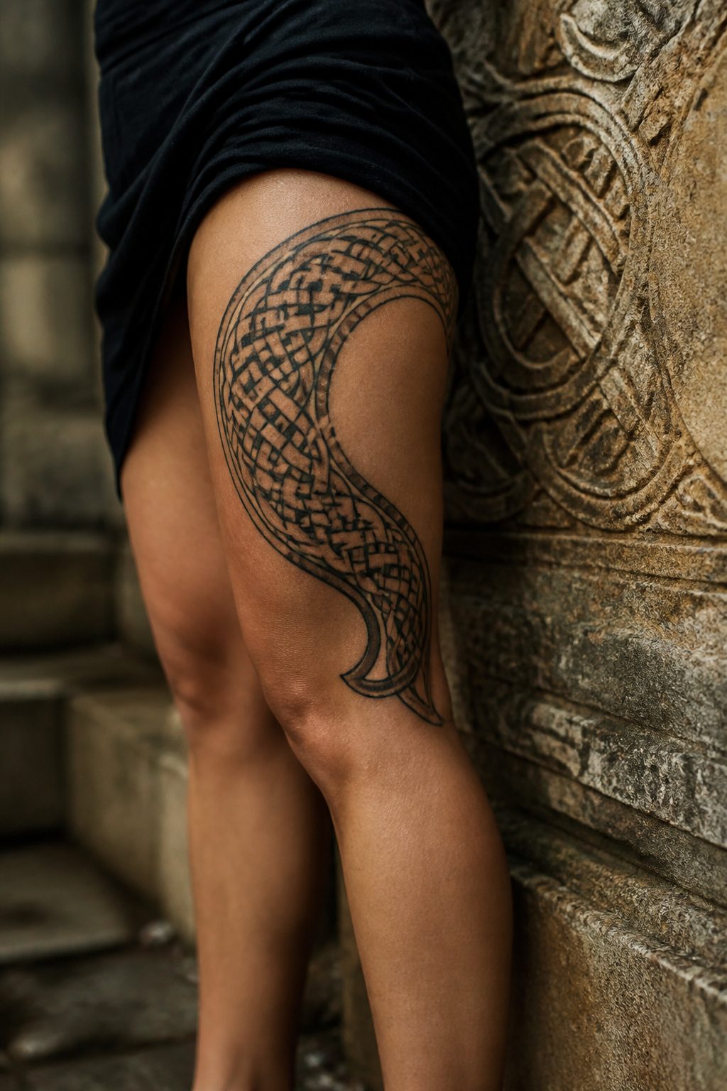
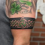
Celtic knotwork and tribal patterns carry lineage you cannot separate from the design. The curves and interlaced lines originated as storytelling tools, marking clan, status, and belief systems that stretch back centuries.
Knotwork wraps around the thigh with a natural logic, each turn following muscle and bone the way it followed stone crosses and manuscript borders in its first form.
Tribal work above the knee reads as strength and bravery in the original context, not decoration borrowed for edge. The ink binds the wearer to that tradition, whether they know the full meaning or not.
That is the part that deserves pause. A pattern that speaks of ancestry on one body becomes empty geometry on another if the story behind it went unread.
The body itself shapes how these designs succeed. Rigid shapes warp when the knee flexes, so the best tribal work above the knee flows with the leg rather than fighting it.
Serpentine curves, ornamental movement lines, and coiling forms adapt as the thigh changes shape. Blackwork and armor-like patterning own the space with force, but only when the design accounts for the canvas being alive, not flat.
If you want symbolism without clutter, one dominant motif with restrained background reads cleaner than competing symbols.
Many small elements crowd the message. The best thigh tattoos say one thing clearly, with room to breathe, and still look balanced when wrapped on a leg, seen from the side, and framed by what you normally wear.
Understanding the cultural background before choosing these designs is not optional research; it is the difference between wearing a story and wearing a shape.
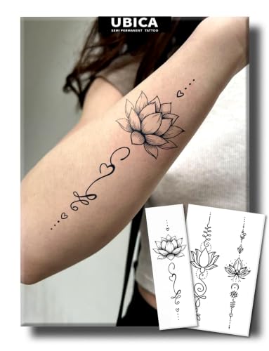
【Zen Lotus Flower Design】This semi-permanent tattoo set features stunning boho-style lotus flower spine tattoos, including intricate mandala lotus, vertical line-art lotus, and delicate floral spine designs. The intricate fine-line design symbolizes purity, rebirth, and spiritual enlightenment, capturing the essence of Zen aesthetics. With its graceful vertical composition, it is perfectly sized to create a stunning, elongated look on the spine, breast, or arm.

Packaging: 8 temporary tattoo stickers with designs including lace, mandala, vintage flowers and other delicate designs. Delicate tattoo stickers will bloom your charm and sexiness, firmly attract the eyes and envy of people around. Materials: These tattoo stickers are made of non-toxic waterproof materials, safe, environmentally friendly, skin-friendly, and can be applied to any part of the body.

SIZE - 10 sheets realistic temporary tattoos with beautiful designs, original brand of Briyhose fake tattoos for adults women kids girl, size is 8.2*4.5 inch (21*11.5cm) 10 Sheets tatoos kit, used for arms, half sleeves, forearm, shoulder, back, neck, hands, legs, thigh, chest, breast, wrist and any other part of your body skin.
9. Symbolic Tattoos
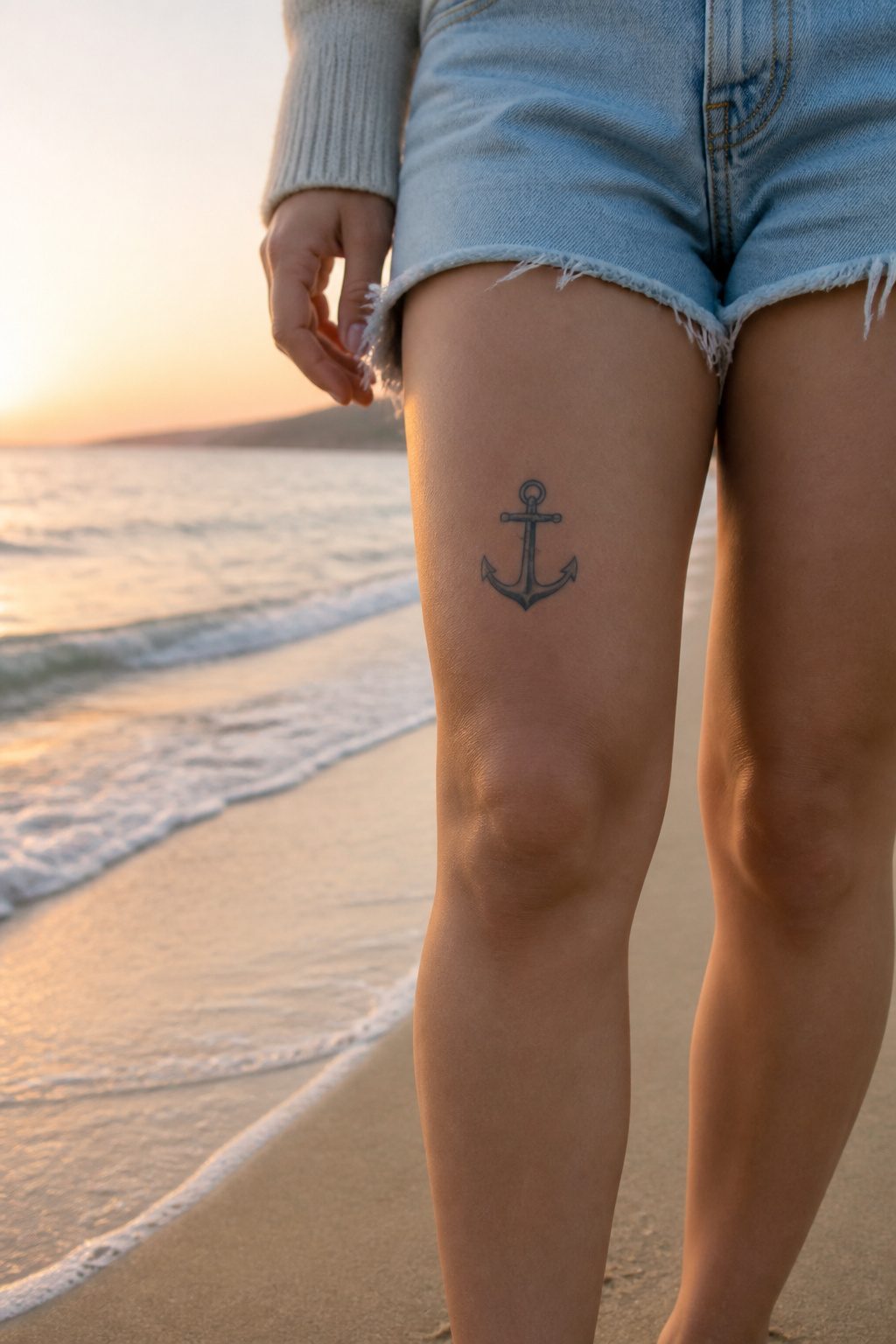
Symbols above the knee carry a tension that lower placements do not. A cross, an anchor, a lotus, a saint’s medal rendered in ink; these marks usually live where the owner controls who sees them.
The inner wrist, the ribcage, the shoulder blade all stay hidden until deliberate choice exposes them. Above the knee, the dynamic shifts.
A skirt at mid-thigh, shorts in July, a swimsuit, a moment of sitting cross-legged on grass: the symbol becomes visible without ceremony, and its meaning moves from private devotion to public statement without the wearer always choosing the moment.
The placement still offers cover.
Trousers, longer hemlines, professional dress; these keep the symbol as close as a locket under a blouse. But the possibility of exposure exists in a way it does not for a hip or a lower back piece.
This changes what people select. A cross above the knee tends toward stylized abstraction rather than crucifixion realism.
Anchors shrink, lose their ropes, become geometry with a suggestion of weight. The symbol remains legible to those who know the code, but it does not preach.
The sweet spot is a symbol that reads as ornament to a stranger and as covenant to you. That dual register matters because above-knee skin ages visibly; the symbol you live with will sag, soften, travel downward.
A design that depends on fine detail for its spiritual charge will blur. A design that carries meaning through silhouette and weight holds longer.
My own preference, after watching pieces age on friends and on my own legs, runs toward bold line and open space. The symbol does its work through shape, not through inscription you need to lean in to read.

Ivy vine tattoos x 16 tattoo sheets for full coverage

【Feminine Floral Design】These delicate lily tattoos are designed for subtle, meaningful self-expression. With fine lines and a natural matte finish, they blend seamlessly on the waist or arm. Perfect as a gift for May birthdays—when lilies bloom—or for anyone who loves elegant floral art. A beautiful reminder of purity and grace, artfully understated.

🐙16 Sheets Unique Flower Leaf Temporary Tattoos:🐠 There Are 16 Sheets Floral Temporary Tattoos For Women Finger Hand Vine Leaves Temporary Tattoos For Adults Including Various Popular Designs Plants Flowers Tattoos Vine Leaf Plum Rose Butterfly Bow Bowknot Leaves Tattoo Sticker.
What Pain Levels Actually Look Like
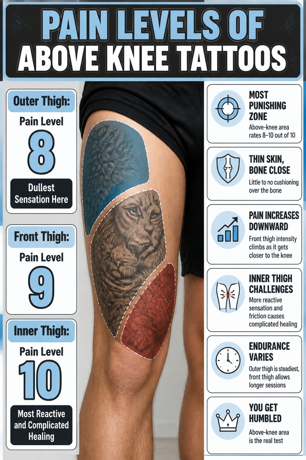
The upper leg is not one uniform surface, and an above-knee tattoo sits in the most punishing zone.
Experts rate pain in this region at 8–10 out of 10, with the skin thinner and almost no muscle or fat cushioning the bone beneath. Even though the needle never touches the kneecap itself, the proximity still matters.
Pain shifts dramatically depending on exactly where the design lands.
The outer thigh tends to be the steadiest ride, more padding keeping the sensation duller and more manageable. The front thigh lets most people endure longer sessions, though the intensity climbs as the design drifts downward.
The inner thigh is where composure breaks; the sensation runs hotter, more reactive, and healing grows complicated from friction against the opposite leg.
For anyone nervous about sitting through it, the outer thigh is the place to start. The above-knee area itself is where people get humbled.

Innovative Skin-Sync Technology: We don't just sit on the skin; we interact with it. By reacting organically with naturally occurring proteins in your skin's outermost layer (stratum corneum), our plant-based formula magically transforms from a transparent guide into a rich, ultra-realistic navy-black. It looks exactly like a healed, permanent tattoo—without the needles or depth.

[Festival & Party Ready] Want to stand out at concerts or beach vacations without the pain? These 18 realistic Polynesian & Maori tribal armband designs instantly elevate your style, making you the center of attention in any crowd or photo.

Product Includes: You will get 8 sheets of lace temporary tattoos, meet most of your needs
How Design Flow Changes on a Curved Canvas
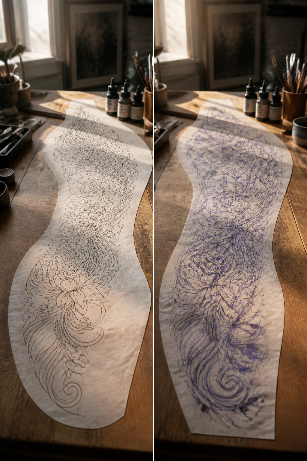
A flat mockup on paper lies to you.
Skin wraps, the quadriceps flex, the knee bends, and every motion changes how the image reads. Flowing organic shapes move more naturally with the leg than rigid geometry, which can distort badly near the kneecap when the joint bends.
The thigh’s curve is not a flaw to fight.
It is the point. Wrapped compositions read better from multiple angles because they follow the cylindrical shape rather than pretending the body is a billboard.
An oversmall isolated symbol often looks lost on this large canvas, while a design with generous curve at its lower edge moves gracefully through a full stride.
What convinced me, reading through how artists actually work this placement, is the shift in thinking: stop designing like a poster hung on a wall and start designing like a body artist.
The knee creates a distinct shape within the leg, and any design that overlaps onto the kneecap or breaks the knee’s natural symmetry will fight the body every time it moves.
When to Show It and When to Hide It
An above-knee tattoo sits in the sweet spot between showing and covering.
Mid-thigh placement means a standard pair of shorts or a knee-length skirt hides it completely, while a shorter hem or a side slit brings it into view on your own terms.
Lower leg ink is harder to conceal, and upper thigh work disappears under almost anything, so the above-knee position gives more daily flexibility than either.
The chameleon effect works both ways. A fitted dress with a vent can flash the design when you walk; tailored trousers keep it under wraps for a conservative workplace.
After my first above-knee piece, I stopped thinking about "tattoo-friendly" outfits altogether. The placement did the work.
Gym clothes are where the practical questions show up. Compression shorts ride and rub more than loose cuts during healing, and the friction point sits right where the ink is freshest.
Once healed, the same flexibility applies: leggings cover, running shorts expose, and you choose by the day rather than by the tattoo.
Frequently Asked Questions
How do I choose a design for my above knee tattoo?
Pick a theme that resonates with you, then let the natural curves of your leg shape the final layout. Flowing organic forms like butterflies, florals, or celestial motifs move more gracefully than rigid geometry when the knee bends.
Work with an experienced artist who can map how the design shifts as your quadriceps flex and the joint moves through its full range.
How painful is an above knee tattoo?
Pain in this zone typically hits 8 to 10 out of 10. The skin above the knee stays thin with almost no muscle or fat padding the bone beneath, so the needle sensation runs sharp and immediate.
The outer thigh dulls it somewhat; the inner thigh is where most people struggle to stay composed.
What are the best designs for above knee tattoos?
Butterflies, mandalas, and floral patterns rank among the most successful choices because each follows the leg’s shape rather than fighting it.
Butterfly wings taper naturally with the quadriceps; mandalas center on the flat front thigh with architectural balance; vines and stems wrap along the body’s lines.
Celestial motifs, geometric patterns, and animal portraits also work when scaled large enough and curved generously at the lower edge.