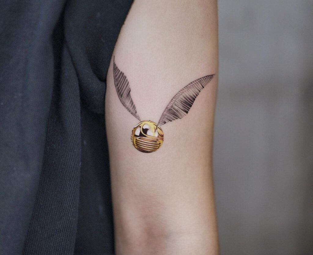
A golden snitch tattoo can stay small enough for a wrist or grow into orbital rings with metallic pigment behind a watercolor wash, and the list below runs through 10 ways artists actually build the design.
Gold ink that reads as metallic on skin is usually a dense yellow packed with pigment, not actual metal, and the heavy load can heal patchy; a test patch with your artist is worth asking for either way.
What separates one design from another is whether you want the piece to read instantly as Harry Potter or to hold up as ornamental art to anyone who never opened the books, and the styles below split both ways.
1. Minimalist Golden Snitch Tattoo
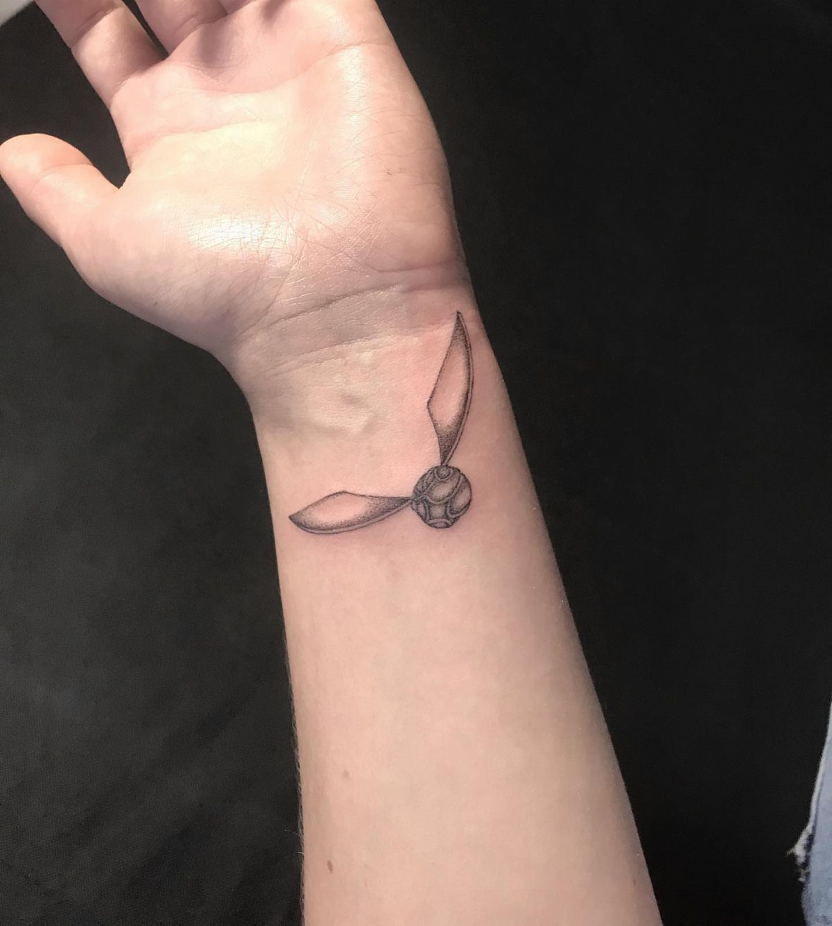
A minimalist snitch keeps to the bone structure: small sphere, 2 wings, nothing else. A wrist placement sits where you will see it daily and others will not unless you show them.
Black and grey heals cleaner than color in this size, and the single needle work means touch-ups matter more than with bolder lines.
Ask your artist about their experience with fine detail at small sizes; not every hand holds that steady. I would want to see healed photos from past work, not just fresh work.
2. Golden Snitch with Text Tattoo
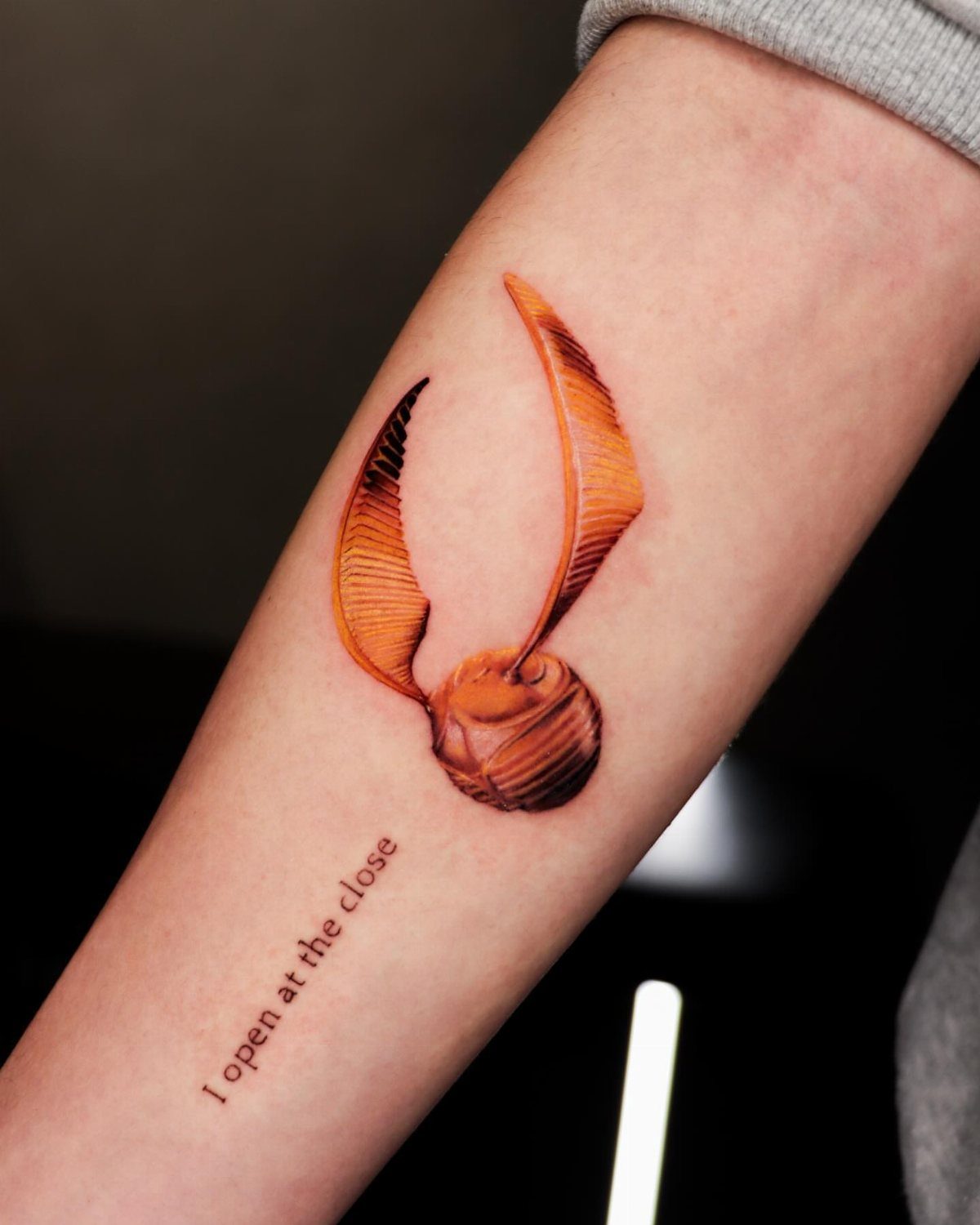
"I open at the close" turns the snitch from reference into dialogue. A typewriter font reads deliberate and slightly worn, which suits the line’s origin as Dumbledore’s handwriting in a story told backward.
Text placement below rather than beside keeps the wings clear for reading. That phrase needs straight space to read cleanly, so the forearm or outer calf works better than a wrist.
Match the text ink to the wing outlines and keep the sphere in gold tones so one element carries the literal color.
3. Fine Line Golden Snitch Tattoo
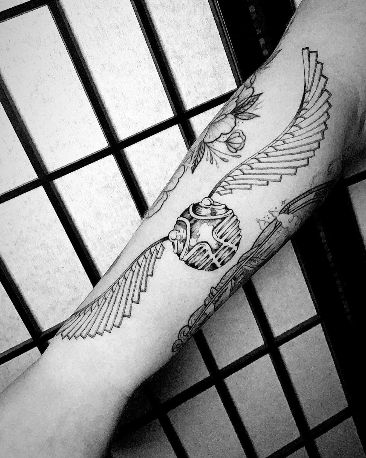
Fine line work lets the snitch share space with other imagery without crowding.
Floral curves threading between the wings soften the mechanical roundness of the sphere itself. Stippled shading adds depth without the weight of solid black; it also ages faster, so plan for a refresh if the dots blur.
This style suits collectors who already have bolder pieces and want something that reads as drawing rather than emblem. The grid background is studio setup, not skin: your version sits on plain tone.
4. Golden Snitch with Watercolor Splash Background
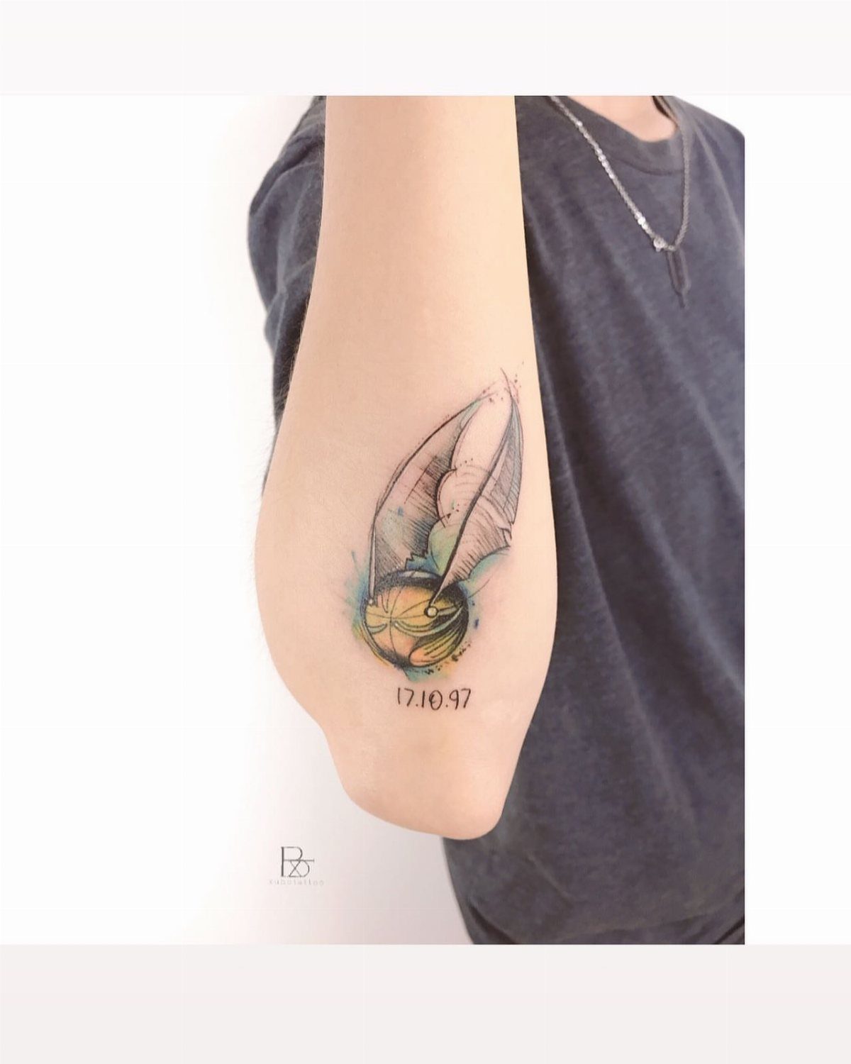
Watercolor behind a snitch reads as motion and memory both. Blue and yellow splashes stay outside the wing lines, which keeps the snitch itself readable as an object; a date below anchors it to a specific day.
Yellow watercolor on lighter skin tends toward invisible as it heals, so the blue carries most of the visual weight in practice.
Ask for a test patch of the yellow if your artist uses it for the sphere; some brands hold better than others.
5. Golden Snitch Tattoo with Stars
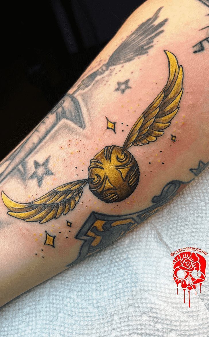
Scattered stars turn the snitch into a night flight without needing a full sky. Dotwork fills the gaps between larger points, which lets the artist build density gradually rather than committing to solid black.
This approach works well as a gap filler between existing tattoos or as a first piece you plan to expand around.
Surrounding ink settles over time; fresh dotwork beside older pieces reads brighter by contrast, something to mention if you want even tone across the whole arm later.
6. Metallic Gold Ink Snitch Tattoo
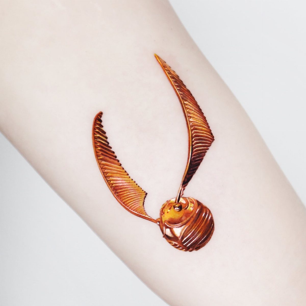
The tattoos that photograph like molten gold online are typically edited lighting or healed yellow packed dense enough to catch light, because suspended metal or glitter in carrier is not a formulation that meets tattoo safety standards.
Bronze and gold catch light like jewelry, which means the effect changes with angle and lighting; in flat indoor light, some of that dimension drops away.
Not every artist stocks true metallic mixes, and the ones that do often charge a materials fee per session.
Test a small patch inside the upper arm first: metallic pigments have higher rejection rates than standard colors, and a raised or itchy result means switching to a warm yellow with heavy white highlight instead.
7. Golden Snitch with Orbital Rings
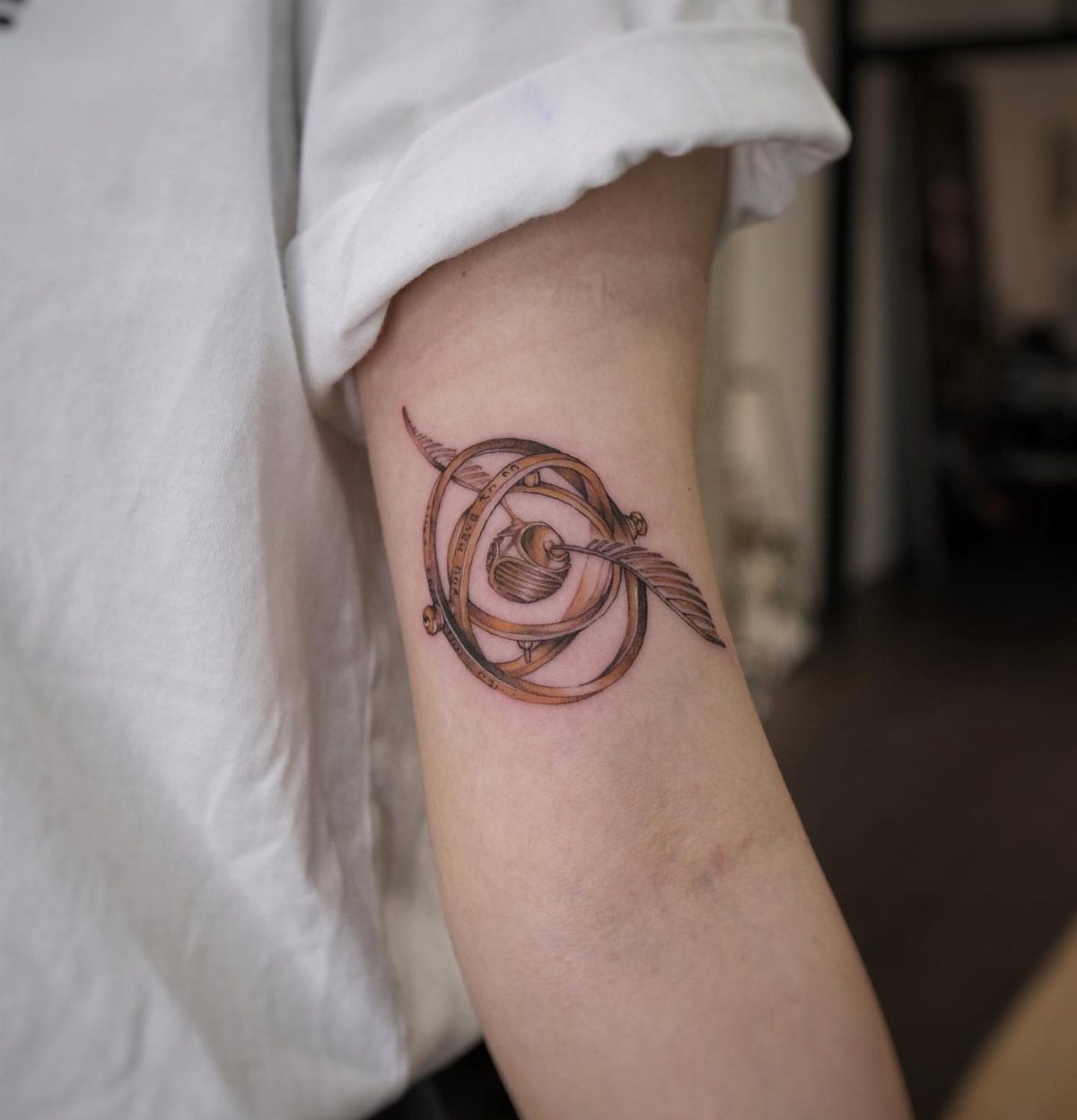
Orbital rings around the snitch borrow from armillary spheres and Time-Turners both, which matters if you are the kind of fan who notices when references stack.
The rings sit outside the wings, never through them; that clearance keeps the snitch readable at a glance and the rings readable on second look.
3 rings at most before the geometry overwhelms the central figure. A single ring might carry a date in small script, but the ring itself does the work; text inside the ring competes with the curve and often heals unevenly.
The inner arm gives the longest dimension the space it needs without wrapping into a distortion zone.
Black ink for the rings keeps the gold of the snitch singular; metallic pigment on metal reads as noise.
The gap between ring and sphere should be wide enough to stay clear after swelling subsides; your artist can gauge the spacing from how the skin behaves during the stencil phase.
Ask the artist to draw the full rotation, even the part that sits behind the wing; the overlap reads as depth only if both halves match.
Symbolism of Golden Snitch
The Golden Snitch carries its narrative weight from the exact moment it appears: the Seeker’s job ends when fingers close around enchanted winged brass moving faster than any broom can chase.
That finish-to-the-race meaning is what most people ink it for. In the story, Harry catches it by mouth in his first match, swallows it accidentally, and the same object later holds a deathly secret inside.
The tattoo does not need to spell out which layer you mean; the shape carries both.
Victory reads differently depending on whose eyes land on it. To another fan, the Snitch codes instantly as Quidditch, struggle, close call.
To someone outside the books, it scans as an ornamental sphere with wings, which is its own quieter win: you chose a private language that does not demand explanation.
Tattoo Placement Ideas
The Snitch’s small size tempts finger placement, and several of the listed designs suit it: the black ink outline, maybe a single ring. What finger skin does to fine tattoos is worth knowing before you commit.
The back of the hand replenishes its outer layer faster than most of the body, which means fading in months rather than years, and the constant flex of knuckles can push ink into blurry territory.
Artists who regularly tattoo hands often charge more for the difficulty, and some refuse the job outright on first-time clients. Ask about their policy.
For the versions with orbital rings or watercolor backgrounds, the arm’s inner length gives the geometry room to breathe.
The wrist entry in the list notes daily visibility; the broader forearm offers the same plus space for expansion if your collection grows. Consider whether your work dress code covers lower arms before you place color there.
Tattoo Style Variations
2 directions in Snitch design matter for choosing an artist: mechanical precision versus atmospheric treatment.
Stippled dotwork and fine black lines need a hand that controls spacing by eye; watercolor and metallic gold need someone who understands how those pigments heal into skin tone rather than paper.
The materials differ too: metallic pigments carry higher rejection rates, and watercolor yellows can drop out entirely on lighter skin. Your consultation should cover which brands the artist stocks, not just which colors they plan to use.
Typewriter font for text integration, orbital geometry borrowed from armillary spheres, floral curves softening mechanical shapes. These are not generic additions; they signal which references the wearer values.
An artist who draws the full ring rotation behind the wing, invisible in the final piece, is someone who respects that the design holds up to close inspection. Ask to see that sketch.