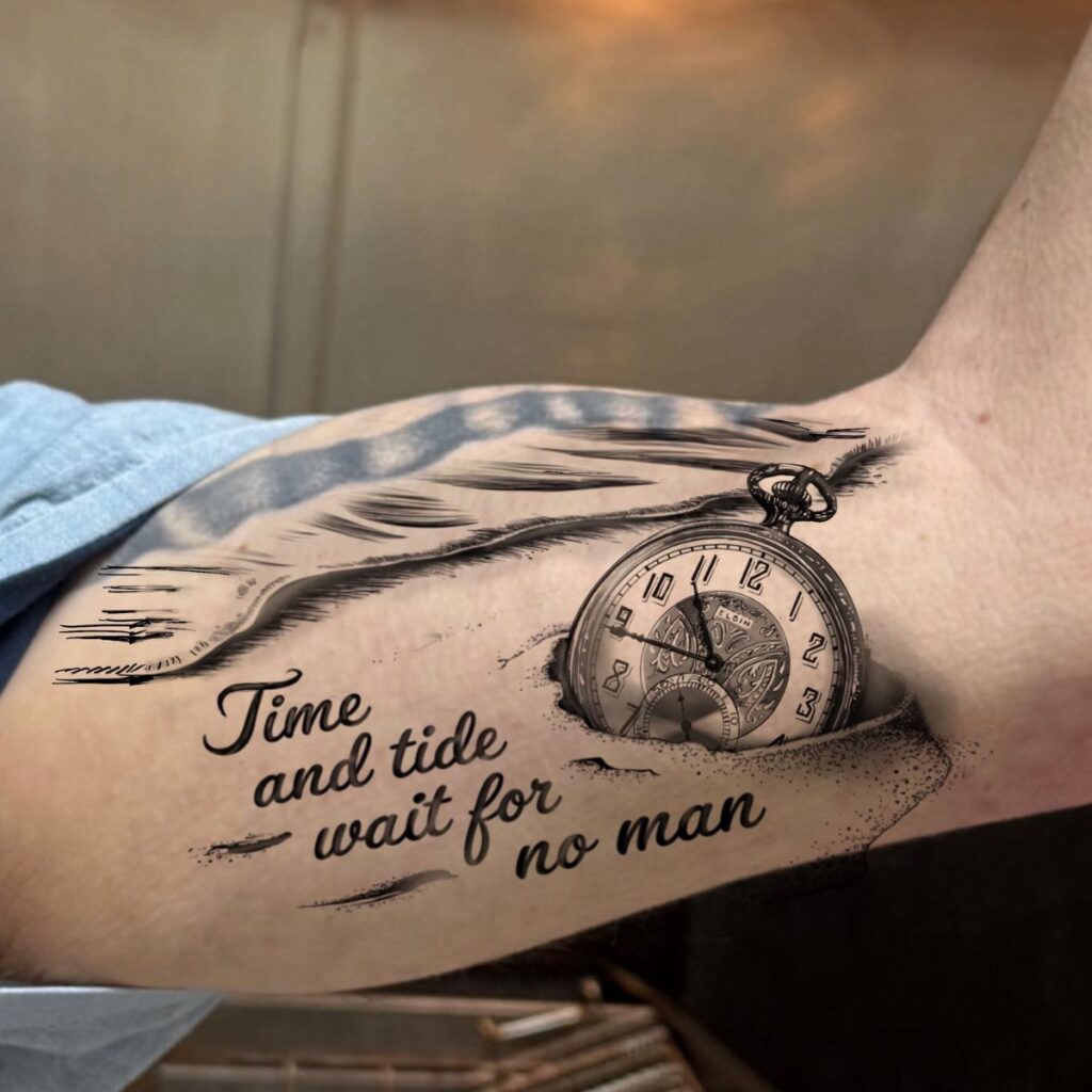
These 6 time waits for no man tattoo ideas range from a single Roman numeral clock face to a melting clock design and a banner with the phrase itself.
Your skin type and how fine lines age on it, not the design alone, should guide which one you ask your artist to draw.
The stippled texture in a pocket watch half-buried in sand needs an artist who can show healed examples of that work, not just fresh photos.
1. Roman Numeral Clock Face
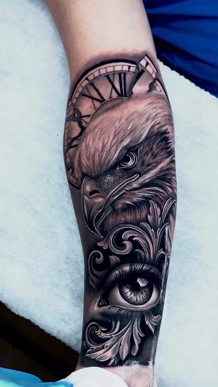
Roman numerals on a clock face read differently than Arabic numbers. They carry weight without shouting, which suits a memorial piece or a reminder you want to live with daily.
Filigree scrollwork and an eagle frame the numerals in this version.
If you are drawn to that density, ask your artist how the fine lines will age in your skin type. Thinner scrollwork blurs faster on some bodies than others.
A simpler route keeps just the clock face and numerals, letting the phrase sit in a banner below. Black and grey ink holds the detail; color would fight the stone-like quality these numerals need.
2. Pocket Watch Tattoo
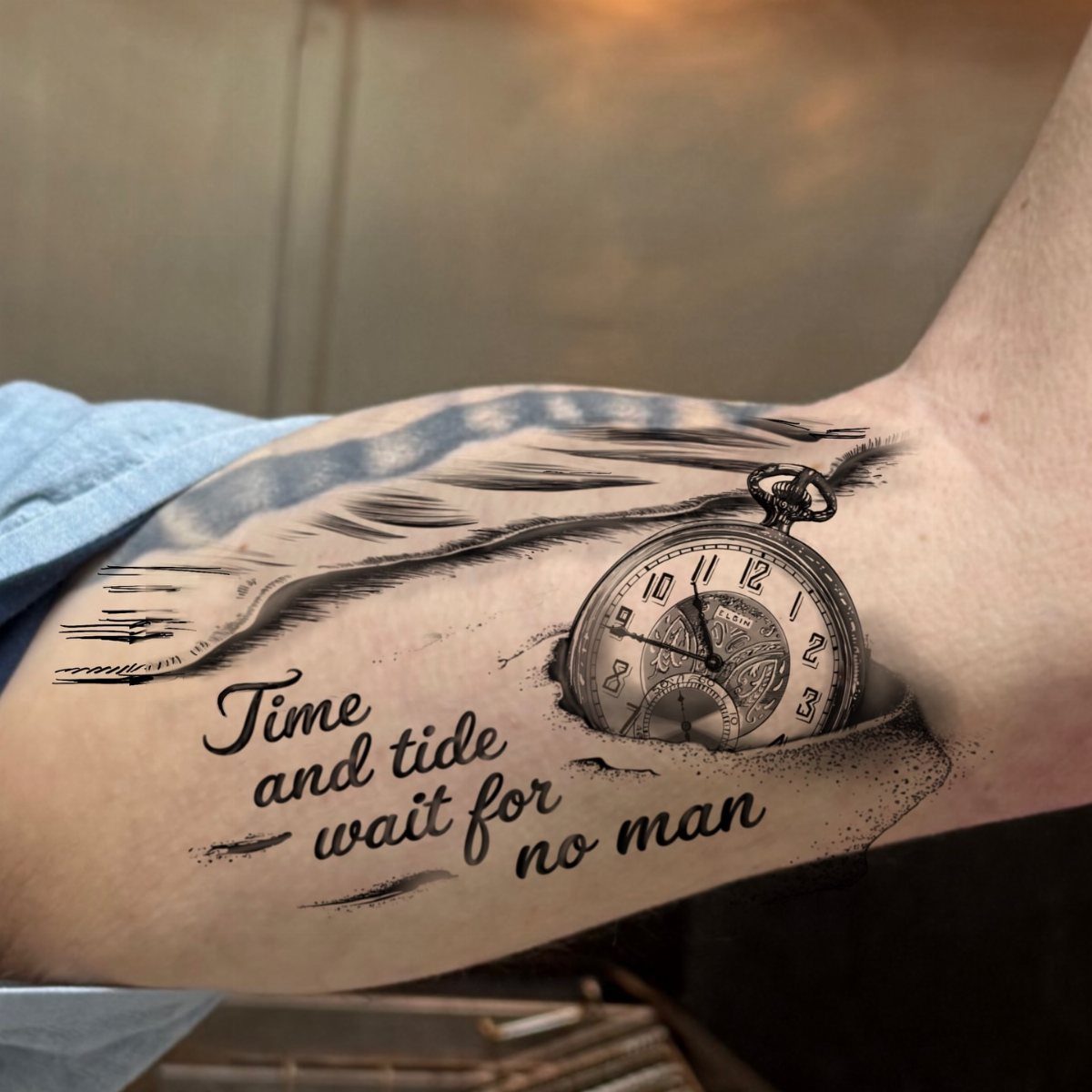
A pocket watch buried in sand gives the phrase a literal shore.
The cursive ribbon above it, "Time and tide wait for no man," turns the proverb slightly, which works if you have a connection to water or loss by it.
Black ink sketching keeps the lines soft enough that the watch does not look like a photograph pasted on. Roman numerals on the face let you mark a specific hour; most people choose the time something ended or began.
The sand texture needs an artist comfortable with stippling or whip shading. Ask to see healed examples of their texture work, not just fresh photos.
3. Hourglass Tattoo
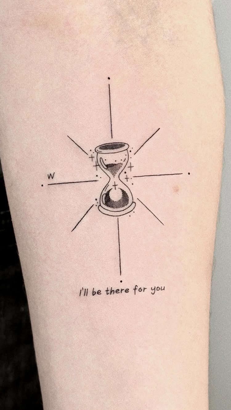
An hourglass makes time visible in motion, even in still ink. A compass radiating from the hourglass gives the piece direction, though you could keep just the glass and falling sand for a smaller design.
The compass-like lines around the base keep the warning practical, almost navigational.
That balance suits someone marking a transition rather than a loss. The sand itself can be drawn fine or bold; fine lines blur over years on high-movement areas like the inner arm.
Black ink handles the contrast best. The glass bulbs need white highlights left open in the skin, which your artist plans from the start or risks muddying later.
4. Roses and Vintage Pocket Watch Tattoo
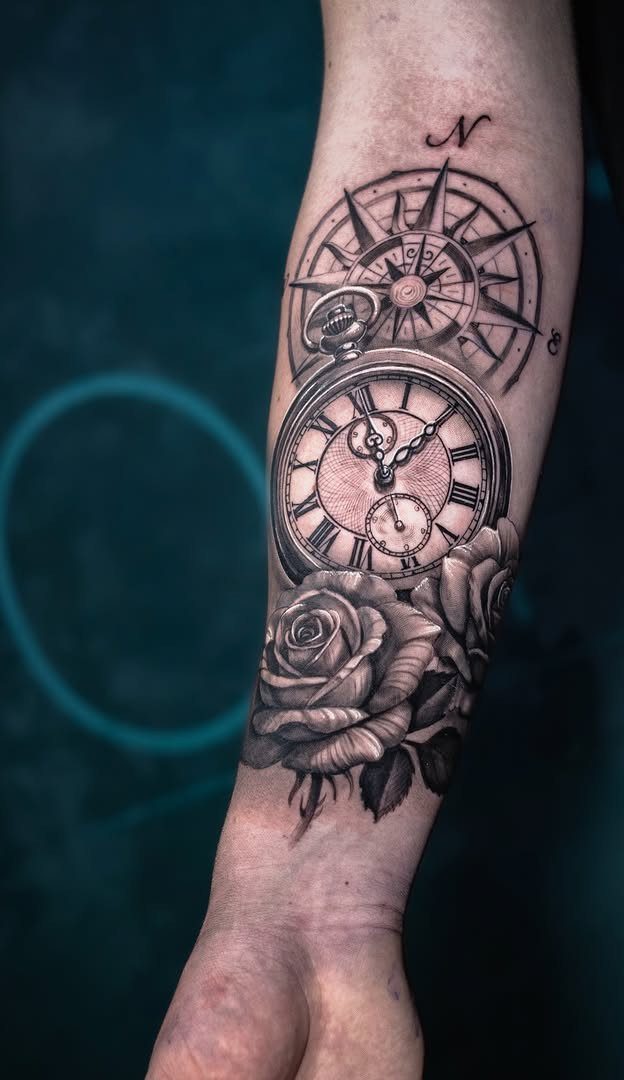
Roses frame a pocket watch with the patience of something that grows while hours pass. A compass rose ties the 3 elements into travel or searching, though the roses alone would carry a memorial reading.
Black and grey realism needs an artist who builds tone slowly.
Too dark too fast, and the petals flatten into shapes without depth. Cursive script for the phrase flows better than block letters here; the curves echo the rose edges.
The forearm gives the detail room to spread without crowding. A smaller version loses the compass or drops to a single rose.
5. Melting Clock Design
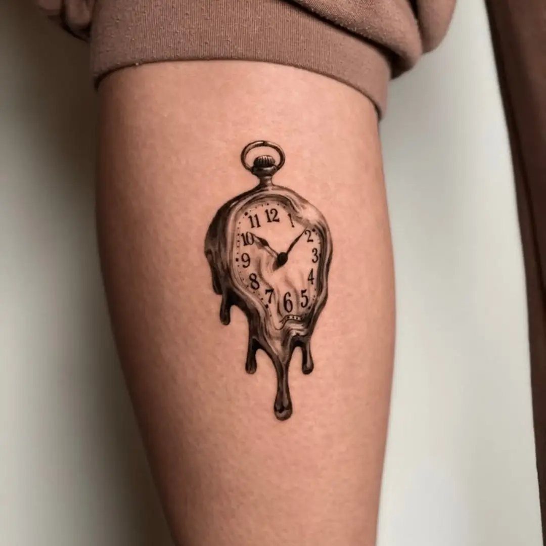
A melting clock borrows from Dalí without needing his name spoken. The surreal tilt suits someone who wants the idea of time more than its literal measure.
Numerals and casing both drip in this version, not just the clock face.
Skeletal elements can merge with the melt, though that asks for an artist who understands anatomy enough to distort it believably. Fine line work keeps the dream quality; bold shading would ground it too heavily.
Roman numerals in the melt read as fragments, which is the point. If you prefer the numbers intact, the melting needs to happen around them, not through.
6. Time Waits for No One Banner
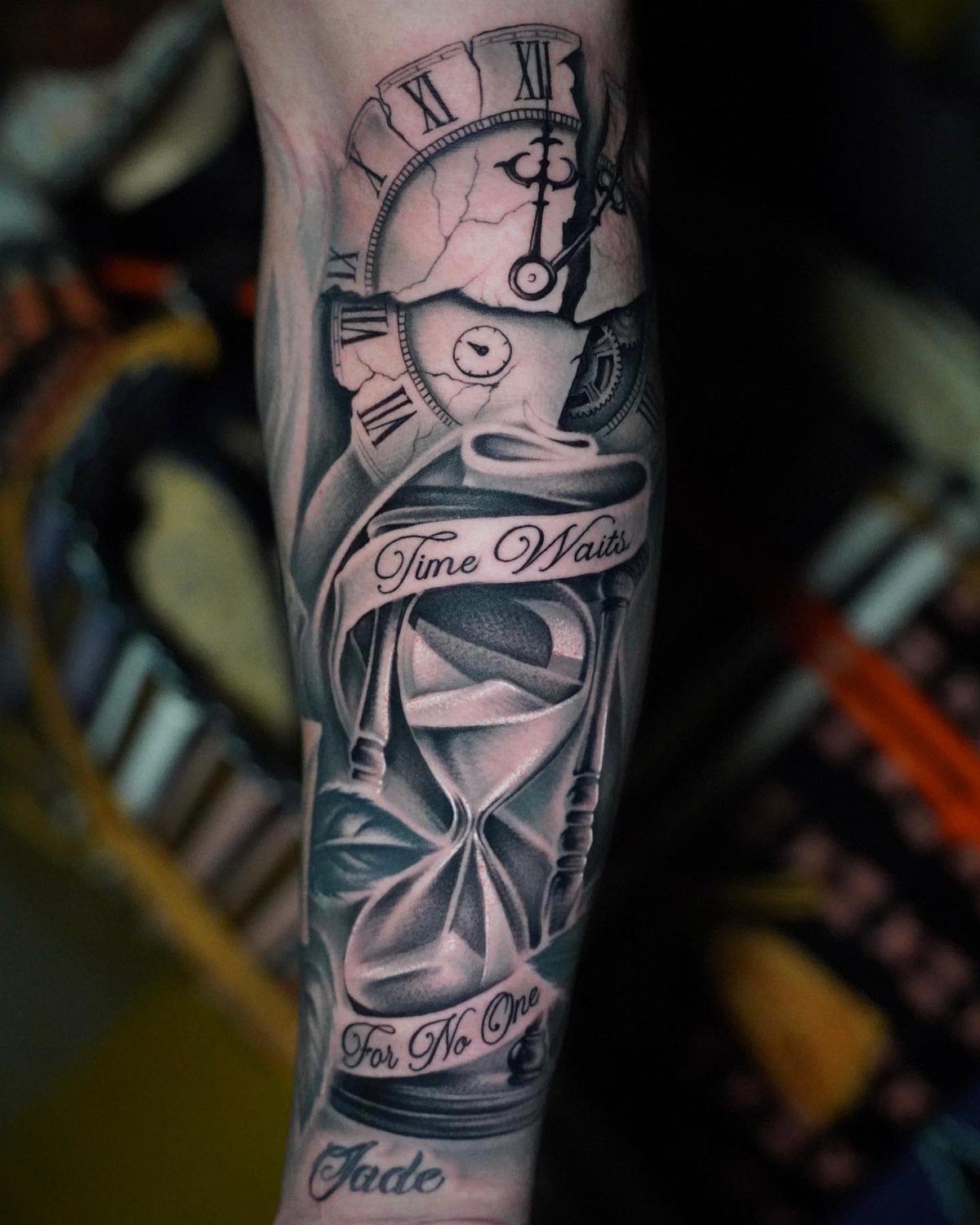
Two banners split the phrase, "Time Waits" and "For No One," which lets you place a name or date between them. A cracked pocket watch and hourglass flank the words, giving the banner objects to rest on.
Black and grey keeps the lettering legible at size. Cracks in the watch face need careful drawing; too many and the face becomes noise, too few and it looks accidental.
The hourglass beside it repeats the theme, so ask whether your piece needs both or if one timepiece carries the weight.
Smaller arms may need the banners stacked rather than spread.
Meaning of the Phrase
The line comes from the 14th century, though it circulates in English through Chaucer and later sources that adapted older proverbs.
As a tattoo, it reads differently than a generic carpe diem; the blunt wording carries a warning, not just encouragement. That tone suits memorial work, since it admits loss without softening it.
Some artists pair it with flowers or growing things to counter the harshness.
Others let the bluntness stand alone. Either choice says something about how the wearer relates to the phrase: acceptance, argument, or both at once.
Tattoo Placement Ideas
A Roman numeral clock face needs flat or only gently curved skin to keep the circle true.
The upper arm, outer forearm, or flat of a shoulder blade all work; the ribs or inner arm twist the geometry enough to distort the numerals over time.
Banners with lettering need height to stay legible.
A single-line banner can shrink small and still read; stacked phrases need more vertical space. The inner bicep verticals well for banners, though sun exposure there is low and black ink stays dark longest.
Large compositions with multiple objects, roses and a watch together, spread best on the back, thigh, or outer calf where the canvas stays broad and flat.
Design Styles
Fine line art keeps the weight light for smaller pieces or detail-heavy areas like the wrist or ankle. The trade is longevity; lines under a millimeter wide spread faster on some skin types than others, and touch-up schedules run shorter.
Traditional tattoo design uses bold outlines and limited color to hold shape for decades.