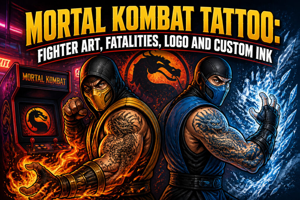
A Mortal Kombat tattoo turns arcade nostalgia into permanent skin art, but the pieces that hold up are the ones built around the same design discipline that made the sprites readable in 1992. High contrast, clean silhouettes, and a limited palette that still works when shrunk to a wrist-sized dragon logo or a forearm ninja portrait. The 35-year-old getting inked today was eight years old feeding quarters into cabinets; the 25-year-old found the franchise through the 2021 film during lockdown. Both want the same mark: when this fiction mattered to them.
Why Mortal Kombat Still Shows Up on Skin
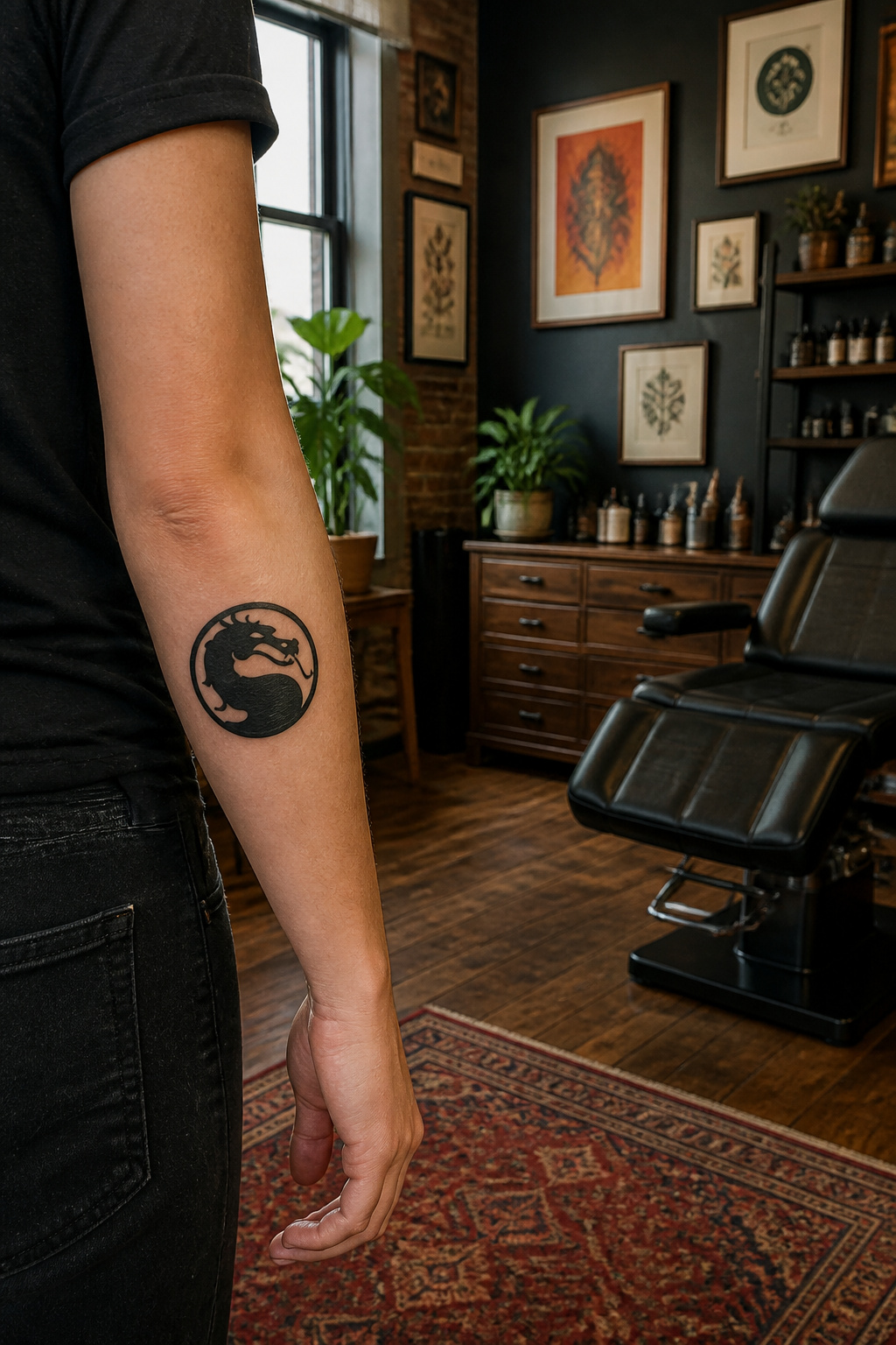
Mortal Kombat has survived long enough to become something people want to keep. Eleven main games, three movies, and a 2021 reboot that pulled in viewers who never touched an arcade cabinet. The franchise built a visual language that works on skin: the dragon logo, the color-coded ninjas, the fatalities frozen in mid-motion.
What convinced me, looking through portfolios of these pieces, is how the imagery functions as shorthand. A Scorpion spear or Sub-Zero spine-rip signals not just fandom but a specific era of your life. The 35-year-old getting inked today was eight years old in 1992, feeding quarters into a machine that ate them fast. The 25-year-old came in through the film, streaming it during lockdown, then went back to the games. Both want the same thing: to mark when this fiction mattered to them.
The crossover into tattoo culture makes sense once you see how deliberately the artists designed these characters. High contrast, readable silhouettes, a limited palette that holds up at small scale. NetherRealm Studios built icons, not just sprites. That design discipline translates directly to how a tattoo ages on a forearm or calf.
Someone choosing this subject is usually choosing nostalgia with teeth. The violence is part of the point, not a drawback. The ink says: I grew up with this, and I am not smoothing its edges for anyone.

Bold Reflective Decal: Officially Licensed Mortal Kombat Dragon Logo Reflective Decal (3.2” x 3.2”) in vibrant, highly visible, eye-catching colors

Officially licensed Mortal Kombat merch. Relive the joy of arcade style battles with this retro gamer gear. Test your might and choose your fighter!

Officially Licensed: Mortal Kombat Black ABS Plastic Auto Emblem (3.2" diameter) - custom molded with vivid colors.
Sub-Zero Tattoos
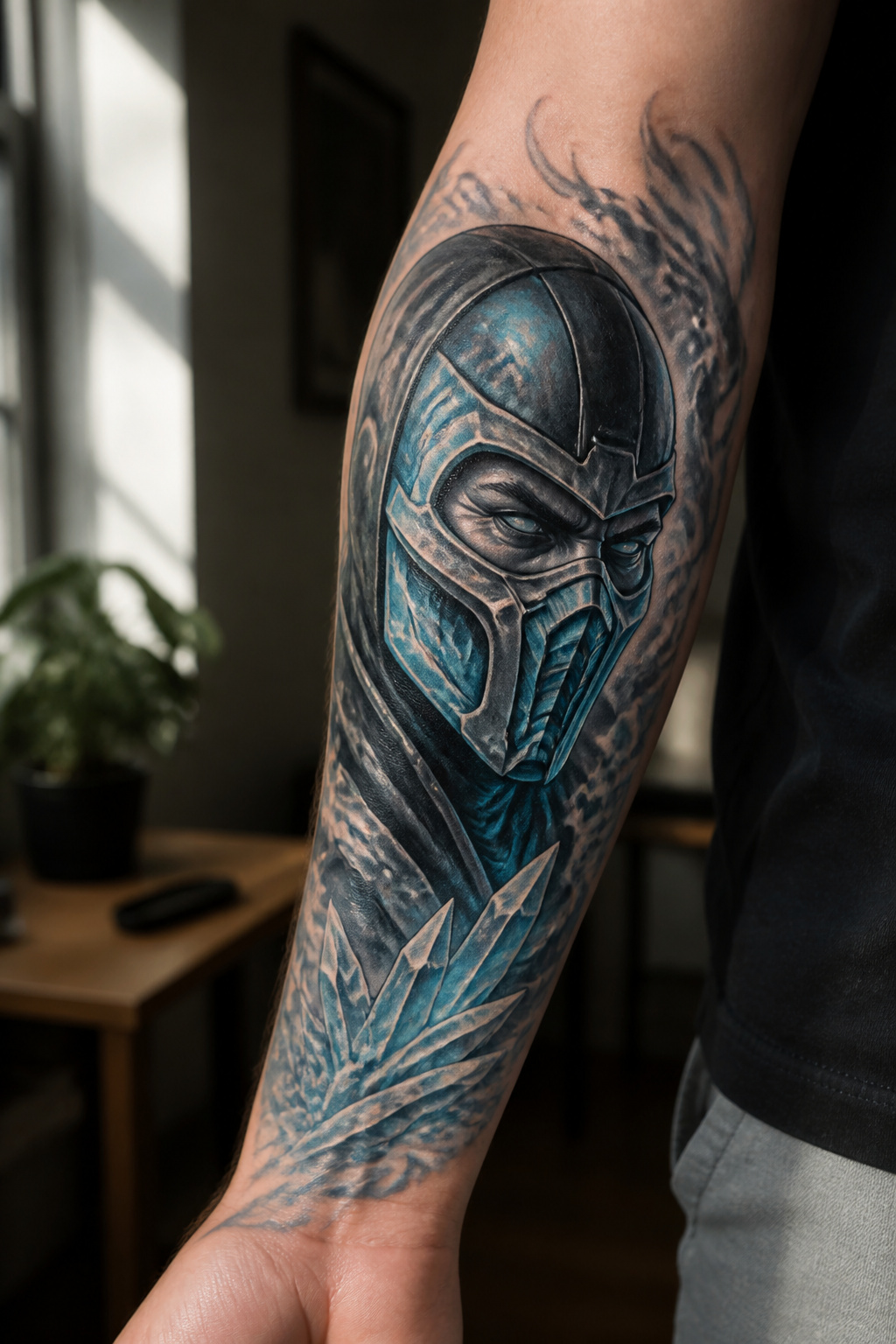
Sub-Zero dominates every Mortal Kombat tattoo discussion for a reason that has nothing to do with the storyline and everything to do with how he looks on skin. The mask gives an artist a clean focal point that reads instantly even at small sizes, which matters when you are deciding between a forearm piece and something behind the ear.
The mask variations themselves carry weight. The classic MKII version with its angular geometry suits black and grey work beautifully; the more armored modern iterations need color to separate the plates. Ice powers sound gimmicky until you see them handled well, where negative space or pale blue ink suggests frost without turning the whole limb into a cartoon. Color tends to win for the cryomancer effects, though a skilled black and grey artist can suggest cold through contrast alone.
What wearing him signals is less about being the "good" Lin Kuei and more about restraint. Scorpion runs hot, literally and compositionally; Sub-Zero demands a cooler palette and a more controlled layout. People who choose him usually want the aggression toned down just enough that the piece works in a professional setting without losing its edge. The ice motif gives them that out.

Premium Quality 1.5mm Silicone Material – Crafted from premium 1.5mm thick silicone, this tattoo skin offers a true-to-life feel with excellent durability and a smooth surface for effortless needle movement during practice.

[Tattoos Stencils Kit]: 24 sheets, each sheet including 4 patterns total 96pcs tattoo stencil. Which featuring Playing card patterns, flowers, lizards, scorpions, rabbits, spiders, butterflies, geckos, small birds, insects, hearts, stars, abstract and tribal motifs and more tattoo designs, enough quantity and different pattern for you create your style.

171 PCS Different Styles Halloween Tattoos Stencil: Our hallloween temporary tattoo stencils sheet comes with 171 different hallloween design such as pumpkin lamps, black cats, skulls, wizards, witch hats, ghoost, witch, Spider Web, Skeleton more halloween Style in 12 sheets A5 size. Perfect for couple halloween party and decoration.
Scorpion Tattoos
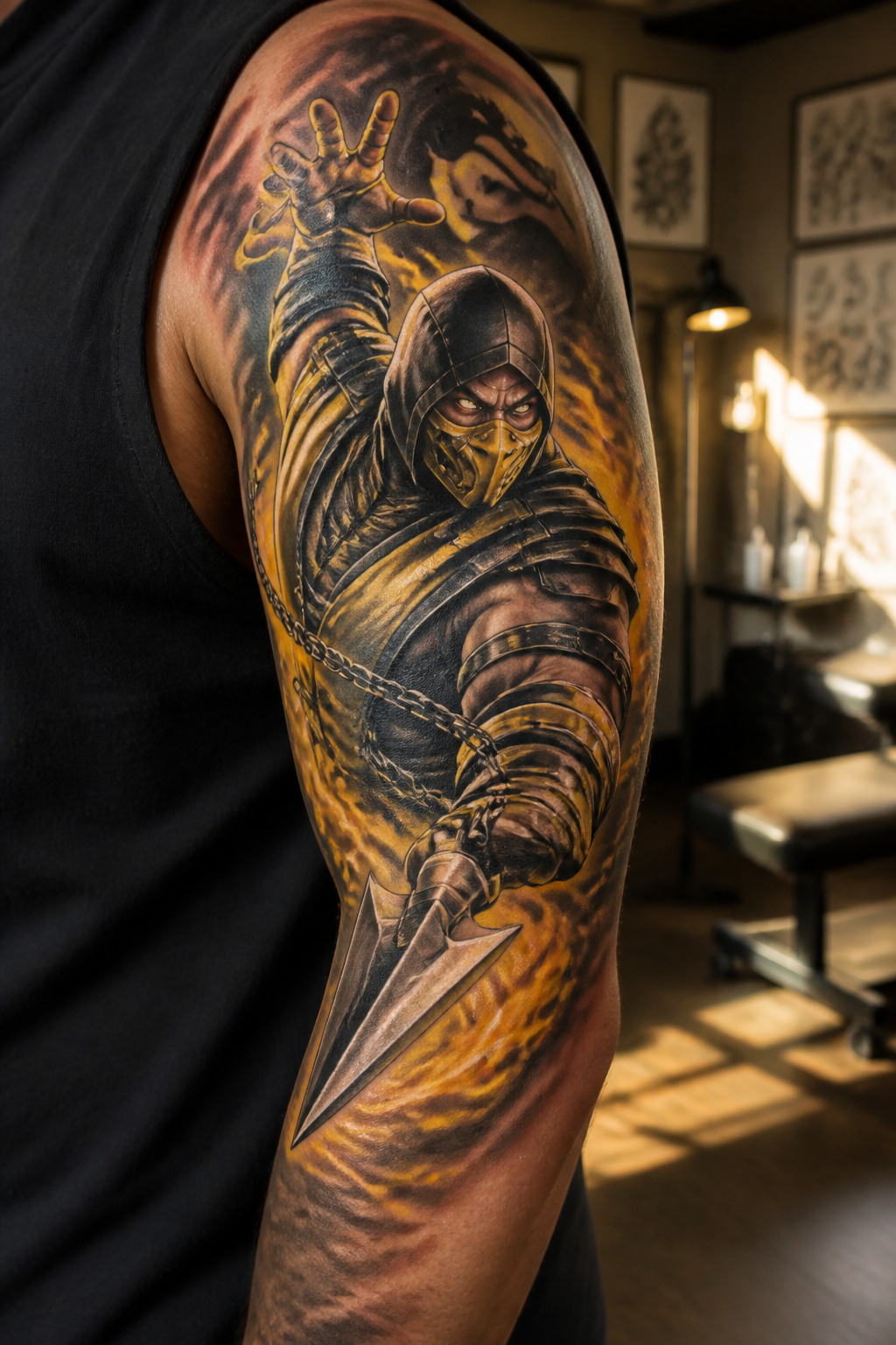
Scorpion sits at the same tier as Sub-Zero in every shop conversation about Mortal Kombat ink. The yellow and black palette reads instantly from across a room, which is exactly why it endures on skin. His spear, the kunai on a chain, works as a standalone weapon piece or as part of a larger composition where the chain wraps a limb. "Get over here!" as text usually lands best small, near the spear tip or tucked into negative space, because the full phrase at scale starts looking like a bumper sticker.
Hellfire demands care from the artist. Straight yellow and orange without deeper reds and cooling shadows turns flat on skin, and flat fire ages poorly. The mask is where generational changes matter most. The MK1–MK3 ninja hood reads classic and clean. The skull-revealed versions from later games split opinion; some artists push clients toward the earlier silhouette for longevity, since hyper-detailed bone work can muddy at smaller sizes or after sun exposure. Others lean into the skull because the contrast against the black hood gives them more to sculpt with light and shadow.
Personal preference: the spear in motion, just released, catches the character better than a static portrait. The chain gives the artist a line to move the eye through the piece, and motion suits Scorpion better than posed stillness.

[Design] - Inspiration comes from Kombat Game , Hand-drawn, realistic workmanship .

Based on Sub Zero from the video game Mortal Kombat 9

[Design] Inspired from MK Game, Designed by CrazyCatCos Team. Thirteen types are available from different versions, Jade/Sub-Zero/Kabal/Saibot/Scorpion/Smoke. Please choose the one you like.
Liu Kang, Raiden and the Rest of the Roster
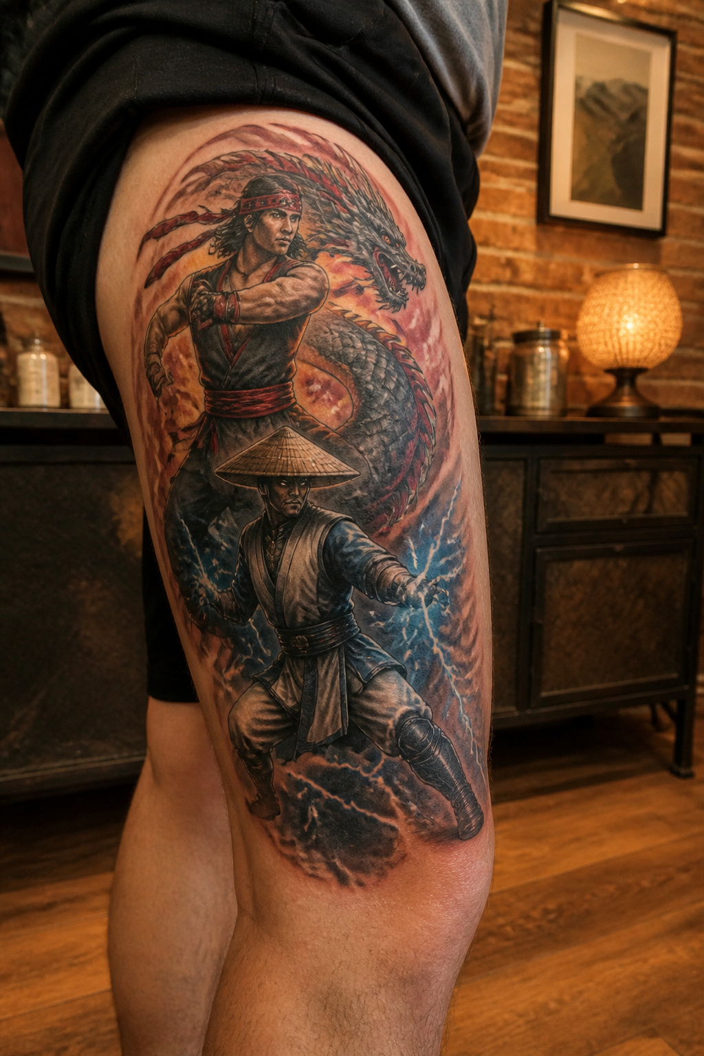
Sub-Zero and Scorpion soak up most of the attention, and the artists I talked to confirmed it: walk into almost any shop asking for a mortal kombat tattoo and those two names come up first. The gap is worth filling. Liu Kang’s dragon motif gives you something instantly readable to anyone who played the arcade cabinets, but the design still leaves room for a custom take on the dragon itself. Raiden’s straw hat and lightning work best as a larger piece where the hat’s silhouette frames the face, though the lightning bolts risk looking generic without the character’s eyes or stance to anchor them.
Johnny Cage, Mileena, and Shao Kahn sit further out on the recognition curve. Cage’s sunglasses and split-glove silhouette read clearly to fans, yet most passersby see just another action-hero portrait. Mileena’s sai and mask make for striking color work, particularly the pink and black palette, but the exposed teeth version pushes toward horror imagery that not everyone wants visible daily. Shao Kahn’s hammer and skull mask demand serious real estate to read properly; a small forearm placement loses the detail that makes him identifiable.
The choice lands you in a tension that no design solves completely. Roster characters outside the ninjas earn double-takes from dedicated fans and blank looks from everyone else. For some collectors, that selective recognition is the point. For others, it defeats the purpose of wearing a reference at all.

Incredibly detailed 7” scale figure based off the Mortal Kombat Franchise

Cute Ninja Tattoo:Packaged 20 large sheets (7.5x5 inches) with 460 pieces ninja temporary tattoos stickers, featuring dynamic warrior designs like shurikens, masks, and martial arts symbols. Perfect for themed parties, cosplay events, or festival body art. Each sticker measures ~1.3 inches for versatile placement on arms, hands, or accessories.

Fatality Tattoos
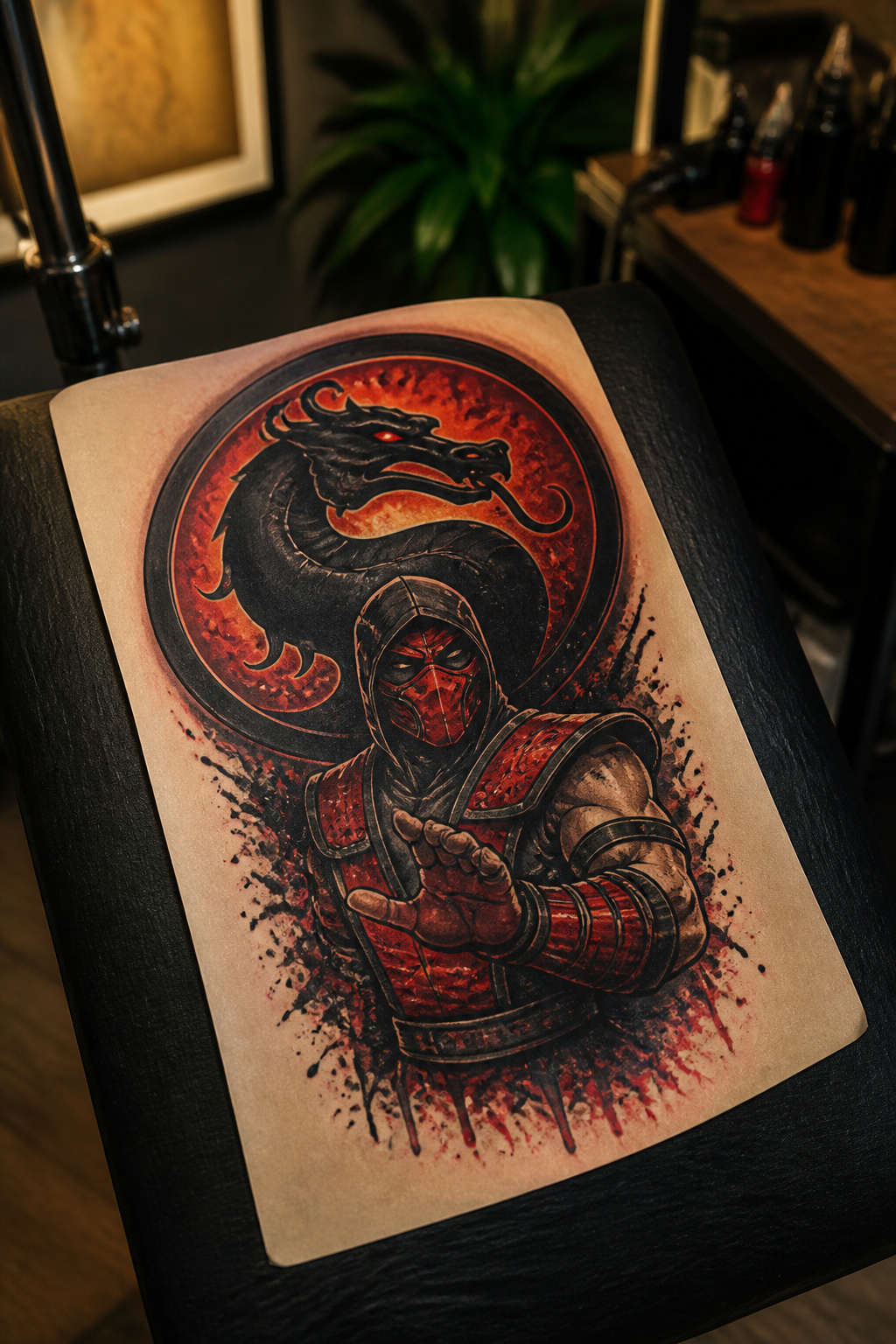
A fatality tattoo carries the same problem the move had in the arcade: the violence that made Mortal Kombat famous in 1992 is also what gets it flagged by shop policies, gym dress codes, and family dinner questions. The spine rip, the head uppercut with spinal cord trailing, the pixel-sprite decapitations from the early cabinets versus the cinematic gore of the 2021 film, each lands differently on skin than it did on a screen you walked away from.
Artists who take these on face a placement puzzle. The back or thigh gives enough flat real estate for the full composition, but that is also where the detail reads most clearly as anatomical horror. A forearm or calf placement shrinks the scene and softens it into abstraction, which some collectors prefer and others feel defeats the point. Color choices matter too. The arcade-era versions lean into limited palettes, blocky reds and blacks that read as retro reference rather than medical textbook. Modern cinematic rendering demands more nuance, more shading, more time in the chair, and more conversation beforehand about how this ages when the shock value fades.
The Sub-Zero spine rip dominates the requests, which means artists who want to stand out in the portfolio sometimes pitch the lesser-seen fatalities instead. The pit spike from the original stage, the head uppercut, the early pixel versions rendered deliberately low-res for nostalgia. Each solves the placement problem differently. The pixel art reads as game culture at a distance; the photoreal gore does not.

The vinyl used is UV and water resistant, and will last for many years without fading, peeling, or cracking. The Highest Quality Engineering Grade Vinyl With Semi Gloss Finish.

Officially Licensed Mortal Kombat Design: Features three bold designs including the classic dragon logo, iconic Mortal Kombat title banner, and legendary “Finish Him!” (each 3-5" wide)

Shipped with instructions,Stays in and outdoors for more than 6 years and is waterproof,Made in usa Handmade Decal.
The Dragon Logo
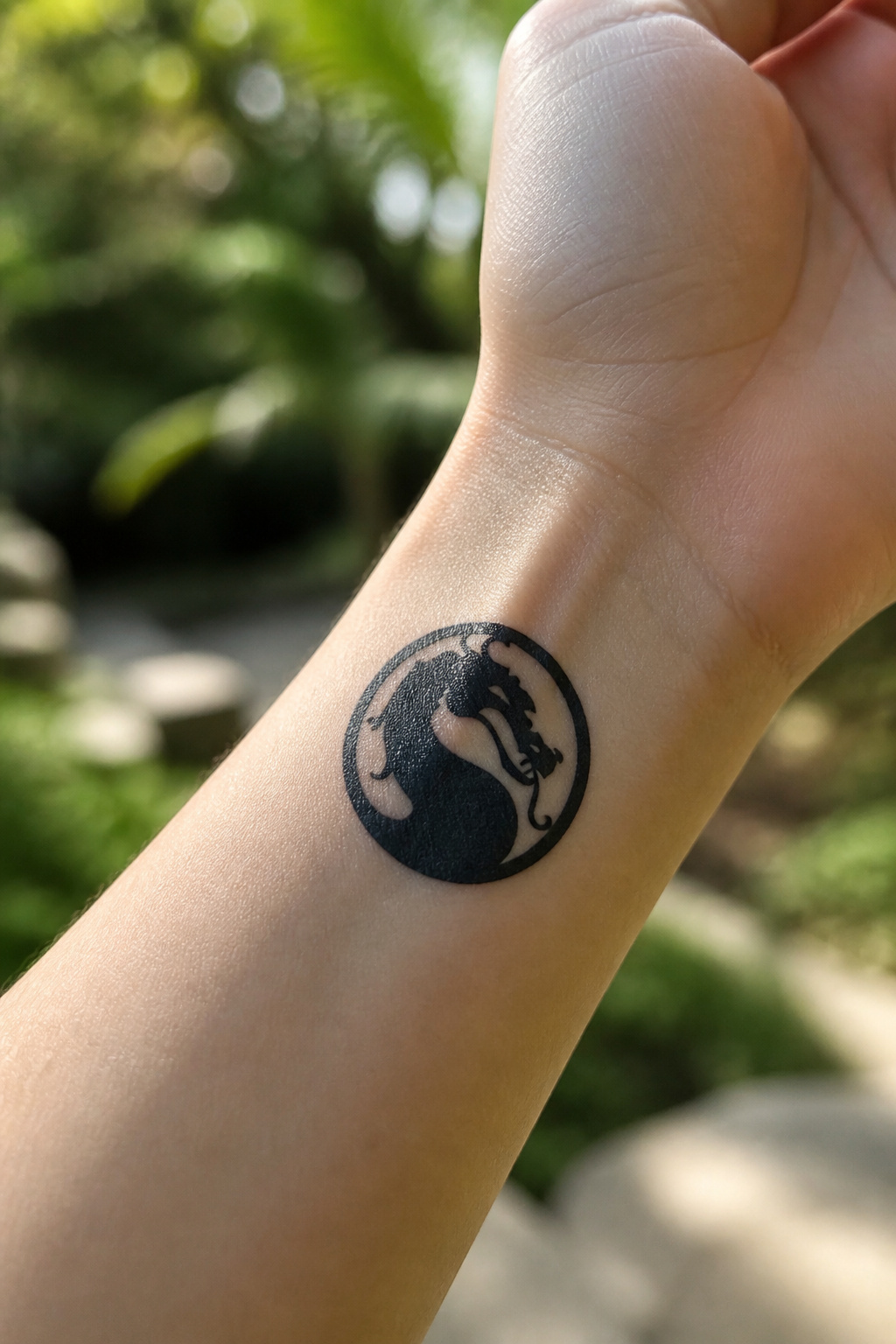
The circular dragon mark that appeared on every arcade cabinet and box since 1992 has become the most common Mortal Kombat tattoo for a reason that matters in a chair: it reads cleanly at sizes smaller than a credit card. The silhouette stays intact whether you place it on a wrist, behind an ear, or high on the shoulder blade where a complex fighter portrait would blur into noise.
Nostalgia works differently with this piece than with character ink. Someone sees the dragon and the memory arrives intact, no explanation needed about which installment you played or which fatality you memorized. The logo did the same job on a crowded arcade floor, identifying the cabinet from across the room without demanding you already knew the roster.
Versions shift slightly across game eras. The original arcade art carries a rougher line weight, almost stamped, while later iterations smoothed the curve of the tail and tightened the circle. Either holds up as tattoo material; the older version ages into a slightly distressed look that some artists intentionally reinforce, and the cleaner modern line suits single-needle work. I have seen both finished, and the choice usually tracks to whether the person walked into an arcade in 1993 or met the franchise through the 2011 reboot.

【 575+ Fun Assorted Tattoo Stencils 】-The ChurlChurl tattoo stencils collection includes 575 high quality stencils with multiple themes. enjoy cute trendy tattoo stencil designs like butterflies, words, flowers, symbols, totem, Egypt style patterns and more.
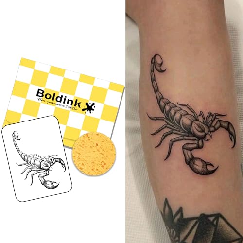
【Realistic Semi-Permanent Look】Boldink temporary tattoos are designed to look more like real tattoos than traditional temporary tattoo stickers. They are waterproof, smudge-resistant, and non-shiny for a natural-looking finish. The tattoo will appear silver at first and gradually darken into a rich, realistic color within 48 hours. For best results, avoid contact with bare skin, especially the face, and cover the tattoo with clothing while sleeping to prevent transfer.

32 Bold Animal Tribal Patterns – 4 large A4 sheets featuring Dragons, Wolves, Scorpions, Lions, and more, for a strong, edgy look with professional-quality stencils.
Custom Designs That Blend the Game With Something Else
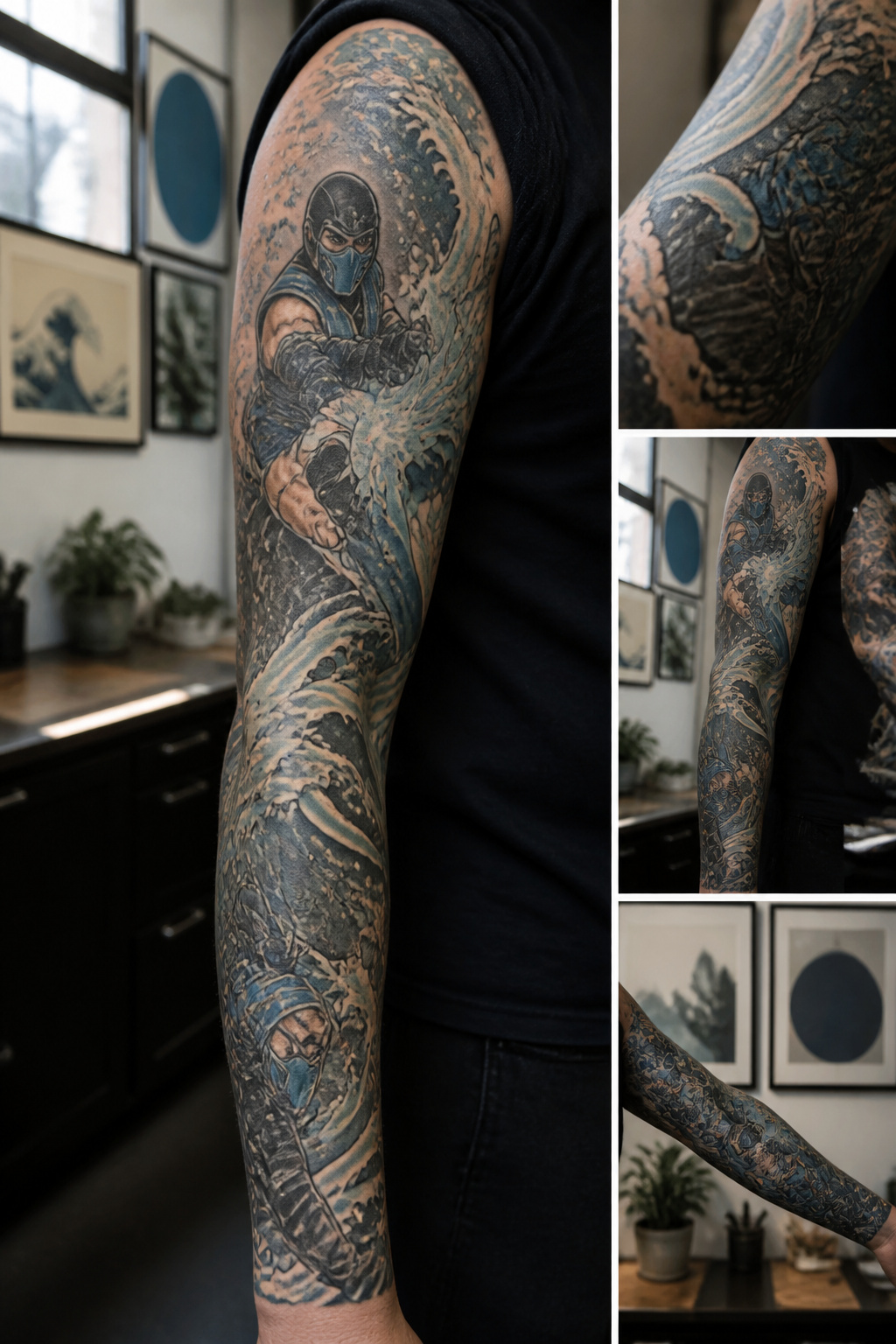
The rarest Mortal Kombat tattoos pull the game into another visual world entirely. A Sub-Zero sleeve rendered as an ukiyo-e woodblock print, all flat color blocks and stylized waves, reads as Japanese art first and fan ink second. Finding an artist who already studies that style matters more than finding one who knows the character. I have seen pieces where Chun-Li from Street Fighter faces off against Sonya Blade in a single composition, the two franchises fused into one fighting stance, and the best ones work because the artist treated both figures as real bodies in motion rather than logos to stack.
Pin-up and horror reimaginings run the same risk. A 1940s bombshell Kitana can turn costume-party cute fast if the artist leans on the reference photo instead of rebuilding the pose. Horror versions fare better when the artist knows practical effects: an Ermac rendered with Tom Savini-style exposed musculature lands harder than generic zombie rot. These pieces take longer to design and longer to sit for. The artists who want this challenge usually advertise it in their portfolio, not in their shop bio. Look for someone who has already mashed up two unrelated visual languages on skin, then ask if Mortal Kombat interests them.

Traditional, Neo-Traditional and Watercolor Styles
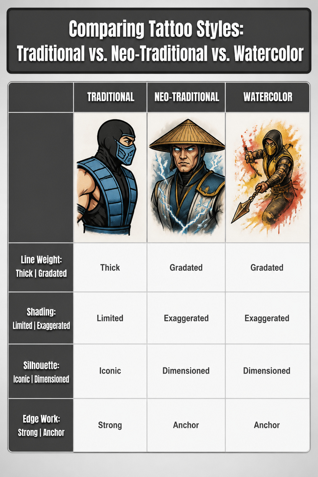
Traditional bold lines carry the same weight as the arcade cabinet art that first sold Mortal Kombat in 1992. The thick black outlines and limited shading match the pixelated sprites and hand-drawn character select screens players remember from that era. A Sub-Zero or Scorpion rendered this way reads instantly as the game, not a reinterpretation.
Neo-traditional work adds dimension those originals never had. Gradated color and exaggerated proportions let a character fill more skin while keeping the recognizable silhouette. The style suits Raiden’s hat or Liu Kang’s dragon, where the extra depth turns a flat icon into something that seems to float off the muscle.
Watercolor, used carefully, can suggest ice, fire, or blood without hard edges. The trick is anchoring the wash with enough line work that the subject still registers as Mortal Kombat. A Scorpion spear trailing orange and yellow pigment works; a fully abstract wash of red does not. The style has to serve the image, not replace it.

Ninja-Themed Designs: Features bold red and black ninja faces, symbols, and crossed swords that instantly excite kids and perfectly match ninja, martial arts, or action-themed parties and events.


Figure is translucent, inspired by Reptile's in-game "invisible" ability
What Your Character Choice Says About You
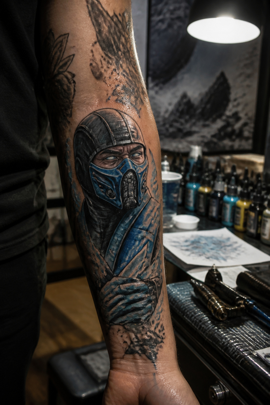
Most people ink the fighter they mained, not the one they think they look like. That distinction matters. A Sub-Zero tattoo usually reads as cool control, the kind of person who blocks first and asks questions later, but the wearer probably just spent three hundred hours freezing opponents in corner traps. The meaning attaches after the fact.
Scorpion carries a similar story. The "get over here" spear and burning skull suggest vengeful drive, and plenty of fans lean into that reading. In the chair, though, the choice more often tracks to childhood muscle memory of a yellow sprite that finally clicked.
The lesser picks, your Reptiles and your Barakas, land differently. They signal deliberate contrarianism or deeper franchise knowledge, sometimes both. Someone with Mileena ink likely remembers her first appearance in MKII and wants you to know they do not need the poster boys to carry their nostalgia.
What convinced me, looking through portfolio after portfolio, is how rarely the stated symbolism matches the actual reason. The character choice is personal expression, but the expression is "I played this one," not "I am this one." The tattoo becomes the story you tell about yourself, retrofitted onto hours spent mashing buttons in a basement.

6 Japanese Style Design Sheets – Traditional dragon, koi fish, phoenix, and samurai artwork gives you an authentic full-arm sleeve look in one easy application.

🐳[8 Sheets Black Dragon Tattoos in One Package!] - Original Brand of TASROI 3D imperial loong Tribal Dragon Temporary Tattoos For Women Men and Adults. Tattoos Temporary Contains 8 Large Sheets Water Transfer Animals Dragon Floral Flower Rose Moon Serpent Totem Armband Etc.

🔥 SPARKLY DRAGON TATTOOS FOR EPIC ADVENTURES : This set includes 108 glitter temporary tattoos featuring powerful dragons, fire-breathing beasts, dragon eggs, shields, swords, castles, and fantasy-inspired designs. Eye-catching glitter details make every dragon shine, adding an exciting and legendary touch that boys will love.
Where Fans Show Their Ink
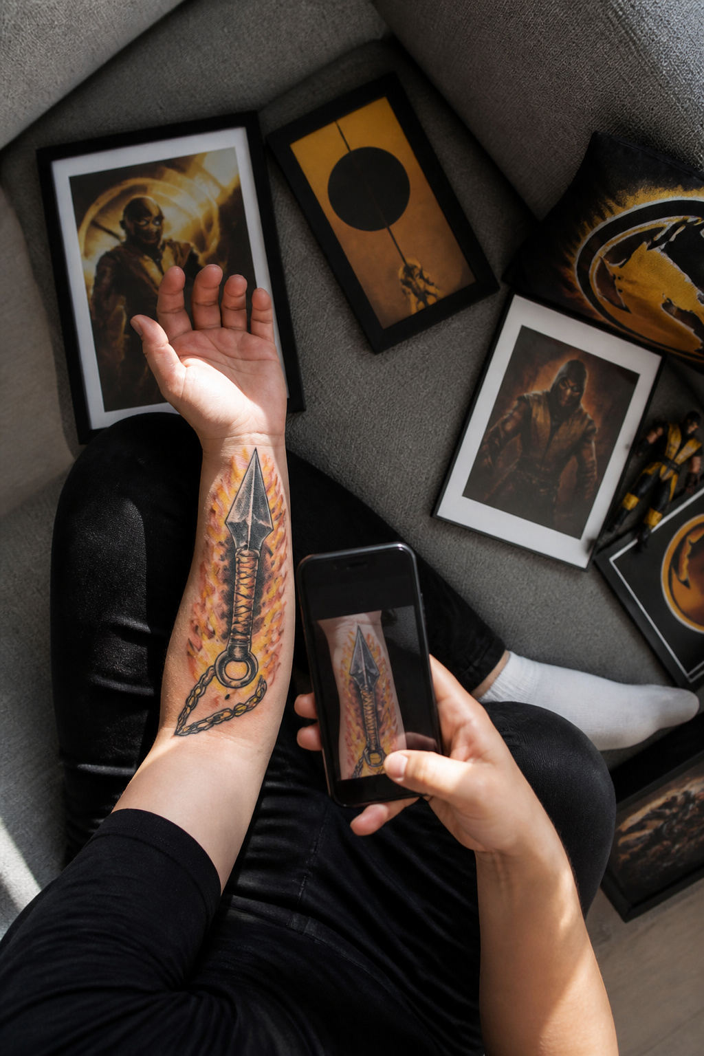
Instagram and Reddit are where most Mortal Kombat tattoo collectors actually hang out, not because the platforms are special but because the formats match what people want. Instagram rewards a clean photo taken right after healing, and the algorithm surfaces work by artist name or game hashtag well enough that someone searching #MortalKombatTattoo can fall into a feed of Sub-Zero sleeves for an hour. Reddit works differently. On r/MortalKombat and the tattoo-specific subreddits, the same image gets conversation: critique of line weight, arguments about whether a portrait reads as the right actor, the backstory of why someone picked Noob Saibot when nobody else does.
What makes a post worth engaging with, from what I have watched scroll by, is specificity. A straight logo trace gets an upvote and silence. A piece that reimagines Scorpion’s spear wrapping through an existing Japanese sleeve, with the artist named and the shop tagged, draws twenty comments asking about session length and how the yellow was mixed. The detail people return for is the same detail that makes a good tattoo: placement choice, how the design moves with the body, the healed result six months later.
The unspoken rule that keeps these spaces functional is do not copy another person’s custom piece. A flash sheet logo is fair game; a portrait of someone’s grandmother rendered as a fighter is not. Collectors will call it out publicly, and artists remember. The etiquette, enforced by shame rather than moderation, is: use the post as reference for style or scale, then work with your own artist to build something that belongs to your skin.

10 Extra-Large Tribal Animal Designs – 5 jumbo A4 sheets featuring Tiger, Dragon, Wolf, Eagle, and Scorpion patterns, perfectly sized for arms, back, chest, or thigh.

▶ Henna Tattoo Kit: 16 sheets tattoo stencils. airbrush tattoo stencils suitable for tattoo lovers. Experience the effects of tattooing without the pain of tattooing.
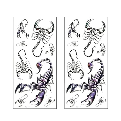
DESIGN FEATURES: High-quality 3D scorpion temporary tattoo stickers with realistic and detailed artwork for an authentic look
Frequently Asked Questions
What are some popular Mortal Kombat tattoo ideas?
Sub-Zero and Scorpion dominate requests because their high-contrast designs read clearly on skin at almost any size. The circular dragon logo also ranks high since it stays recognizable smaller than a credit card. Fatality scenes, especially the Sub-Zero spine rip, attract collectors who want the franchise’s signature violence preserved in ink. Lesser-picked fighters like Liu Kang, Raiden, Mileena, or Baraka signal deeper franchise knowledge but draw blank looks from casual viewers.
What styles are best for Mortal Kombat tattoos?
Traditional bold lines match the arcade-era pixel art and character select screens players remember from 1992. Neo-traditional adds gradated color and exaggerated depth that suits Raiden’s hat or Liu Kang’s dragon motif. Watercolor can suggest ice, fire, or blood effects, though it needs enough line work anchoring it so the subject still registers as Mortal Kombat rather than abstract color wash. Black and grey suits Sub-Zero’s classic mask geometry; Scorpion’s yellow and black palette demands deeper reds and cooling shadows in the fire to avoid aging flat.
How can I find a good tattoo artist for Mortal Kombat designs?
For standard character portraits, check portfolios for video game or pop-culture work with clean line weight and readable silhouettes at small scale. For custom mashups, like a Sub-Zero sleeve rendered as ukiyo-e woodblock print or a horror-style Ermac, finding an artist who already studies that second visual language matters more than finding one who knows the character. The best custom work usually appears deep in an artist’s portfolio, not their shop bio; look for someone who has already fused two unrelated visual languages on skin, then ask if Mortal Kombat interests them.