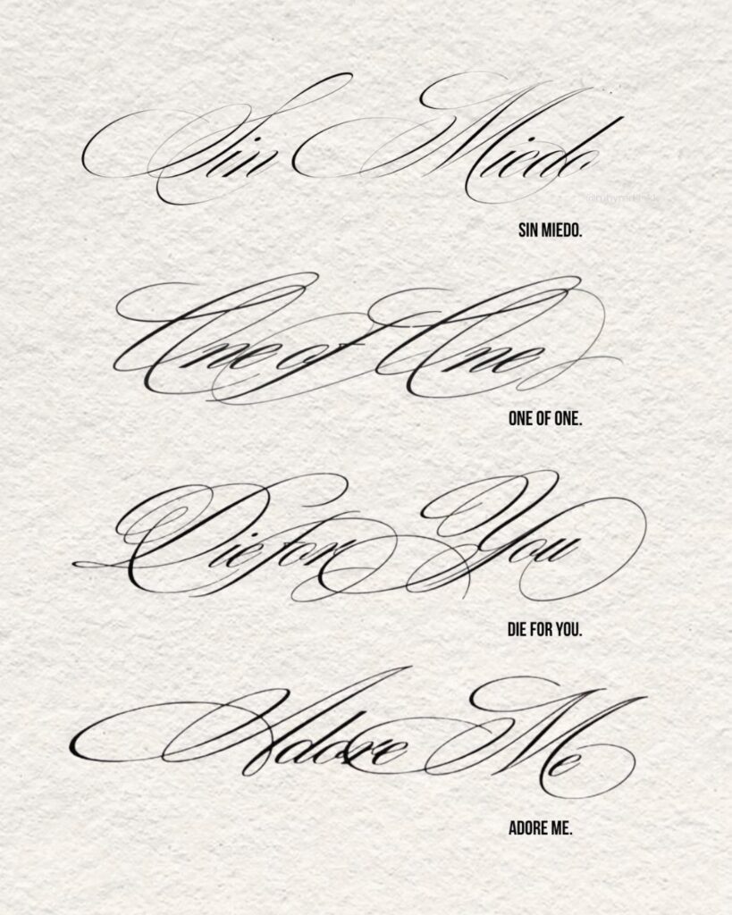
These eleven cursive tattoo stencils range from Brignola’s elegant calligraphy to flowing multi-line quotes, and the right one depends on where your skin moves most.
A wrist bends differently than a thigh, and that motion decides whether flourishes stay legible or smudge into gray.
Brignola Elegant Calligraphy alone offers dozens of alternate glyphs, but those flourishes only matter if your artist can preview which ones survive your chosen placement.
1. Brignola Elegant Calligraphy
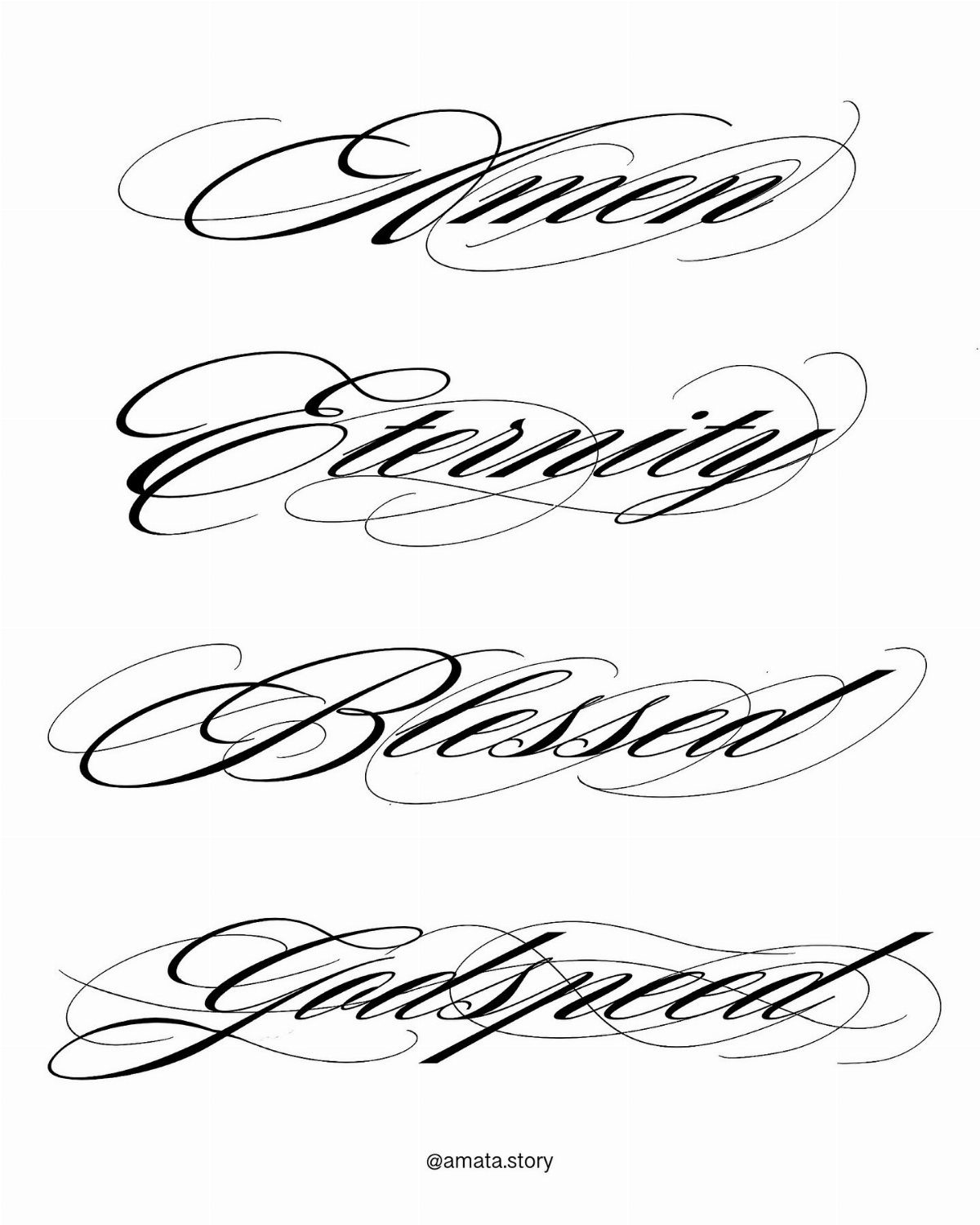
Brignola carries its ornament like it means it, not like an afterthought.
The font packs more than 1,000 glyphs, which means your artist can swap alternate flourishes and ligatures so your "Amen" or "Godspeed" does not match the next person’s down to the loop.
That density of detail demands room. At small sizes the thins risk shaving down to nothing over time, so I would ask for this at least palm-sized or larger.
The numbers keep the same stroke drama as the letters, so dates or coordinates hold up alongside words.
If the phrase matters more than the decoration stays crisp, lighter calligraphy might age cleaner.
2. Cursive Fonts for Tattoos on Wrists
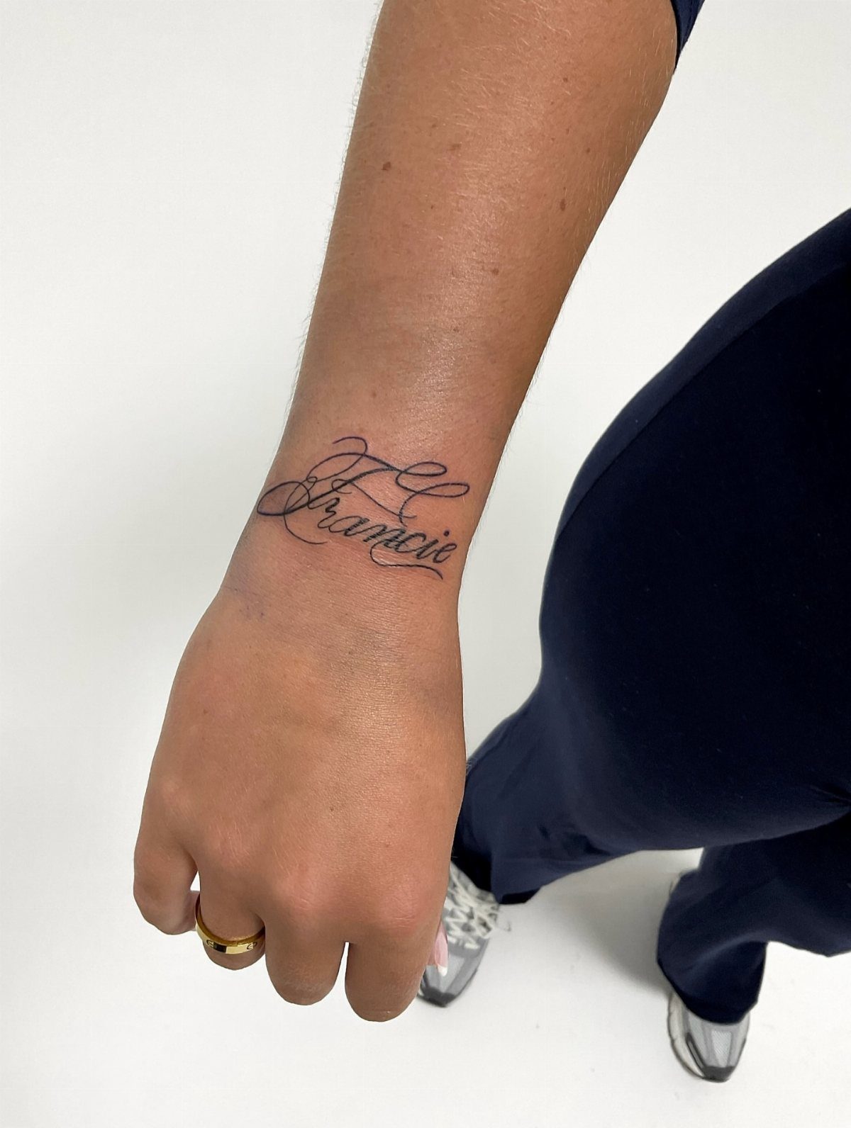
A wrist gives only so much height before bone and movement start fighting the design. Cursive wins here because the joined flow bends with the arm instead of boxing against it.
Single-word placements work best with enough flourish to feel personal but enough restraint that the wrist’s daily bend won’t turn loops into smudges.
Romantic Cursive and Flowing Script families read most clearly at this scale; heavier Ornate Script wants more space than a wrist reliably offers.
I would check my own wrist motion before finalizing length. A name that looks centered at rest can skew when the hand bends back.
3. Custom Cursive Tattoo Stencil
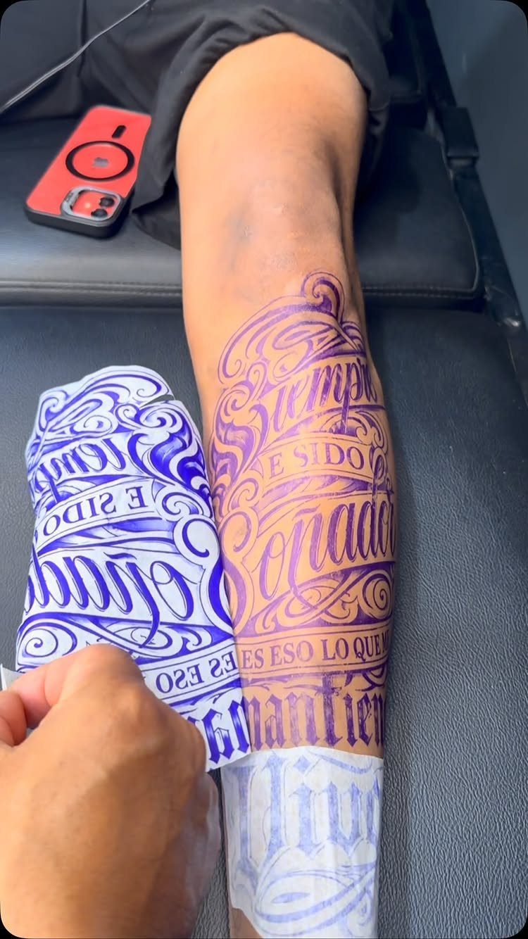
The purpletransfer on this leg reads clean because someone redraw it for skin, not just printed a font file.
Most digital scripts were built for screens or wedding invites; their tight joins and hairline upstrokes blur together once ink settles and sun hits.
An artist working custom will ask placement questions a font website does not. Sternum skin moves different from outer forearm, needs different line flow.
The stencil in this entry’s photo is being applied to a shin, so the letters would need slight opening at the connections to stay distinct once the ink settles and the skin ages.
Ask your artist about stroke weight for your chosen size before the needle touches. Complimentary consultations exist for exactly this.
4. Flowing Style of Cursive Lettering
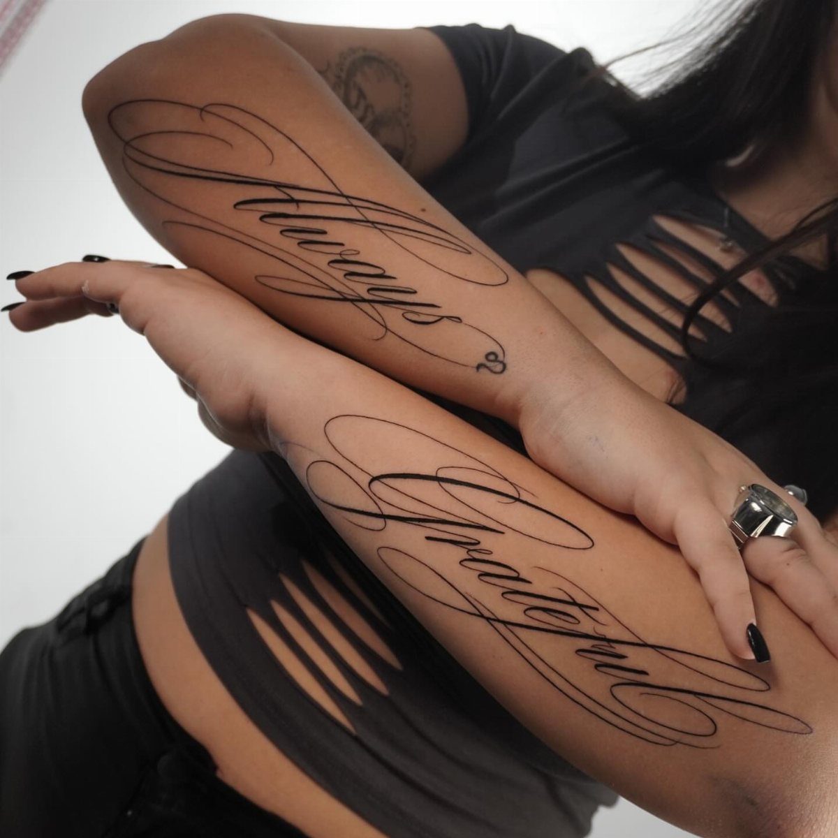
"Always" and "Grateful" across 2 forearms turn the body into a matched set, the kind of pairing that only works when both pieces share the same rhythm.
The flourishes here stay long but light, enough movement to feel hand-drawn without tangling into unreadable knots.
This style suits pairs or sequences.
A single word gains narrative weight when the lettering itself flows; two related words across two arms make the physical gesture part of the meaning. The fine-line execution keeps the black from overpowering smaller frames.
I would bring my own arm span to the consultation. What flows across a broad forearm can crowd on a narrower one, and these loops need uninterrupted skin to travel.
5. Calligraphy Word Flash Sheet
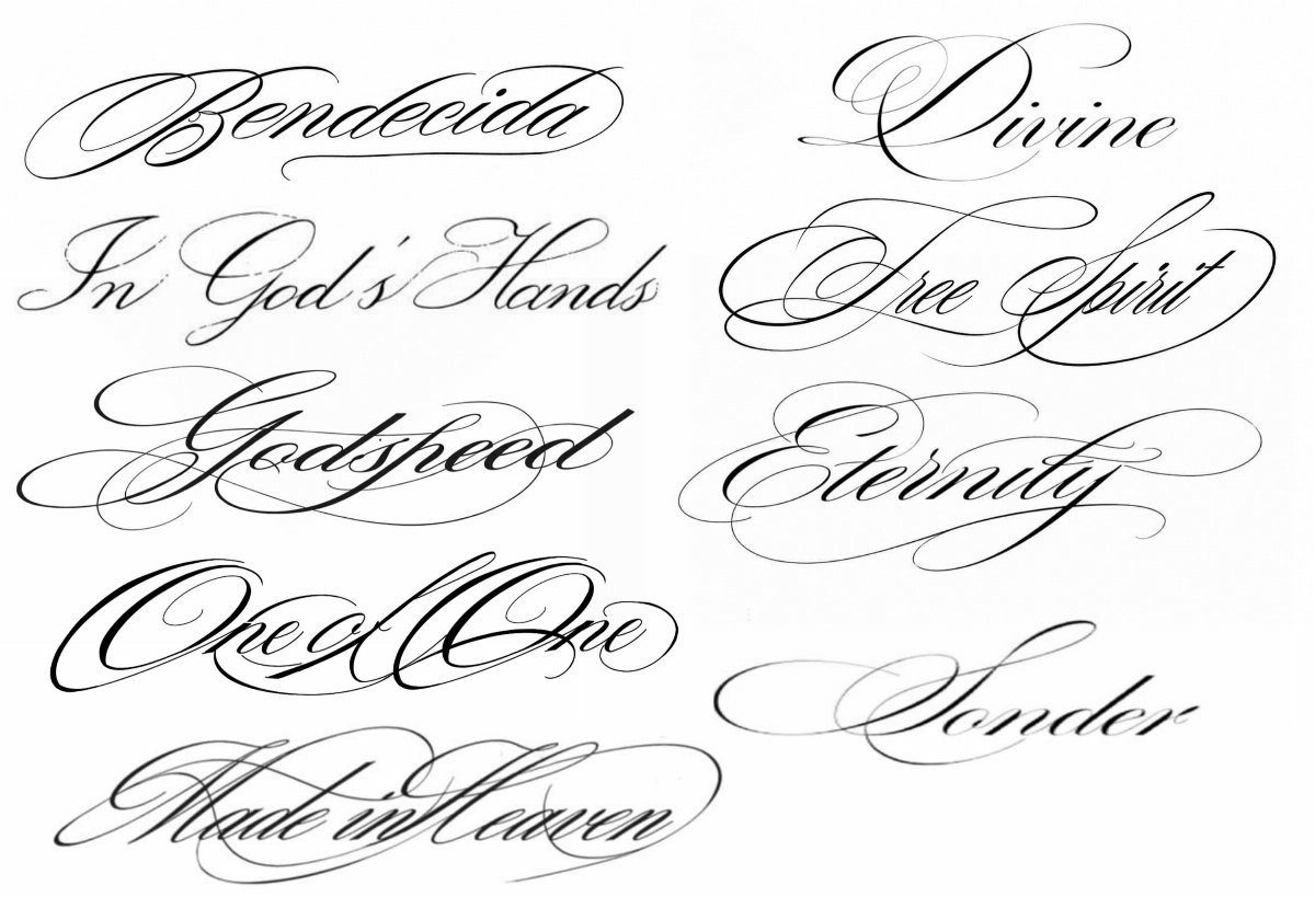
A flash sheet shows options ready to choose: "Bendecida," "Divine," "Free Spirit," each drawn as a finished piece rather than a typed word awaiting design.
Those thick-and-thin strokes borrow from pen or brush technique, which means they need size to hold. At too small, the thins disappear and the word becomes gray mush.
Check your chosen phrase at your intended size before committing. Single words and short phrases stay sharpest; longer quotes lose the calligraphic drama and gain readability problems fast.
Ask whether your artist drew these for flash or can adapt one to your chosen word with the same stroke contrast.
6. Multi-line Script Tattoo
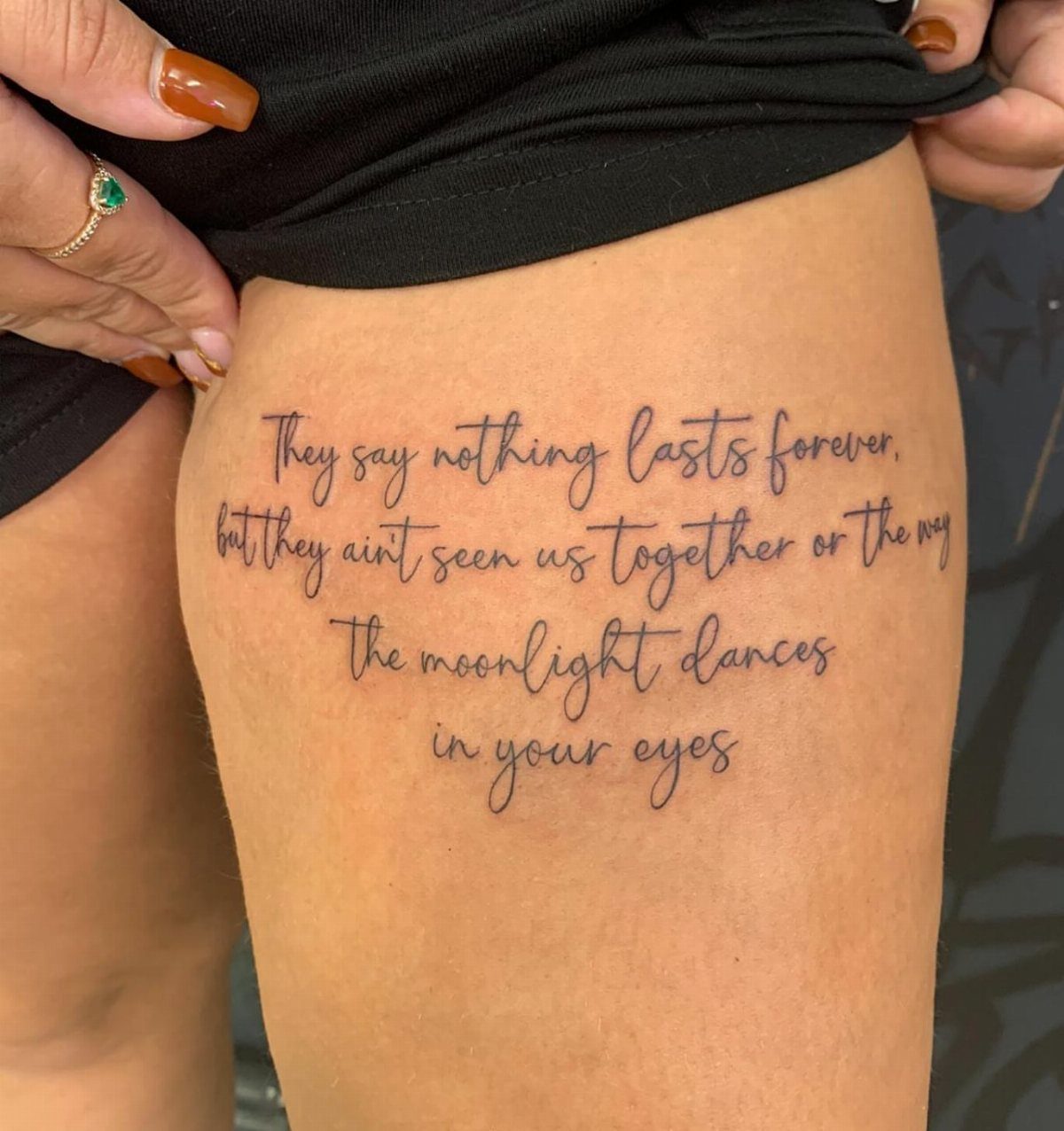
Poetry laid out across a thigh gives the words space to breathe.
The cursive stays legible across the length because the script family handles extended text better than Ornate or heavily flourished alternatives. Each line breaks where the grammar does, so the eye follows naturally.
Leg placement buys width; use it.
A paragraph compressed onto a rib or ankle would force the lettering smaller than this style survives. The trade: thighs see sun, friction, and weight change, so the finest lines may need touch-up sooner than elsewhere.
I would confirm line spacing with the stencil on my body before ink. Too tight and the descenders of one line tangle into the ascenders of the next.
7. Fine-line Quote Forearm Tattoo
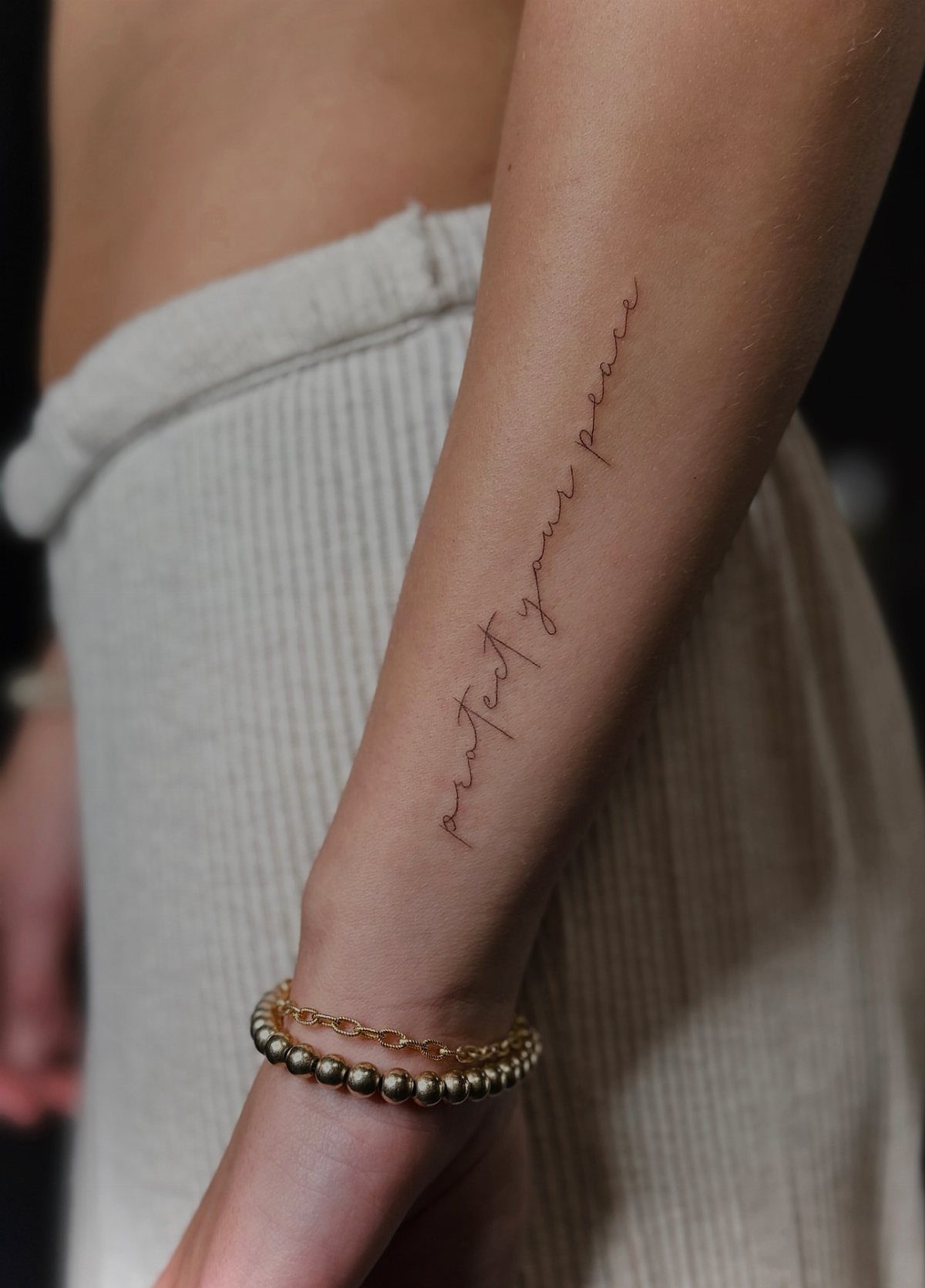
Vertical layout on the inner forearm turns the arm itself into a margin; the eye travels down instead of across, which suits longer phrases that would crowd sideways.
"Protect your peace" reads as a private reminder, visible to the wearer first and others only on gesture.
Fine-line script families stay cleaner than calligraphy at this scale, but needle diameter matters more here than font choice. A single-round-liner keeps hairlines open; anything bolder and the words blur together across the length.
The full quote needs to fit without crowding, so measuring the forearm first beats resizing later.
A phrase that fits a standard stencil may need the line breaks redrawn for shorter or longer proportions, and climbing too high toward the inner elbow risks daily friction from sleeves.
8. Cursive Name Tattoo with Crown
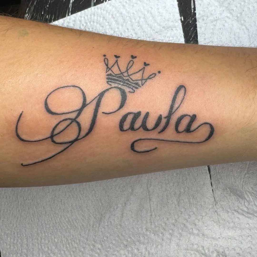
A name in cursive gains its own monument when a small crown sits above: the symbol makes the person named feel singled out without changing the readable word beneath.
A name with a crown reads as self-claim rather than dedication to someone else.
The crown adds visual density that pulls the eye up; balance it by keeping the name’s loops generous enough to hold their own weight. A too-thin script underneath looks crowned by accident.
Placement on outer arm shows it steadily. Inner arm or rib places the crown too close to the body’s own anatomy and confuses the symbol.
Before committing, I would hold a paper cutout there through a full day of motion to see where the crown lands at rest.
Choosing the Right Font
Elegant script families range wider than most people check. Fontify lists 12 distinct directions, from decorative calligraphy down to fine line and handwritten, and that breadth matters because skin pays off different choices than paper does.
Bickham Script Pro 3 carries more alternates than most; an artist can dodge an awkward join by swapping a capital or shortening a swash. The danger is using too many.
One strong capital and clean lowercase usually outlasts a word where every letter curls into its neighbor. Adobe Fonts licenses it through Creative Cloud, which makes previewing straightforward if your artist works in that system.
The pairing of formality and wording matters as much as the font file. A script chosen for ceremony should stay readable, not become clutter.
Tattoo Artist Collaboration
Think Tank has been running script work out of their Denver shop since 2002, and the 3,000 sq. ft. studio puts as much weight on the consultation as the aftercare that follows.
That timeline matters for lettering because the stencil rarely survives unchanged. A capital may need simplifying, a connection between 2 letters opening, a final tail shortening so it does not run into a tendon or wrap badly around forearm shape.
I would start with the artist, not with a font list. Stock type gives a skeleton; your artist redraws for your placement, your skin, and how that skin moves.
Testing helps: print at 300 DPI, hold it to your body through a day’s motion, and see where the design lands at rest before the needle touches.
Emotional Connection to Tattoos
Cursive tattoo stencils carry a natural rhythm that can mark tribute or resilience without stating either explicitly, and the intimacy of script style suits content that is already personal.
The balance to hold is legibility against closeness. A font too ornate turns private meaning into decoration; one too plain loses the handwriting quality that distinguishes script from any other lettering.
Body curves matter here more than with block forms.
Wrists, ribs, and forearms all move and compress, and cursive joins can follow that better than squared letters. The curve of the line matters as much as the letters it forms.
Frequently Asked Questions
What is the best cursive font for tattoos?
That depends on what you need the tattoo to do. For names and longer quotes, Elegant Script, Flowing Script, and Romantic Cursive stay most legible.
For something more decorative, Brignola packs over 1,000 alternate glyphs so your artist can swap flourishes and ligatures, though it needs palm-sized placement or larger to keep those thin strokes from fading.
Bickham Script Pro 3 packs extra alternates, which gives an artist more ways to smooth out joins that would otherwise stick.
Is there a font generator for tattoos?
Yes.
Fontify lets you line up a dozen tattoo styles next to each other, script included, and pull your text down as a PNG. Refont’s Fancy Fonts Generator works similarly: type your word, browse cursive options, copy or download.
What you get is a screen preview, not a skin-ready stencil. I would still bring that file to an artist so they can redraw it for your placement, line weight, and how your skin moves.
Is there a font that looks like cursive writing?
Plenty, and they fall into different categories.
A script font links each letter to the next in a single stroke, the way tidy handwriting does. On Fontify, the cursive section runs from decorative calligraphy down to fine line and handwritten, each behaving differently on skin.
What looks like pen writing on screen may still need redrawing for tattoo use; hairline upstrokes that read on a monitor blur together once ink settles.