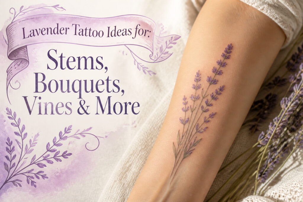
A lavender tattoo can run from a two-inch wrist stem to a full thigh wrap, and the deciding factor is not how much skin you have but how much motion that skin sees.
Fine line work survives decades longer on the collarbone or upper arm than it does on the inner wrist, where sun and friction blur bold outlines into thick shadows.
The bud-to-bloom cluster, one of the designs below, needs that extra room to breathe; crowd it and the varied heights flatten into a logo.
1. Single Lavender Flower Stem
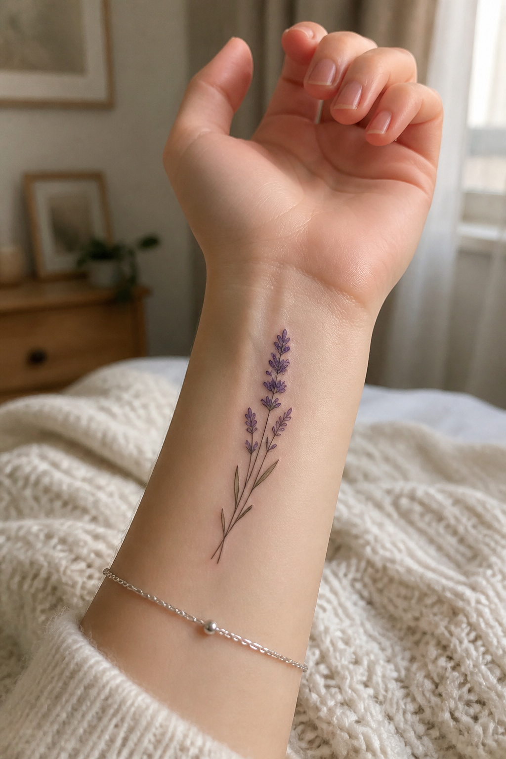
A single lavender stem carries the same quiet confidence as a handwritten note left on a pillow.
The elongated shape draws the eye upward, following the natural line of the forearm, the inner wrist, or the curve behind the ear without fighting the body’s own geometry.
Fine line work keeps the edges crisp, and that slenderness is what makes this design survive as a first tattoo; there is no overwhelming commitment, only a stalk and its tiny flowers that still reads as botanical illustration rather than abstraction.
Placement determines how much of that line the world sees. Vertical along the inner wrist, the stem sits where you notice it during the day, a private marker.
Horizontal just below the wrist bone changes the rhythm, widening the gesture. Behind the ear, it disappears into hair and reappears with movement.
The ankle offers the same conceal-and-reveal game.
What ages best here is restraint. Bold outlines thicken and blur over time on high-movement skin; fine line and micro style stay closer to the original intent.
A tiny shadow underneath, nothing more, shifts the stem from flat symbol toward something that could have been cut from a field guide.
Keep it small for delicacy, or push to medium size if you want the individual flower buds to stay readable. Either way, the minimalism is not emptiness; it is the decision to let one thing be enough.

【TEMPORARY TATTOO PACK FOR MAN WOMEN ADULTS KIDS】Each Size is about 105 x 60mm / 4.13 x 2.36 inch. Contains 15 sheets temporary tattoo paper stickers which are printed with non-toxic ink.

★【12 Pieces/LOT】--COKTAK Brand Temporary Tattoos Sticker in package.【Size】: 10x6CM 3.9"x2.3"

🌊【15 Sheets Small Lavender Temporary Tattoo】GOROMON Unique Design Temporary Tattoos For Women Adults Clavicle Tiny Hands Tattoo Temporary Face Armband Tatoo Sticker Paper Tatto Paste. Flower Tattoo Design Water Color Rose Lotus Multicolor. Size: 10.5x6cm 4.1"X2.3".
2. Lavender Flower Bouquet
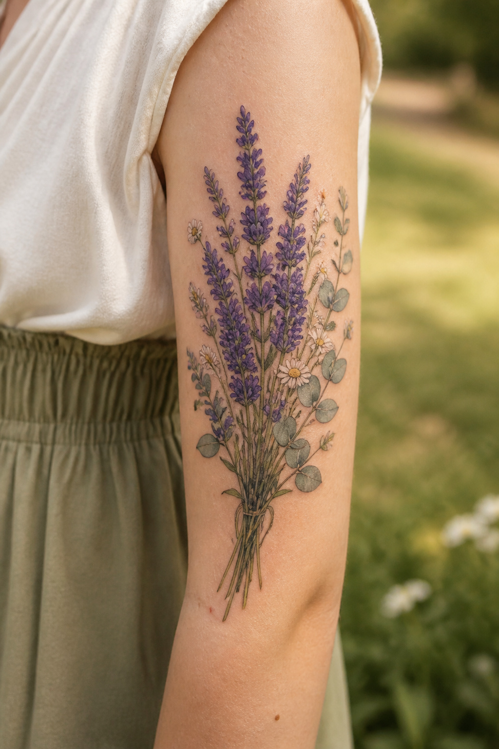
One lavender stem reads quiet and personal. Bundle several together and the whole mood shifts: more blooms create fuller visual weight, turning a private symbol into something celebratory or memorial.
The eye reads abundance, not solitude.
This style needs room. The upper arm, thigh, or shoulder blade give the stems space to spread naturally rather than crowd.
Composition matters here. Keep the bundle tight and compact, or let it fall loosely, like something gathered from a field that morning.
A bouquet also invites company. Eucalyptus, chamomile, or baby’s breath alongside the lavender build a full wildflower feel rather than a single-note piece.
The mixing changes the story again, from one flower’s meaning to a whole season of them.
3. Lavender Flower Wrist Tattoo
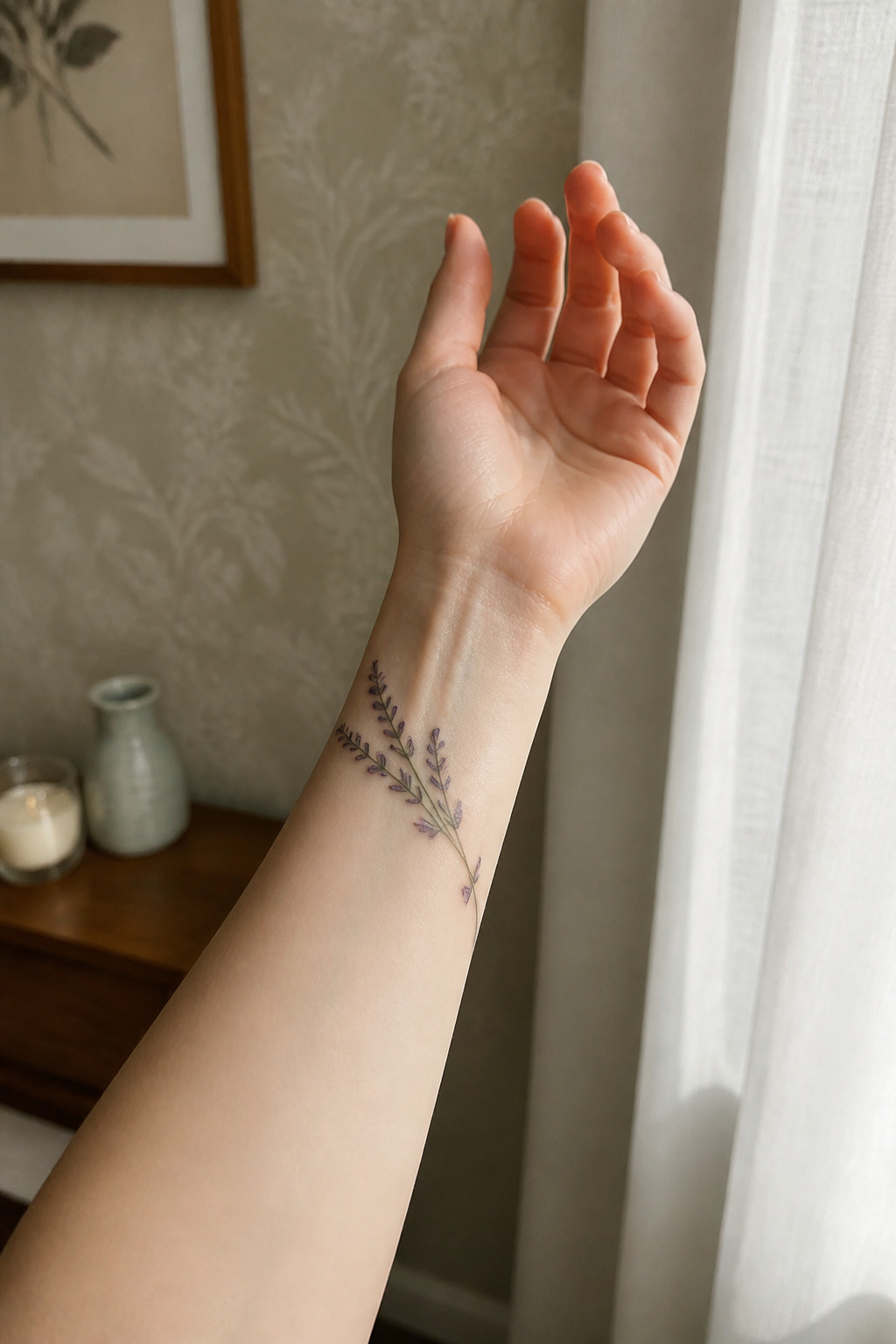
The wrist puts a lavender stem in your line of sight every morning, which turns the design into something functional rather than purely decorative.
Fine line work ages better here than bold outlines, since wrist skin sees constant motion and sun, and a heavy border tends to blur or spread where thinner pigment holds its edge.
A vertical stem along the inner wrist reads as classic, while a horizontal sprig just below the wrist bone follows the bone’s own plane.
The curve of the wrist matters more than most first-timers expect: straight stems fight the anatomy unless the artist bends them slightly to trace the radius, or keeps the design short enough that the distortion stays minimal.
Lavender wins here because the silhouette stays narrow. Bulkier flowers need width to read as themselves; a rose or peony on a wrist either crowds into a blob or scales down so far it loses its identity.
A lavender stem or small cluster stays legible at two to three inches, which is about the usable real estate before you hit the joint or the vein valley where ink tends to fall out.
Pain sits moderate to firm on the wrist, especially over the bone and the inner surface where the skin is thin and nerves cluster.
Most artists will warn you that the area close to the palm, near the thenar eminence, stings more than the outer wrist.

【Graceful Lavender Wildflower Design】This charming set features detailed lavender flowers and wildflower bouquets tied with delicate bows. Lavender is widely known to symbolize purity, silence, and devotion, offering a sense of calm and healing through its gentle artistic form. These fine-line botanical sketches are perfect for the inner arm, wrist, or ankle. Ideal for women who appreciate cottagecore aesthetics and romantic floral art, adding a touch of serene beauty to any look.

🌷 Beautiful Hand-drawn Flower Tattoos - Roses, Daisies, Poppies, Tulips, Lavender, Wildflowers Black and White Illustrative and Fine Line Styles

🌻 Beautiful Hand-drawn Flower Tattoos - Roses, Daisies, Poppies, Tulips, Lavender, Wildflowers Black and White Illustrative and Fine Line Styles
4. Lavender Flower and Bee Combo
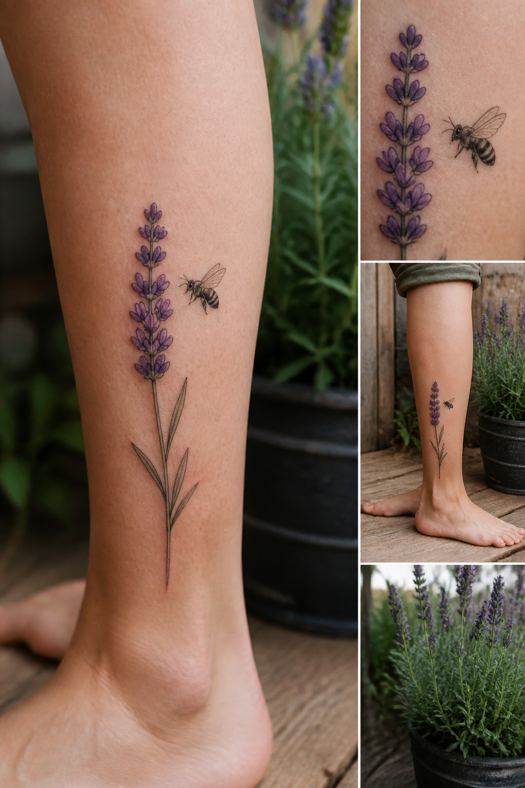
A bee approaching a lavender stem turns a static flower into a small scene, and the composition decides whether it reads as alive or awkward.
The bee can hover mid-flight, rest on a bloom, or angle in from the edge of the piece; each choice changes how the eye moves across the skin.
I prefer the approach shot, where the bee is still in transit, because it leaves the story unfinished in a way that invites a second look.
Color separates the elements cleanly without needing heavy outlines.
Muted purple for the lavender stalk against a black-and-white bee keeps both forms readable at tattoo scale, and the contrast in temperature, warm against cool, does the work that detail alone cannot.
A fully colored bee risks muddying the focal point unless the palette stays restrained.
Placement on the leg or sleeve gives the horizontal spread that lets the bee travel. Too compact a space, and the motion collapses into clutter.

Generous Quantity: 5 sheets x 8 = 40 temporary tattoos

DAISY CHAIN BRACELET DESIGN Hand-drawn floral chain tattoo designed to wrap around the wrist or arm like a piece of jewellery.
5. Lavender Flower and Butterfly
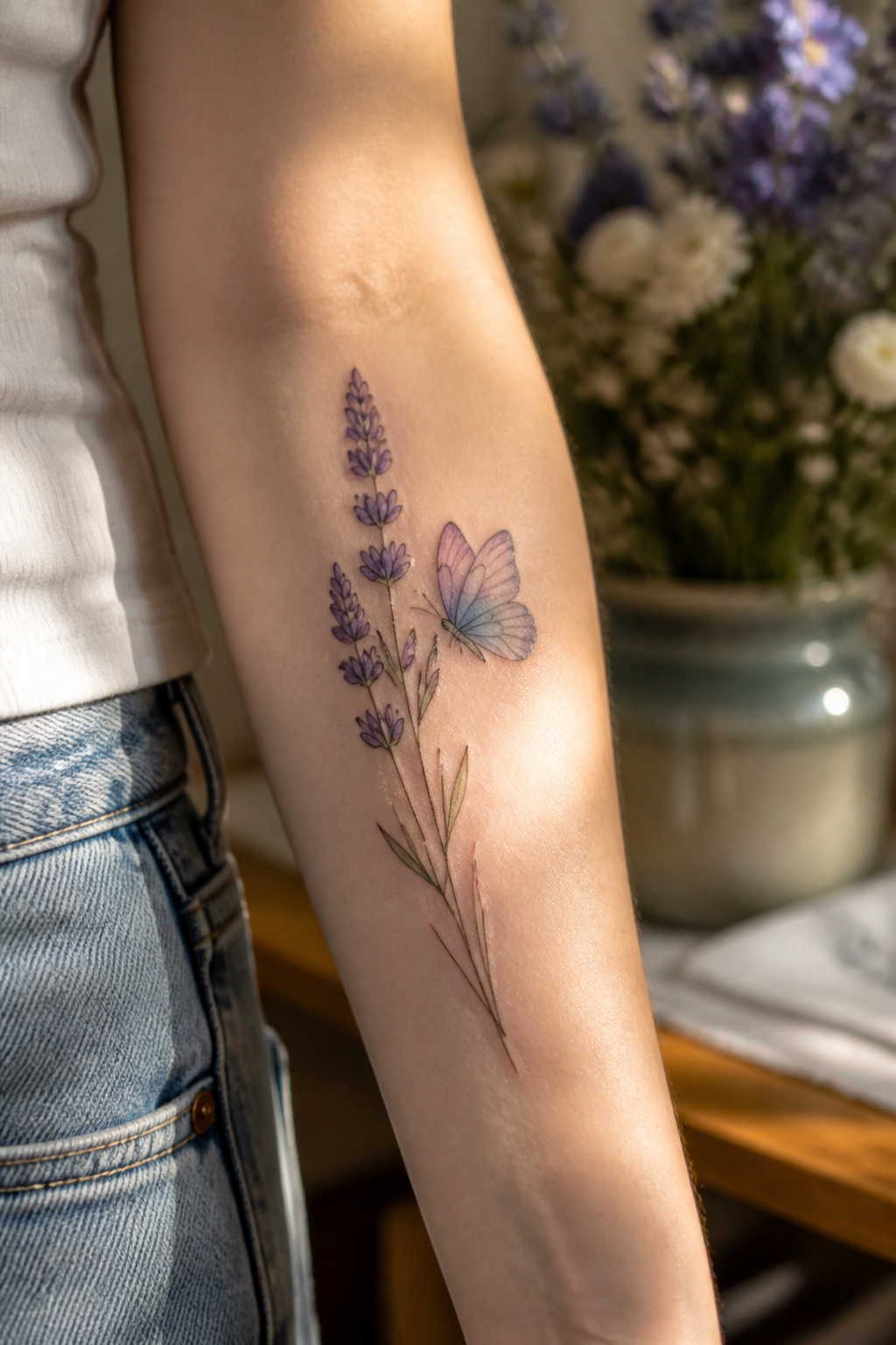
The butterfly lands on or near the lavender stem in almost every version of this pairing, and that placement matters more than most people expect at first glance.
The lavender gives the eye a vertical line to follow, thin and steady, while the butterfly breaks it with something wider.
Size-wise, the insect usually reads smaller than the flower cluster itself, maybe two-thirds its width, so the design keeps botanical weight rather than tipping into something too airy.
Keep the butterfly small enough that the lavender still reads as the subject, not the other way around.
A butterfly that matches or exceeds the flower mass turns the piece into an insect tattoo with floral decoration, which defeats the purpose if you came for the plant.
Both symbols carry transformation associations, though they arrive from different angles. The lavender side tends toward calm, the settled state after change; the butterfly carries the motion of change itself.
Placing them together creates a before-and-after in one image, which is why this combination draws people marking graduations, recoveries, relocations, the ends of marriages.
The forearm and outer shoulder are the usual placements, visible enough for the wearer to see the reminder without a mirror.
Watercolor butterfly against fine-line lavender is one way to play the contrast; a bright blue insect against pale purple stems is another, the color clash adding energy that either element alone would lack.
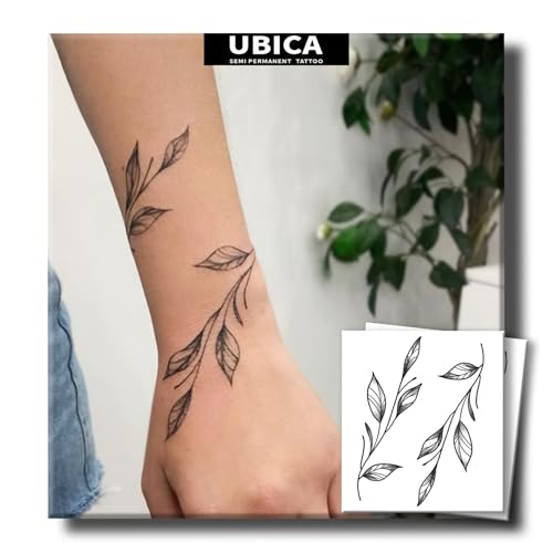
【Natural & Skin-Friendly】Made with plant-based extracts and free from harsh chemicals, UBICA semi permanent tattoos are gentle on all skin types—even sensitive skin. Express yourself without irritation!

Suitable quantity and right size: Package contains 12 sheets of temporary tattoos in unique and beautiful designs. Size: 22 x 4 cm / 8.66 x 1.57 inches for each sheet.

✿【Exquisite Flower & Vine Tattoo】: These temporary tattoos feature delicate winding vines, blooming flowers and tiny leaf elements with natural and soft outlines. Adopting gradient color printing technology, the patterns are layered and vivid, presenting a romantic, elegant and minimalist aesthetic style. Perfect for women and girls to modify collarbone, wrist, arm and back, creating a gentle and charming feminine look.
6. Black and Gray Lavender Flower
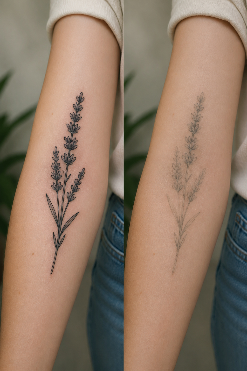
Removing color from a lavender tattoo shifts the entire mood from soft and botanical to something more architectural and permanent. The linework becomes the whole story.
A skilled artist builds the flower’s dimension through shading and negative space alone, letting the gradations of black and gray carry what purple ink would otherwise announce.
This style tends to age more gracefully than its color counterpart. Purple pigments, especially the lavenders and violets, often drift toward blue or green as they settle and fade beneath the skin.
Black and gray holds its original register for years without that color shift, which matters if you are thinking decades rather than seasons.
The result reads as quiet sophistication rather than romantic softness. It works particularly well at larger scales where the shading has room to breathe, and white highlights can add depth without breaking the monochrome.
For a realistic botanical look that still feels timeless, this is the direction worth considering.

【Flower Temporary Tattoo For Women Kids 】There are 12 sheets flower tattoo stickers in each package, flower tattoos size is 5.5x2.67"inch, pattern include Lavender sunflower Violet chrysanthemums and various types of flowers.you can used these tattoos for arms, shoulders, back,chest, legs,neck and worn any where on your body.

🌸VARIETY OF DESIGNS - The small tattoos set includes 50 sheets with vivid rose, peony, lavender, and leaf designs. With different beautiful flower semi permanent tattoo, you’ll have a large selection to choose and share with family and friends.

Versatile Wedding Decor: The artificial roses is perfect for making bouquets, centerpieces, kissing balls, boutonnieres, cake flowers or any other flower decorations that you want decorate, wedding, party, baby shower anniversary and so on. Add some romantic sweet atmosphere to your event
7. Lavender Flower Vine Across Collarbones
A lavender vine tracing the collarbones uses the bone itself as a guide, the stems running horizontal so the body shapes the art instead of fighting it.
The placement sits at the threshold between public and private: a wide neckline reveals the full line, a crew neck erases it completely.
That control over who sees it and when is part of what draws women to this spot repeatedly.
The collarbone area tends to run more sensitive than fleshier placements.
Nerve density close to the surface and the thin layer of tissue over bone mean the needle registers sharper, though most people who sit through it judge the result worth the extra bite.
A skilled artist will keep the vine delicate enough that the pain stays brief; heavy saturation in that zone extends the session without improving the look.
Feminine associations cling to this placement partly because it frames the neck like a pendant, drawing the eye upward to the face.
The lavender softens the effect further, the herb’s long history in perfumery and calm-making giving the tattoo a quiet, lived-in grace rather than aggressive statement. It reads as something chosen for yourself first, noticed by others second.
8. Lavender Flower Heart Shape
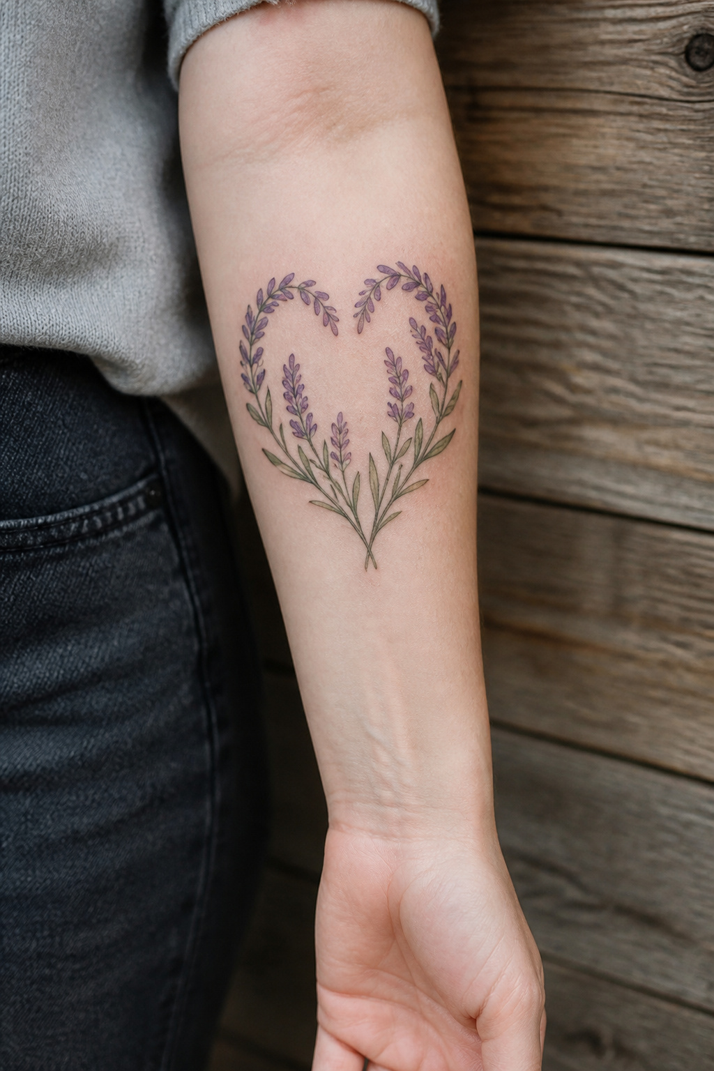
A heart built from lavender stems carries two very different moods depending on whether you leave the center open or fill it with purple.
The negative-space version reads quieter, almost like a sketch the eye completes on its own; filled in, it becomes a solid stamp of color that photographs well and holds up from a distance.
The shape itself is flexible enough for two jobs that usually need different tattoos. For memorial work, the sprigs can angle inward from both sides and meet at the base, the way hands fold.
For romantic meaning, the stems can cross and weave more loosely, less symmetrical, less grave. The lavender keeps either reading from tipping into cliché; it is not a rose, not an arrow, just calm and presence.
Placement shapes the choice. Open centers work better on spots where the skin itself provides contrast, the inner forearm or a shoulder blade.
Filled centers survive compression onto smaller areas, a rib panel or an ankle, without turning into an unreadable blob.
Either way, the stems need to stay identifiable as lavender, those narrow paired leaves and the tiny bud clusters, or the design collapses into generic floral heart number four hundred and twelve.

🌼 Beautiful Hand-drawn Fine Line Style Tattoos - Black and White Fine Line Flowers, Roses, Branch, Butterfly, Arrows, Hearts, Stars

142+ Nature-Inspired Tattoos Stencil Designs in 12 Sheets: This temporay tattoo template set features over 142 unique, delicate designs centered on enchanting botanical and natural elements. Discover a vast collection of flowers (daisies, roses, sunflowers, lavender), intricate leaves, winding stems, complete bouquets, elegant wreaths, crowns, bees, and butterflies. Perfect for creating floral temporary tattoos, henna-inspired patterns, and nature-themed body art.
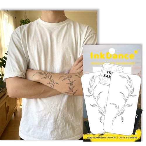
Innovative Skin-Sync Technology: We don't just sit on the skin; we interact with it. By reacting organically with naturally occurring proteins in your skin's outermost layer (stratum corneum), our plant-based formula magically transforms from a transparent guide into a rich, ultra-realistic navy-black. It looks exactly like a healed, permanent tattoo—without the needles or depth.
9. Lavender Flower and Dew Drops
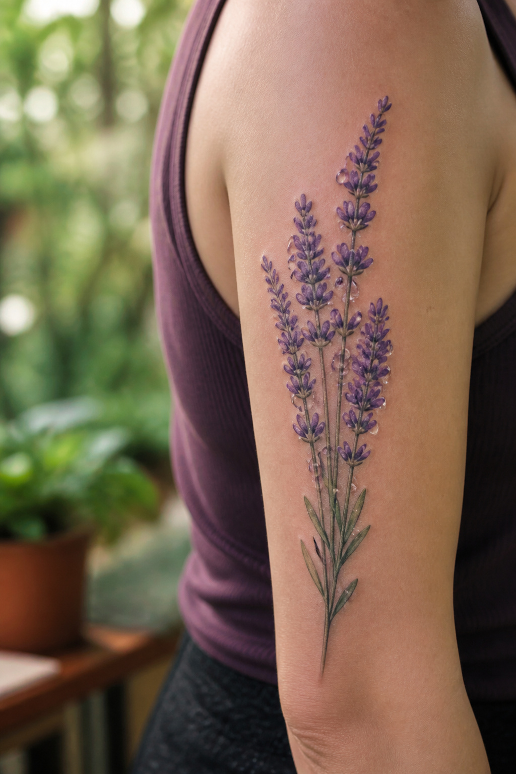
Water droplets on lavender petals demand a level of precision that separates a botanical illustration from something that looks freshly cut.
The effect depends on how the artist handles white ink or negative space: pure white highlights catch light like a convex lens, while untouched skin beneath a gray wash can read as a droplet’s shadowed underside.
Both approaches work, but mixing them without a plan flattens the image into polka dots.
Placement changes what the eye expects. On a forearm or upper arm, where the skin stays relatively flat and the viewer’s gaze lingers, two or three drops reward close inspection.
Too many, and the composition turns busy, undercutting the lavender itself. Smaller areas or spots that twist with movement make the illusion harder to sustain, the droplets distorting in ways that break the spell.
Ask to see healed photos of similar details before committing; white ink fades unpredictably, and an artist’s fresh portfolio won’t show you that.

[Package] 1 pc boutonnier and 1 pc wrist corsage [Material] Made up of artificial silk flowers and faux eucalyptus leaves; and the wristband part is available in both ribbons...
10. Lavender Flower Wreath Circle
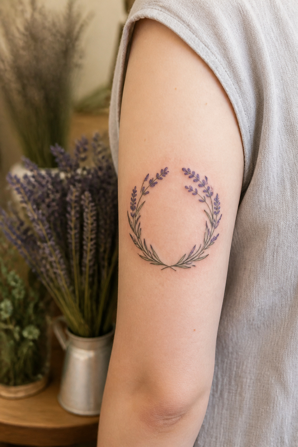
Curving lavender stems into a perfect circle demands exact symmetry, and the natural droop of the flower fights against it.
Lavender heads want to lean, so the artist has to build in counterweight, usually denser leaf clusters on the upper arc, or let the stems break the frame slightly at the top so the circle reads as a wreath rather than a rigid ring.
The center is where most people make this design theirs. Initials, a date, or coordinates sit cleanly inside the negative space.
A small moon or simple geometric shape works too, though words need careful spacing; too long a phrase and the stems get pushed to the edges and lose their fullness.
Fine-line dots can replace solid stems for a lighter frame, but that style shows every wobble, so the circle has to be mapped before a needle touches skin.
Placement follows the symmetry. Forearm, upper arm, calf, or leg all hold the shape without the curve of the body distorting it.
The wholeness of the circle paired with lavender’s usual meaning, calm and healing, gives the piece its quiet weight.

【Colorful Wild Flower Tattoos for Women】There are 24 sheets sexy and fresh with different designs tattoos in one package,each piece is 2.36*9 inch,including lavender rose forget-me-not plum blossoms wild flowers weeds body art tattoos,which look sexy and mysterious,suitable for women girls who want to try fresh style and different colors tattoos.

🐙16 Sheets Unique Flower Leaf Temporary Tattoos:🐠 There Are 16 Sheets Floral Temporary Tattoos For Women Finger Hand Vine Leaves Temporary Tattoos For Adults Including Various Popular Designs Plants Flowers Tattoos Vine Leaf Plum Rose Butterfly Bow Bowknot Leaves Tattoo Sticker.

✿【 Long Strip Body Art Tattoo 】: Designed with extended long strip patterns tailored for arms, back, torso and shoulders, these full-size temporary tattoos cover larger skin areas perfectly. Featuring diverse delicate patterns and smooth integrated lines, the overall look is stylish and atmospheric, easily creating a stunning full-body decorative effect and upgrading your whole dressing temperament.
11. Lavender Flower Vine Around Thigh
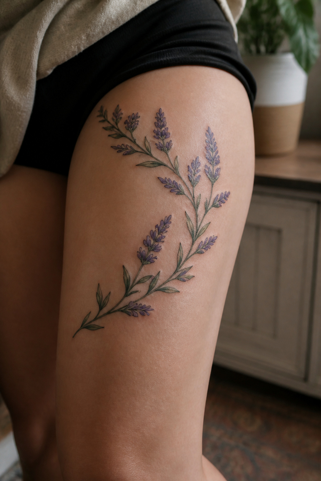
A vine wrapping the thigh follows the leg’s natural curve in a way flat placements never manage. The stem climbs toward the hip or spirals around, and that arc lets the artist build real length into the design.
More surface area means room for individual florets, leaf pairs, and the thin tendrils that break up a thick line.
The thigh carries weight and movement differently than the calf or ankle. Skin here shifts when you walk, sit, or cross your legs, so the direction of the stem matters.
An artist who maps the design while you stand and again while you sit catches where the stretch happens. Skip that step and the vine pinches or gaps in ways that show.
Pain sits lower here than on bone-forward spots like the shin or kneecap. Muscle and fat cushion the needle, though the inner thigh and the seam where leg meets hip sting more.
Most people book a longer session for this placement, treating it as the statement piece it becomes.
Full wrap or one-sided climb is the real choice. All the way around reads as jewelry in motion.
One side keeps it modern, asymmetrical, easier to hide or reveal depending on cut.
12. Lavender Flower Cluster with Buds
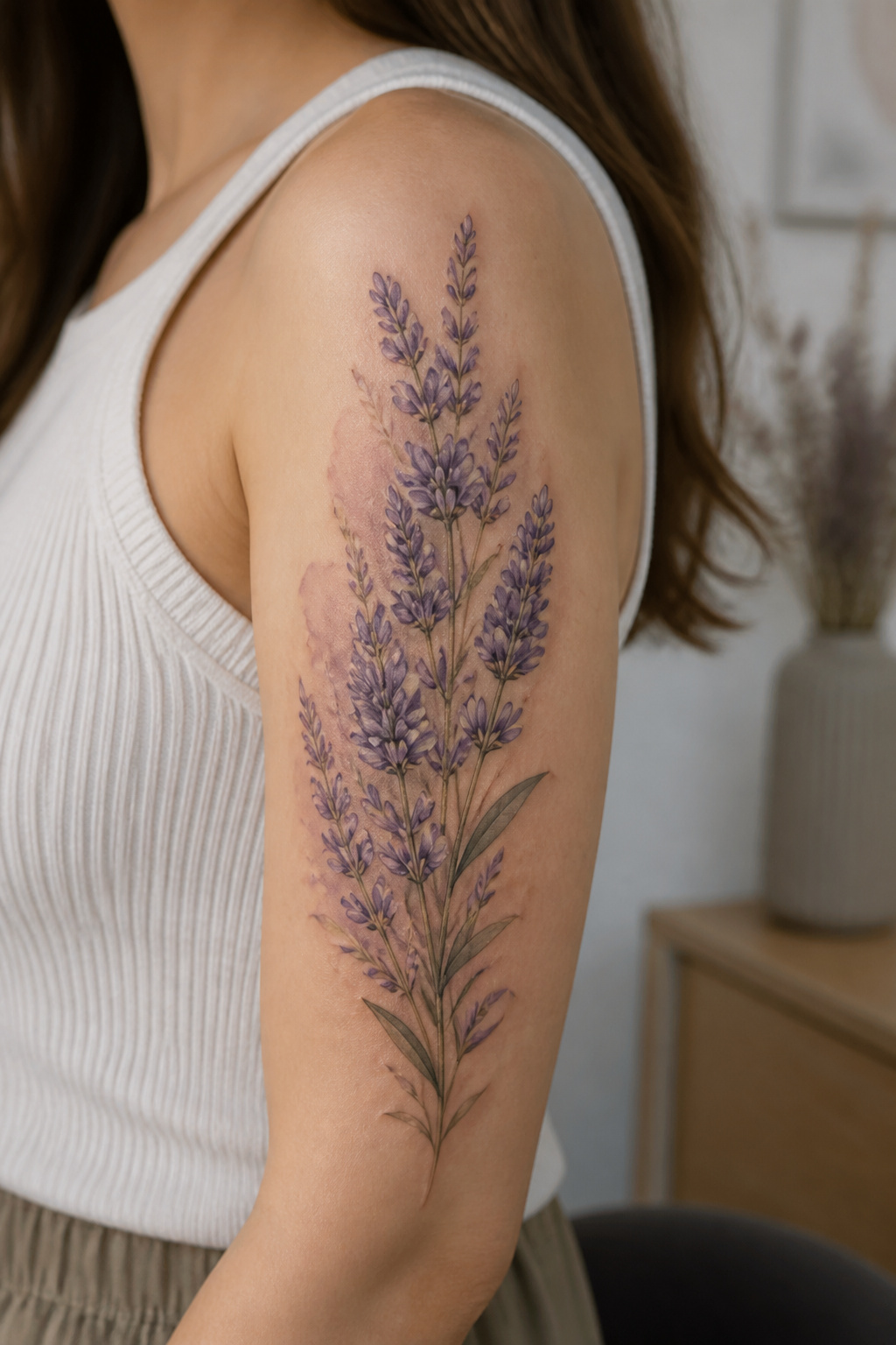
A cluster of lavender stems at different stages, some in full bloom and some still tightly budded, carries a quiet story about growth without needing a single word of explanation.
The unopened buds read as potential, the open flowers as arrival, and the pairing gives the design a visual rhythm that keeps the eye moving.
What convinced me, looking through dozens of these, is how much the spacing matters: stems grouped too evenly flatten into a logo, but varied heights let the cluster breathe and feel like something gathered rather than arranged.
The shoulder, upper arm, or calf give enough room for that variation to show. A few loose petals falling from the cluster add motion, though the bud-to-bloom contrast already does most of the work.
For anyone marking a transition, the timing symbolism lands without being literal.
13. Lavender Flower Vine Across Back
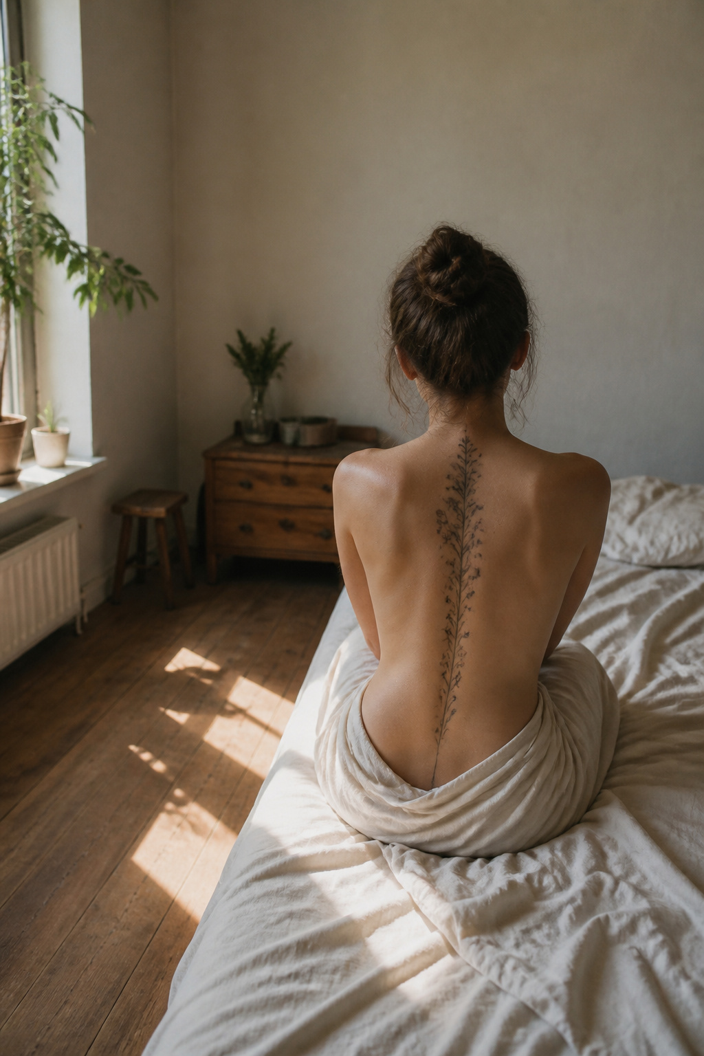
A vine across the back needs enough horizontal real estate to let the stems trail without bunching up, which means the placement usually starts at one shoulder blade and runs to the other, or sits lower where the back stays relatively flat.
The shoulder line gives the design a natural frame; the lower back offers the same uninterrupted plane without competing with clothing necklines.
The flat planes of the back suit trailing designs because the skin does not shift much with normal movement. Lavender’s elongated shape works with the body’s length, whether the vine travels spine-to-spine or follows the curve just below.
Sessions build this out gradually: the main vine goes down first, then branches and blooms fill in over time.
Visibility splits here. The wearer sees nothing of it without a mirror, while others catch the full sweep in a backless top or at the beach.
That mismatch matters if you want a tattoo for private meaning versus public display.
14. Lavender Flower with Script Ribbon
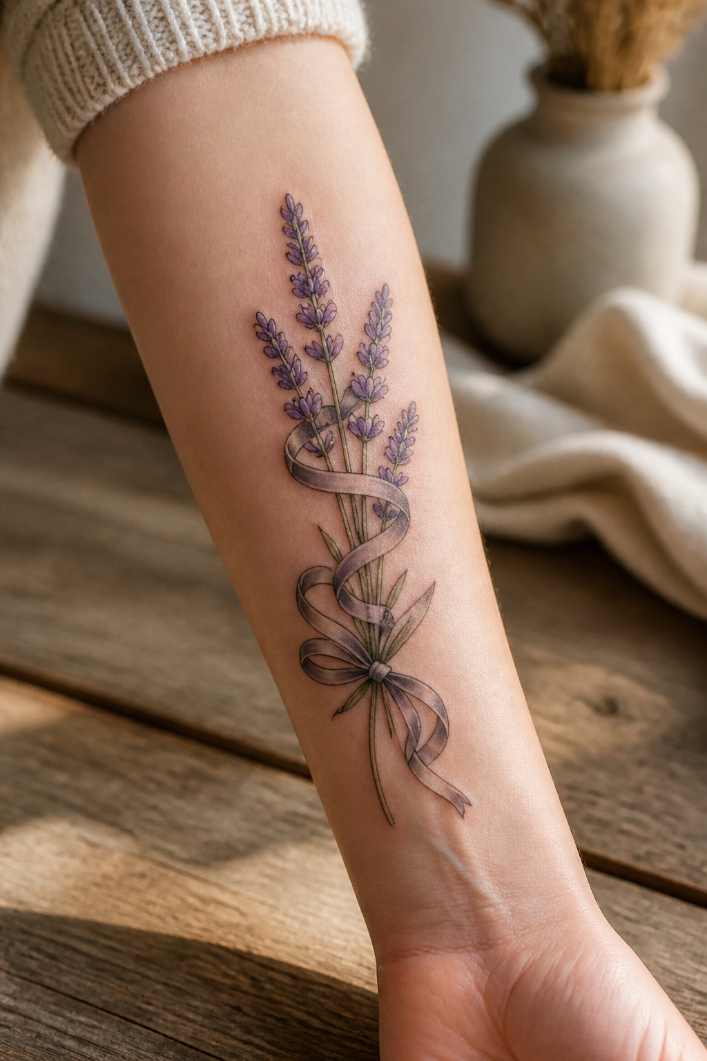
A ribbon woven through lavender stems lets the text and the image share space instead of sitting side by side like two separate tattoos.
The vintage banner style keeps the words from floating loose, anchored by the stems that pass behind and in front of it.
Font choice matters more here than in most script tattoos. The lettering has to hold its own against organic, irregular shapes without turning stiff.
Overly rigid serifs fight the lavender’s natural curve; too-loose handwriting can look accidental where it crosses the stems. Thin, consistent line weight usually wins, matching the delicacy of the flower itself.
Spacing where text meets image is the part that trips up the design.
The stems need enough room to read as stems, not as scratches through words, and the words need air so they do not crowd into the negative space.
Most artists solve this by letting the ribbon overlap the stems at one or two points rather than weaving constantly, which keeps both layers legible.
Names and dates are the usual choices, though single words show up too, the kind that carry private meaning for the person wearing them. The ribbon makes even a common word feel chosen rather than plucked from a font sheet.
15. Lavender Flower and Bees in Flight
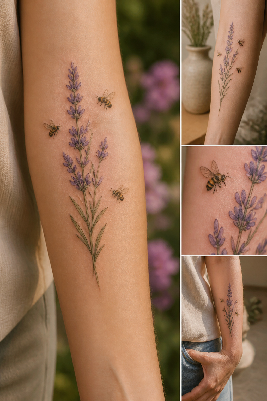
Multiple bees in flight around a central lavender stem or cluster create a piece that reads as genuinely alive on the skin, but the difference between one bee and several is more than a headcount.
A single bee anchors a small scene; three or four turn the tattoo into a snapshot of real movement, with the eye traveling from insect to bloom and back again. The risk is clutter.
Without careful spacing, the composition collapses into noise.
The balance comes from treating the lavender as fixed architecture and the bees as punctuation. Dotwork shading, kept faint or omitted entirely, keeps the background from competing.
Placement on the upper arm, thigh, or shoulder blade gives the design room to breathe. For nature-themed sleeve work, this pairing functions as a strong anchor piece precisely because the motion contrasts with the stillness of the stem.
The bees can render realistic, geometric, or illustrated depending on preference, though a single style throughout prevents the piece from feeling assembled rather than grown.
16. Lavender Flower Spine Trail
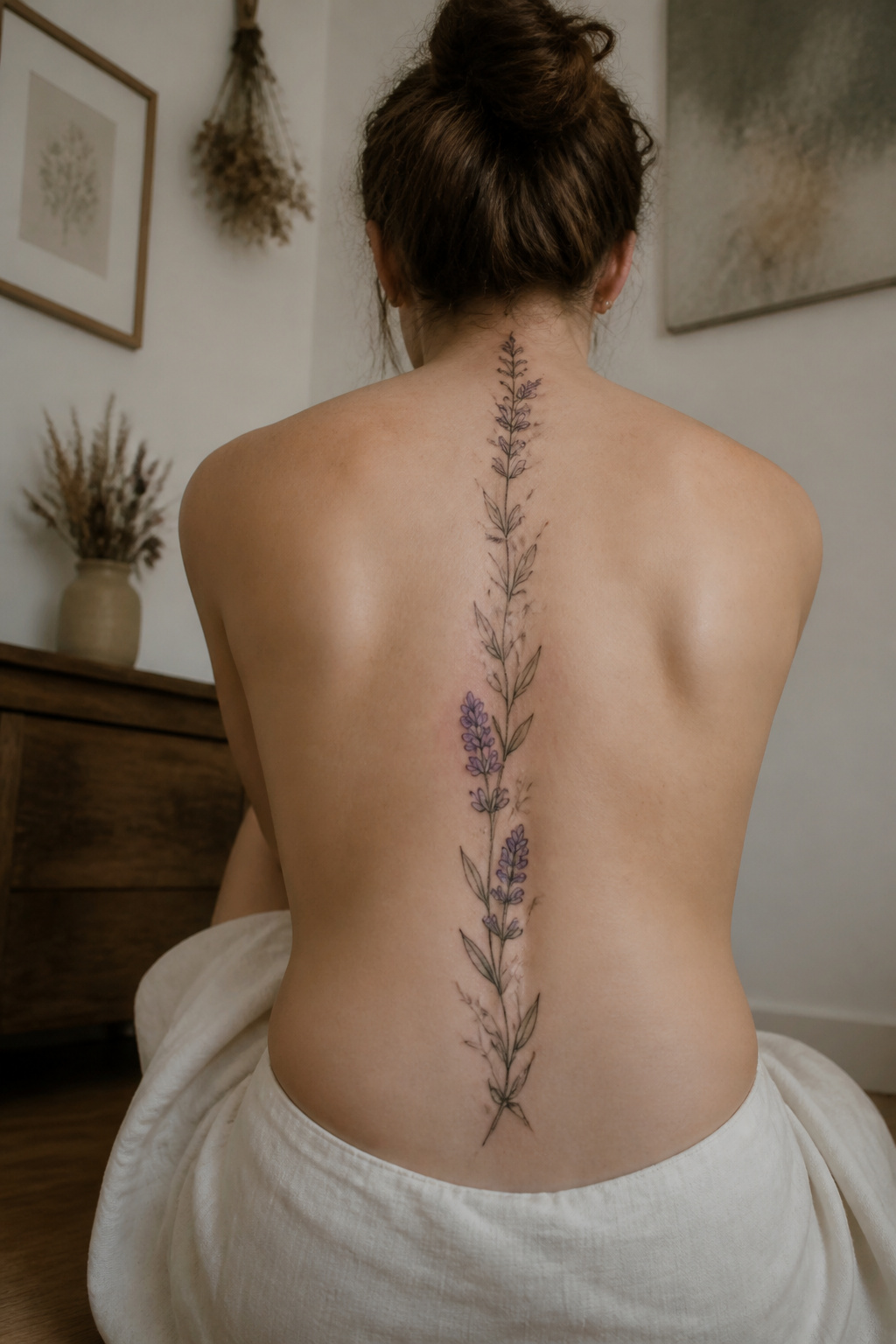
A vertical lavender tattoo following the spine turns the body’s own line into the stem, with blooms branching off at intervals as the design travels from nape to mid-back or lower.
The placement demands slim proportions kept dead center; even a slight drift left or right throws off the symmetry that makes this read as elegant from behind rather than crooked.
Fine line work holds up better here than thick outlines, which can blur or spread along the bone.
The pain is concentrated. The spine sits close to bone with little cushioning, and the repeated passes needed for a longer piece mean this area ranks high on most pain charts.
Plan for 2 to 3 sessions if you want the full length, not because the design is complex but because skin and tolerance both need recovery time.
What struck me, reading artists’ accounts of these pieces, is the intimacy of a tattoo the wearer never fully sees without mirrors or photographs. The back of the body becomes a private gallery, viewed mainly by others.
That quality, the choosing of something beautiful for a place you yourself only glimpse indirectly, shifts the tattoo from decoration toward something closer to trust: in the artist’s hand, in the image held in memory rather than constant sight.
What Lavender Tattoos Mean
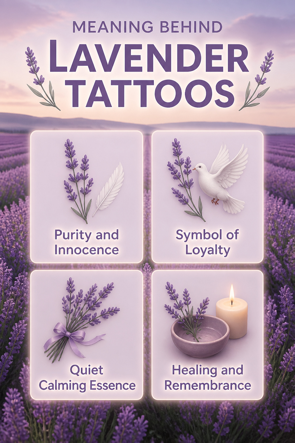
Purple has carried associations with purity and innocence since at least the ancient Mediterranean, where the dye was rare enough to signal restraint rather than excess.
Lavender inherits that same palette but softens it, the color muted by gray-green stems rather than shouting from a throne. That quietness matters to people choosing ink.
A rose or lily can claim similar virtues, yet both read as more declarative, more ceremonial. Lavender grows wild in fields you walk through, not flowers you receive wrapped in paper.
The loyalty and devotion side of the meaning shifts with what you add. A white dove turns the stem toward faithful love; a ribbon tightens the same idea into something almost bridal.
Left alone, the sprig keeps its meaning open enough for silence, for calm, for care without the performance of caring.
I have seen the difference in how people describe their pieces: rose tattoos tend to name the person, lavender tattoos tend to name the mood they want back.
The smell helps, sure, but the color does the work when the tattoo is only lines. That is why someone after healing or remembrance often lands here rather than on a poppy or violet, flowers with heavier symbolic freight.
Lavender lets you carry a meaning without explaining it.
Where to Place It
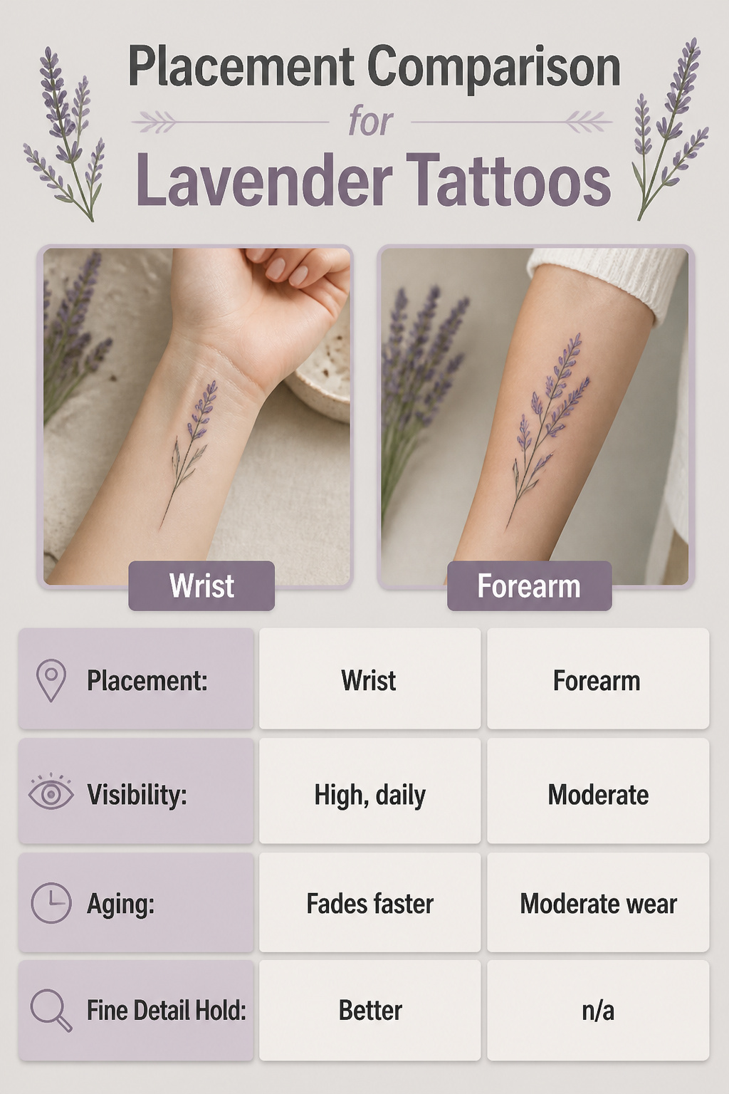
A lavender tattoo’s fine line work ages differently depending on where you put it. The wrist sees sun and friction daily, so that delicate purple stem will fade faster there than under clothing.
Chest and collarbone placements catch the eye without the same wear, and the way a vine traces the collarbone’s edge can feel like jewelry that never comes off.
Thigh skin stays more stable over time, which matters for the lighter purple hues that can read as ashy or disappear entirely on deeper skin tones if the artist doesn’t adjust the saturation.
| Placement | Visibility | Aging | Fine Detail Hold |
|---|---|---|---|
| Wrist | High, daily | Fades faster from sun/friction | Better with fine line than bold outline |
| Forearm | Moderate | Moderate wear | n/a |
| Chest/collarbone | Selective, intimate | Protected, slower fading | Accentuates natural contours well |
| Thigh | Usually covered | Most stable long-term | Full vine wrap moves with the body |
The lighter purple hues need more saturation on melanin-rich skin or they will gray out within a year. Ask your artist to show healed photos on a skin tone close to yours before committing to a pastel wash.
Style Options That Change the Look
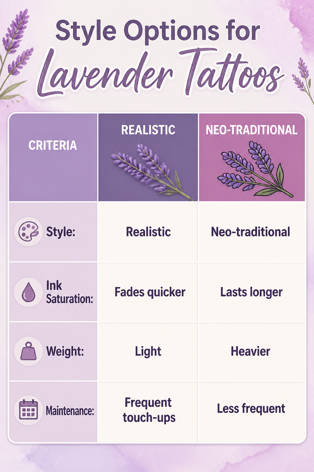
Realistic lavender tattoos rely on shading to create dimension, with black and gray work often outlasting color over time. The negative space does the heavy lifting, and white highlights can add depth if your artist uses them.
This style needs room to breathe. Larger placements like the forearm or thigh let the detail land; shrink it down and the fine shading muddles faster than you’d expect.
Neo-traditional pieces hold their saturation better because the bold outlines create a built-in barrier against spreading ink. The tradeoff is weight.
A neo-traditional stem carries visual heft that competes with delicate areas like the wrist or behind the ear. That same density reads as intentional on a shoulder or upper arm.
Fine line and micro styles match the single stem perfectly. The minimalism is the point.
What convinced me, looking through healed examples, is how quickly the thinnest lines soften. Budget for touch-ups every few years if you go this route, or accept the fade as part of the look.
Abstract approaches, dotwork especially, give the design a different energy. The lavender becomes pattern more than plant.
This ages well because the eye reads the texture as intentional even as individual dots blur slightly. Match the style to how much maintenance you will actually do, not to the fresh photo that sold you on it.
Frequently Asked Questions
What does a lavender tattoo symbolize?
Lavender tattoos carry meanings of purity, innocence, loyalty, love, and devotion. The muted purple reads quieter than a rose or lily, more about a mood you want back than a person you name.
Leave the stem alone and it stays open for calm, silence, and care without needing explanation; add a white dove or ribbon and it tightens toward faithful love.
What are some popular placements for lavender tattoos?
Wrist, forearm, collarbone, thigh, and back are the most common spots.
The wrist puts it in your line of sight daily; the collarbone frames the neck like a pendant; the thigh gives room for a full vine that follows the leg’s curve.
Fine line work ages better on covered skin than on areas that see constant sun and friction.
Are lavender tattoos suitable for all skin types?
Yes, though lighter purples and soft greens show up more clearly on lighter skin tones, while deeper, saturated purples and dark greens complement deeper skin tones better.
The fine line style that makes lavender tattoos delicate can also make them harder to read on very dark skin unless the artist adjusts contrast accordingly.