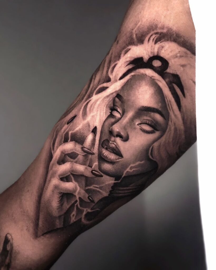
Storm tattoos run from a single lightning bolt on a shoulder to a full thunderstorm sleeve stacked from sky to ground.
What decides which one belongs on your skin is how much real estate you have open and whether you want the scene to read as weather or as symbol.
Color saturation work separates thunderstorm pieces from greyscale cloud bases, since the purple mass above a horizon line or streetlamp demands pigment loads that monochrome studies never face.
1. Storm Clouds Tattoo
Dark storm clouds in tattoo form work best when the artist builds them from layered grey washes rather than flat black fill.
The swirling texture comes from leaving negative space for highlights and adding bright white or pale grey lightning that reads as actual light rather than just another color.
Warm lightning, the kind Al Cleckler draws in red-orange against charcoal cloud bases, shifts the whole mood against cooler black-grey skies. On skin, this contrast needs a heavy hand with the darks or the lightning disappears into healed skin.
A sleeve or large panel gives the clouds room to billow; too small and the detail collapses into muddy grey.
2. Lightning Bolt Tattoo
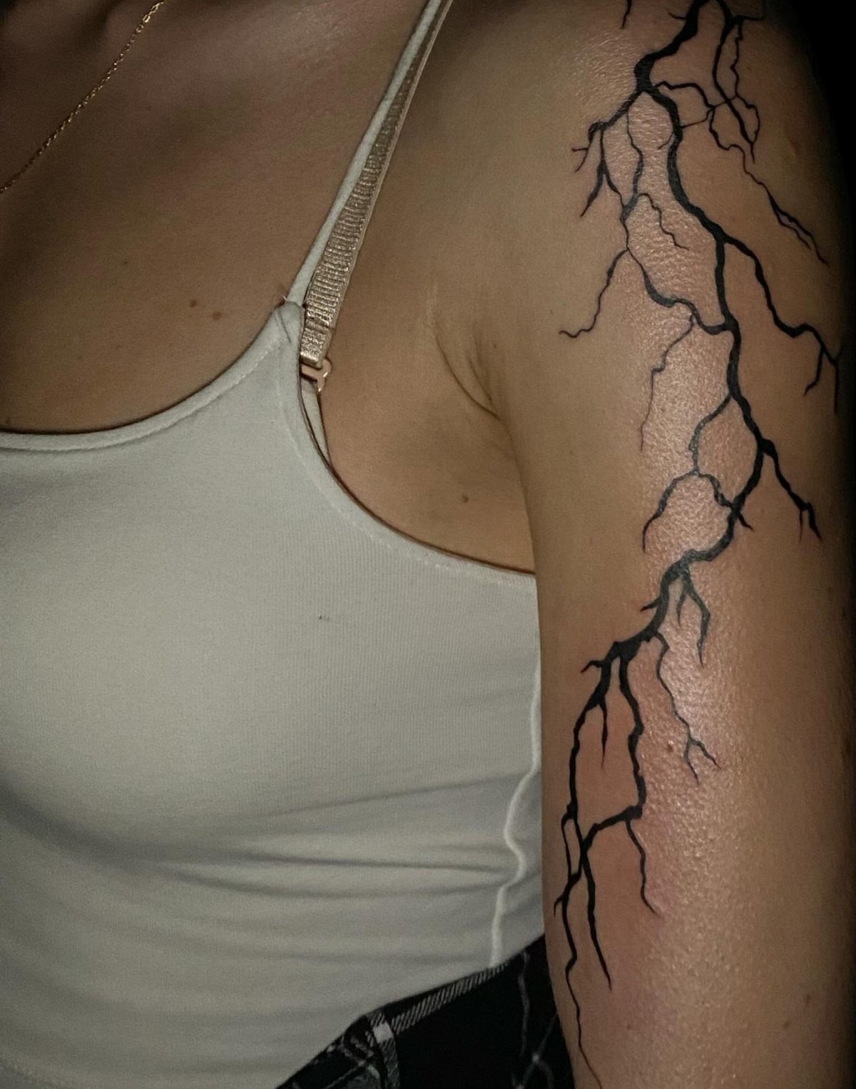
A standalone lightning bolt earns its keep through motion.
The jagged fork running down an arm or shoulder works because the body line itself becomes the current path; straight vertical placement on an already vertical limb can look pinned-on instead of alive.
A single bold bolt carries enough weight without cloud backup, though pairing it with minimal storm elements keeps it from reading as clip art.
Red or orange accents at the strike point mimic heated contact, a detail that shows up well in thick black line work.
Branching designs need careful spacing; too many splits and the silhouette weakens as it ages. One strong central fork heals cleaner than scattered fingers of electricity.
3. Full Moon and Storm Tattoo
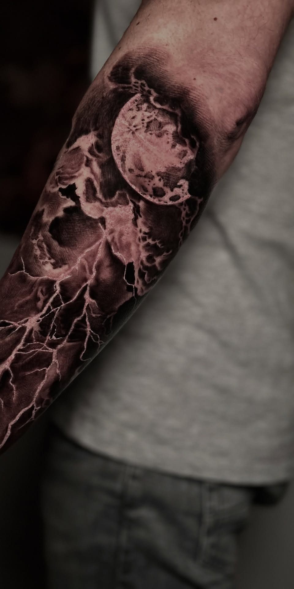
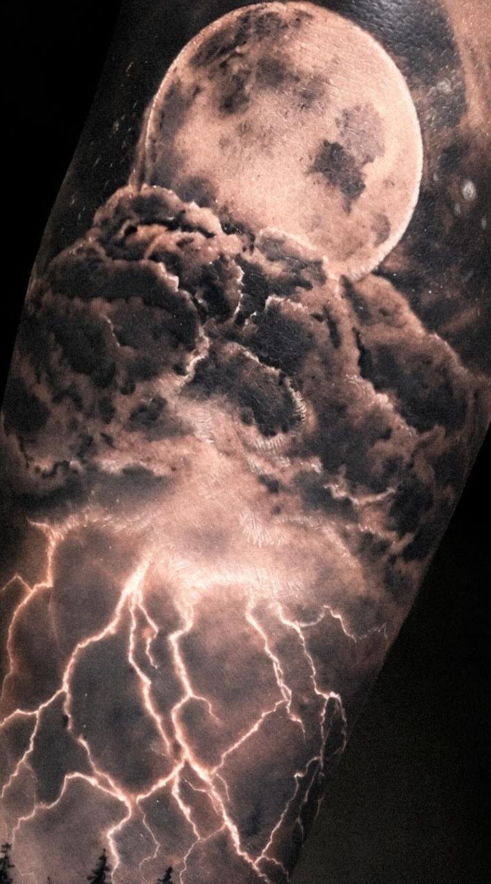
Full moon pieces turn on the contrast between an unbroken pale circle and everything chaotic around it.
The moon itself stays relatively flat and bright while the storm activity frames it, a composition that risks looking like 2 separate tattoos if the artist does not knit the edges together with drifting cloud wisps or faint glow.
The full moon hovers over dark clouds and jagged lightning bolts on the forearm, with nothing else needed to set the scale.
Without that grounded element, the scene floats. Black and grey ink keeps the night sky convincing; color usually breaks the illusion unless a skilled hand keeps the palette restrained to deep blue-greens and barely-there purple.
4. Stronger Than the Storm Text Tattoo
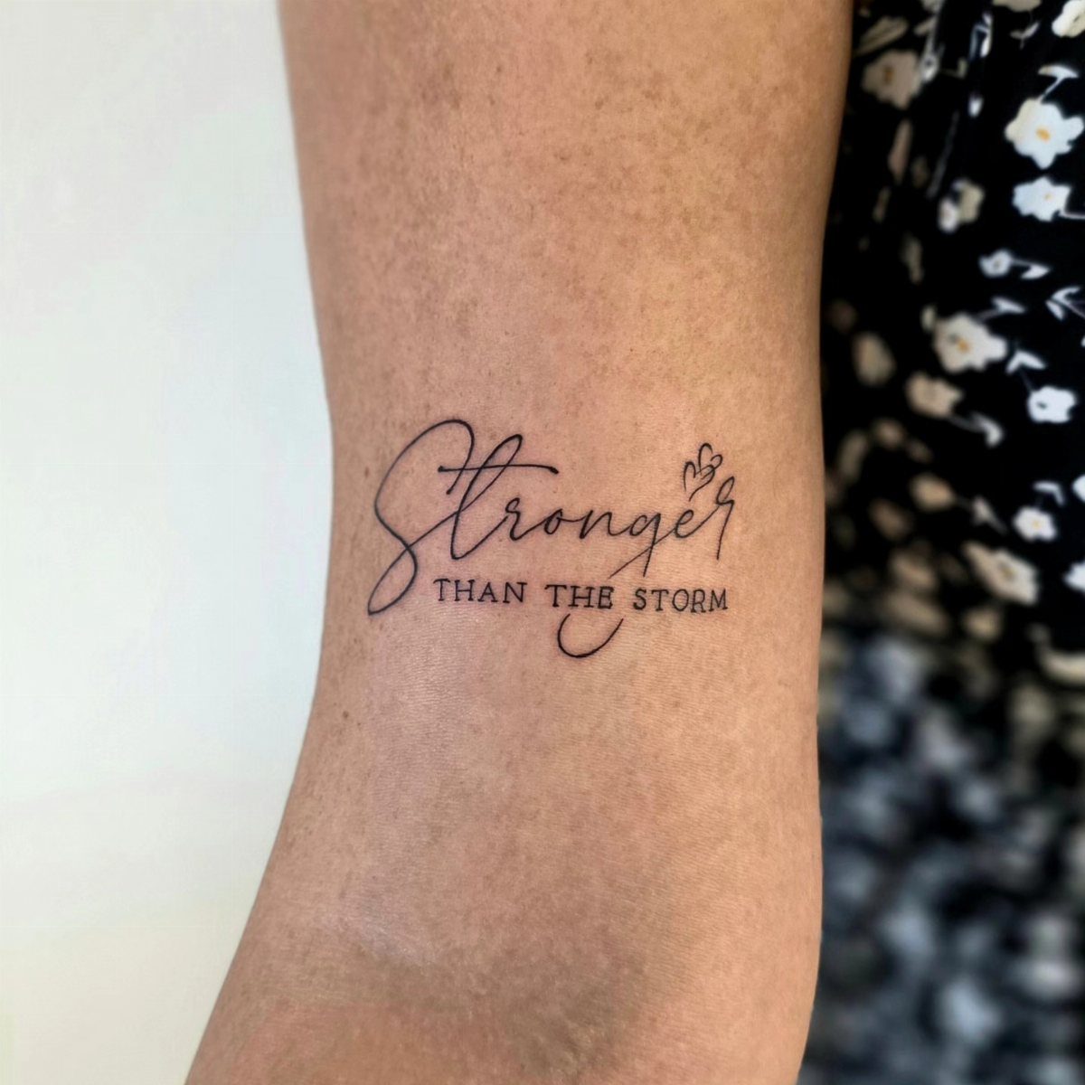
Text that reads "Stronger THAN THE STORM" needs one typographic decision made before the needle touches skin: the weight given to "THAN THE."
The sample has it in lighter or smaller characters, which creates a visual stumble that may or may not be what you want. Script, serif, and simple block all carry different assumptions about permanence and tone.
Small heart accents work if they are spaced as punctuation, not decoration; the red outline version in searches keeps them from disappearing into black text.
Check letter spacing by viewing the stencil at arm’s length; words that read fine close up blur together on curved forearm skin.
Keep this phrase short enough to stay legible after healing, not just while it is fresh.
5. Thunderstorm Tattoo
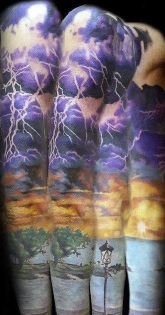
Thunderstorm sleeves pull off what single lightning bolts cannot: actual weather depth from sky to ground.
The purple cloud mass in the reference sits above a full landscape, which means the tattoo has a natural top-to-bottom reading that mirrors how we actually watch storms approach.
Sunset color at the horizon line gives the dark sky something to darken against.
That gradient work demands an artist comfortable with color saturation, since purple shifts muddy fast without enough pigment load. The streetlamp and tree line anchor the composition in ordinary space; without them, the clouds read as pattern rather than scene.
Leg placement suits this scale when arm canvas is already committed.
6. Cumulonimbus Clouds Tattoo
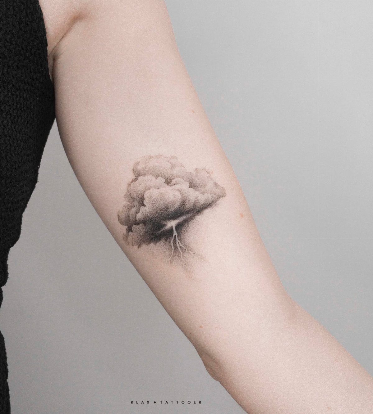
Cumulonimbus clouds are the specific tower shape that says storm to anyone who has watched one build.
The anvil top and vertical mass need correct proportions or the cloud reads as generic fluff; reference photographs help, since most people have not looked closely at cloud anatomy.
Bright blue lightning against greyscale cloud bases, as in the electrician-themed references, trades realism for visibility.
Electric blue holds up in skin better than yellow-white but reads less like natural lightning and more like graphic design. The heavy black shading around the cloud shape keeps it from turning blue-grey overall as it ages.
This suits inner arm placement where the vertical cloud column follows the limb line and the viewer’s eye travels the full height.
7. Eye of the Storm Tattoo
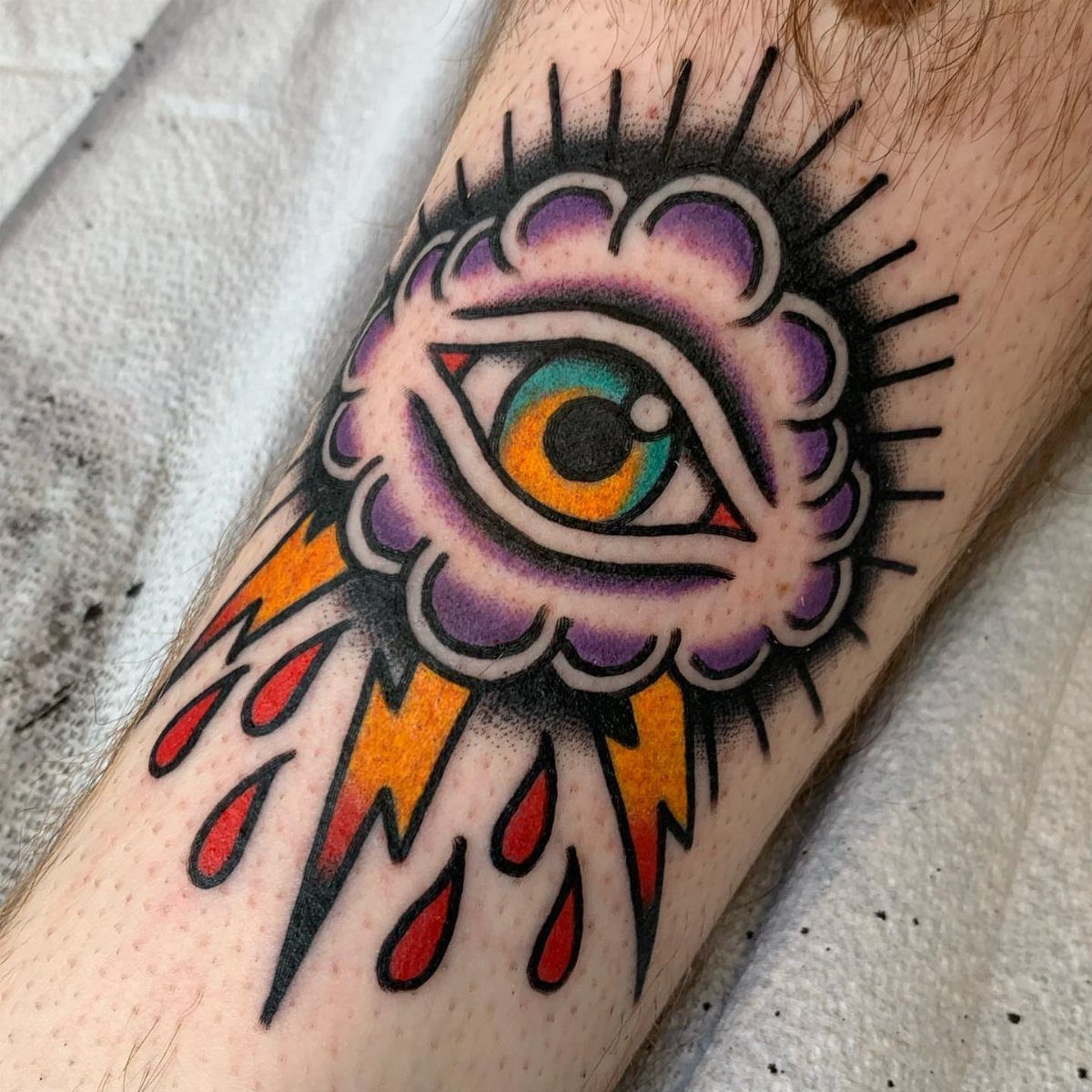
The eye of the storm stays calm while everything around it spins, and that contrast is what makes this image work as ink.
A single traditional eye, framed by purple cloud mass and jagged lightning, turns an abstract idea into something a viewer recognizes instantly.
Traditional style lining keeps the eye readable at a distance where softer shading would blur.
The purple cloud needs enough saturation to hold against black linework; red raindrops, if you want them, read as blood or warning depending on placement and are best decided before the session starts.
Lower leg placement gives vertical space for the storm to build around the eye. The eye itself should face outward, toward whoever sees it, not down the limb.
8. Dancing in My Own Storm Text Tattoo
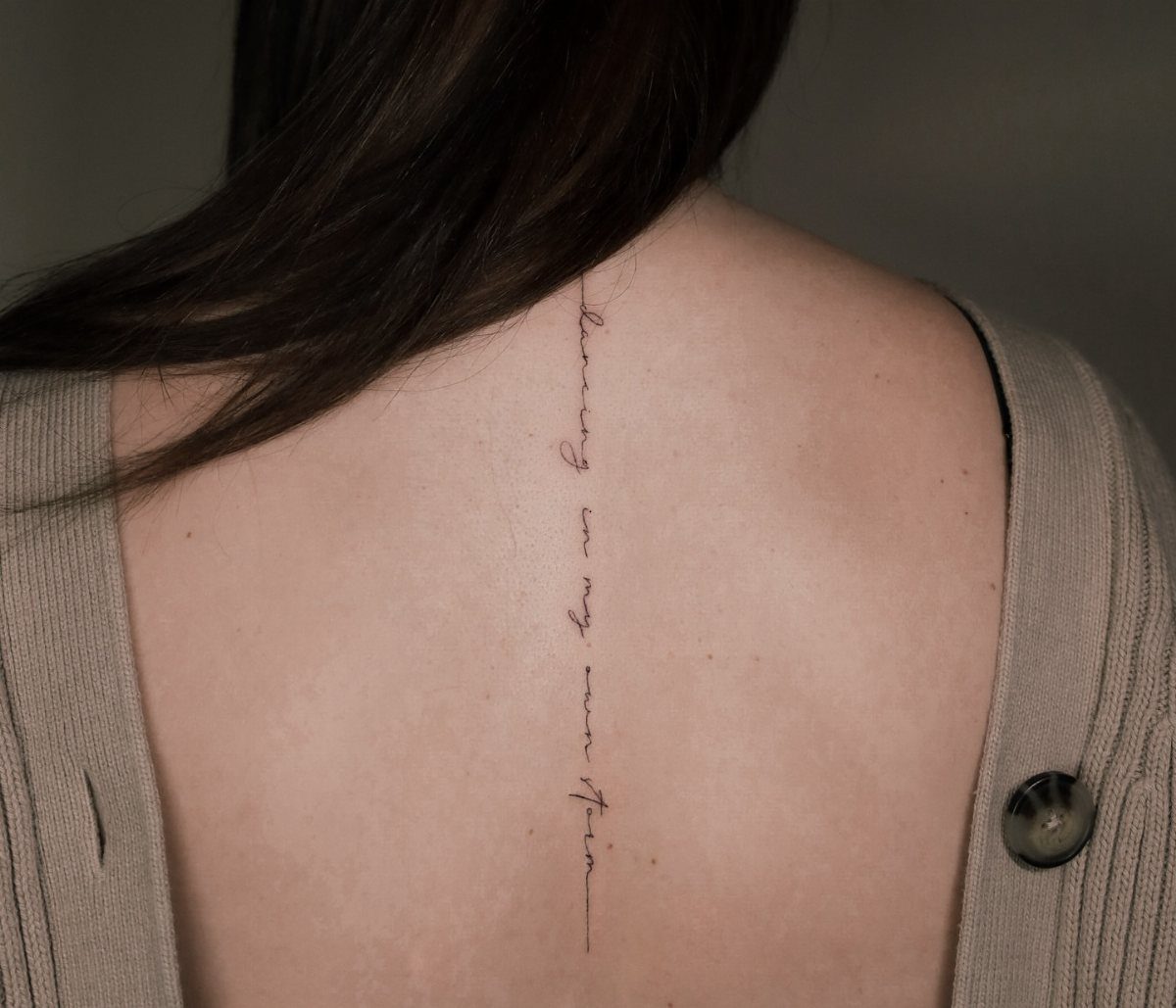
Vertical spine placement turns text into a bodily gesture; the phrase becomes something the wearer carries rather than displays.
Fine line script down the backbone demands an artist who can keep consistent pressure while working around vertebrae, and the shallow needle depth that preserves such thin lines also means faster fading.
The lowercase styling in the visible piece softens the declaration into something personal rather than motivational-poster loud. That choice suits someone who wants the words closer to skin than to billboard.
Before committing, test the full phrase in temporary ink. Lettering throws shadows on curved back skin that flat paper cannot predict, and "own storm" needs room to read as two words, not one tangled shape.
Frequently Asked Questions
What does a storm tattoo symbolize?
Storm tattoos draw their meaning from the contrast built into the image itself: endurance against destruction, calm inside chaos.
A lightning bolt slicing through black clouds or an eye holding steady while purple mass spins around it turns nature’s violence into a personal claim about getting through difficulty.
The specific symbolism shifts with the detail you choose. Red-orange lightning against charcoal reads as heated struggle where white on grey reads as sudden clarity.
Text that says you outlasted the storm makes the claim literal, while a full moon in cloud frame lets the viewer supply their own meaning.
What is the 1/3 rule tattoo?
I have not worked with the 1/3 rule directly, so I will leave that to artists who use it in their practice.